22 Facebook Ad Examples to Inspire Your Next Campaign
Nearly every time I bring up Facebook, someone scoffs and tells me they’ve stopped using it. If you’ve heard similar stories, you may be wondering: are Facebook ads still relevant? The answer is: Yes. Hard data disagrees with all this anecdotal evidence — in 2022, Facebook is still the most-used social media platform in the world, and Facebook ads reach 42.8% of internet users.
Beyond the impressive usage statistics, Facebook also continues to offer marketers the most sophisticated options and settings within its Ads Manager. Whether it’s building advanced custom audiences, running A/B tests, or trusting the algorithm’s targeting, marketers have full control over their Facebook ad campaigns down to the smallest detail.
If you’re already familiar with how to advertise on Facebook and the different Facebook ad types, this guide will give you all the inspiration you need to start creating ads for your next campaign.
We’ve found 22 fresh examples of best-in-class Facebook ads and highlighted what you can learn from them.
Bonus: Get the Facebook advertising cheat sheet for 2022. The free resource includes key audience insights, recommended ad types, and tips for success.
Facebook image ads examples
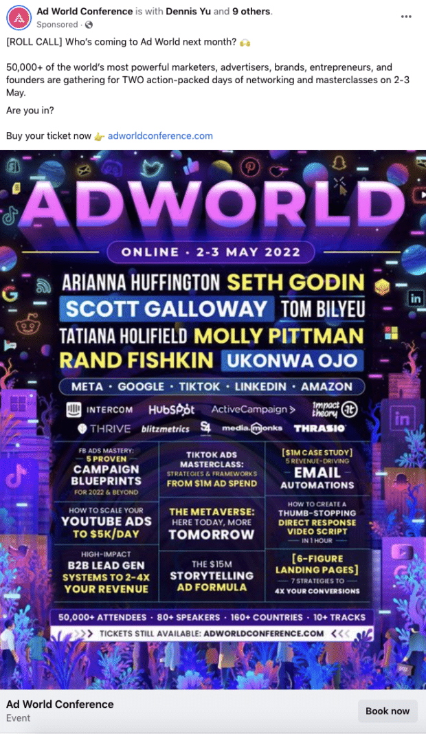
1. Ad World Conference
What can you learn from this ad?
- Ad World is playing off the music festival template to generate excitement about the speaker lineup.
- The ad uses different font styles to distinguish the conference headliners, which makes individual names stand out more despite a large amount of text.
- The caption creates a sense of FOMO (“50,000+ marketers”) and urgency (“Who’s coming next month?”).
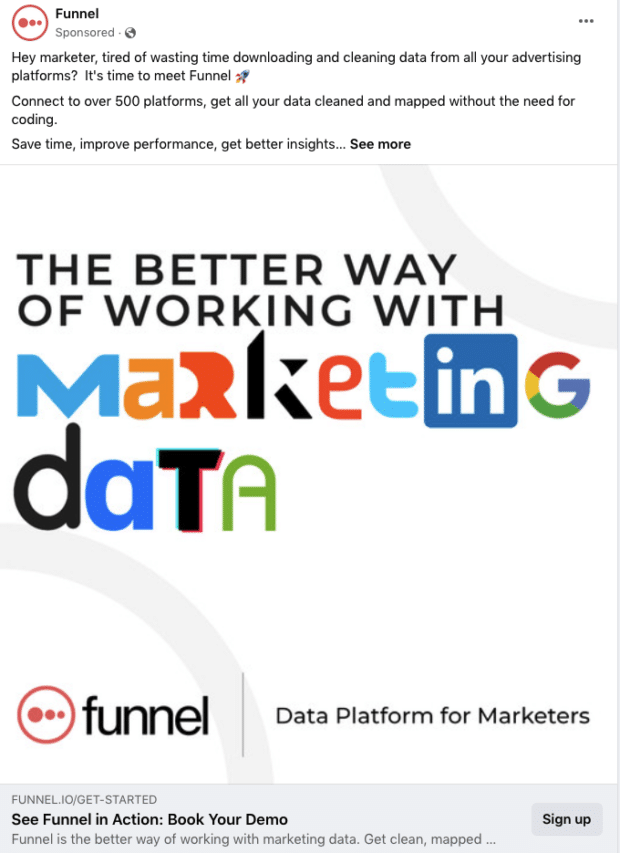
2. Funnel.io
What can you learn from this ad?
- The ad’s caption is carefully tailored to the target audience. The copy starts off by calling out the intended audience (“Hey marketer”).
- The ad calls out the pain points that its audience often faces (“downloading and cleaning data from all your advertising platforms”).
- The image is unique and creative — it uses elements of recognizable logos to spell out the unique selling proposition (USP), while also conveying the integrations that Funnel works with.
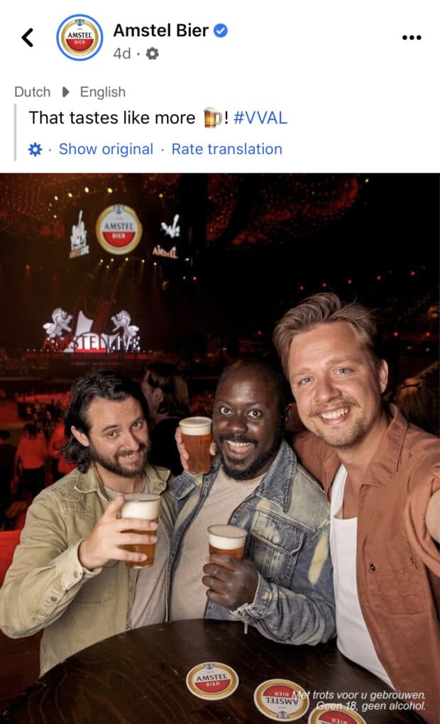
3. Amstel Beer
What can you learn from this ad?
- The ad has an organic look and feel — it looks like a regular Facebook post from your friends at a bar (tip: to achieve this effect, consider using user-generated content).
- The ad keeps it simple. There’s no text in the design — the image of people having a good time lets the product sell itself.
- The copy and caption are also written like an organic post, with a short caption, emojis, and hashtags.
4. Tropicfeel
What can you learn from this ad?
- This ad creates a sense of urgency. It drops the powerful words “last chance” in the copy and mentions a discount, which prompts the viewer to act fast.
- The CTA highlights social proof (“+2,000 5-star reviews”), creating trust, which is especially useful for viewers unfamiliar with the brand.s
- The ad copy focuses on the brand’s offering that has likely been validated through other channels such as search ads (Express shipping, 30% discount, 8 high-tech product features).
5. Toptal
What can you learn from this ad?
- The ad’s caption uses a common marketing template: “We solve problem X, so that you can achieve goal Y.”
- The CTAs are specific and consistent across the ad image and copy (“hire now” and “hire top talent now”).
- The ad uses cheeky copy and the image’s design (“…can handle more projects than we can fit in this post”) to capture attention.
Facebook carousel ads examples
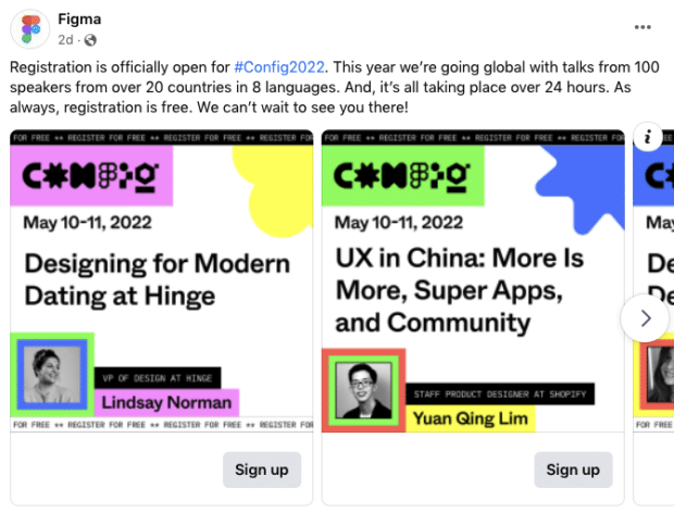
6. Figma Config 2022 conference
What can you learn from this ad?
- The images used in this ad incorporate bright colors to draw attention to the speakers and event name.
- Figma makes good use of the carousel format, highlighting one speaker/topic per slide, which makes the viewer more likely to scroll through all the topics and speakers
- The ad’s key info is included on every slide (event name, date, “register for free”).
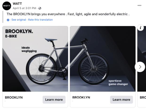
7. WATT
What can you learn from this ad?
- Splitting the product image over two (or more) slides compels the viewer to scroll through the carousel to see the other parts. This can work well for all products or designs that take up more horizontal space.
- WATT keeps text to a minimum, with each slide only containing one key feature or benefit of the product.
- The caption is short and sweet, appealing to the ad audiences’ needs when searching for a new bike.
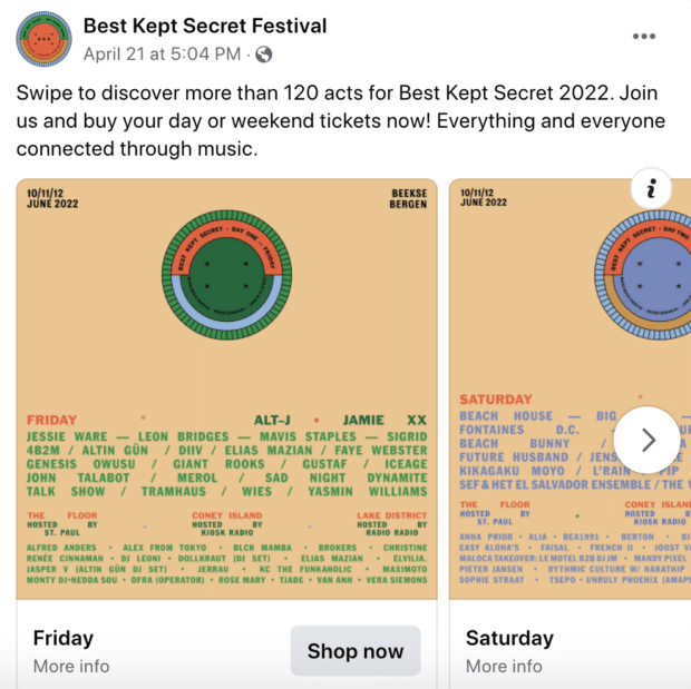
8. Best Kept Secret Festival
What can you learn from this ad?
- The CTA in the copy encourages the audience to “Swipe to discover…” and interact with the carousel.
- Using carousels for a multi-day event by splitting each day into a separate slide is a great way to cover a lot of information without overwhelming the design.
- Simple design with colors, text, and logos only – no fancy production needed!
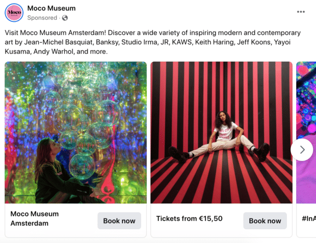
9. Moco Museum
What can you learn from this ad?
- Each slide corresponds to a different selling point from the ad’s copy (in this case, an art collection).
- Different from the other examples, this ad uses very contrasting images in each slide which makes it stand out on the feed — and from other carousel ads.
- Rather than just showcasing individual art pieces, the images show people within the museum, helping viewers picture themselves there. This technique can also be applied to physical products (showing people using your product, not just the product itself).
Facebook video ads examples
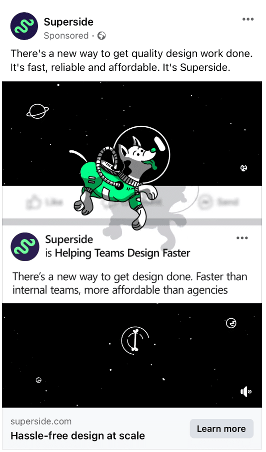
10. Superside
What can you learn from this ad?
- The design of the ad makes it appear 3D by mimicking the Facebook user interface and adding a floating dog with a shadow over the ad — a creative way to grab your audience’s attention.
- The creative design corresponds well with the ad’s copy (“There’s a new way to get design done”).
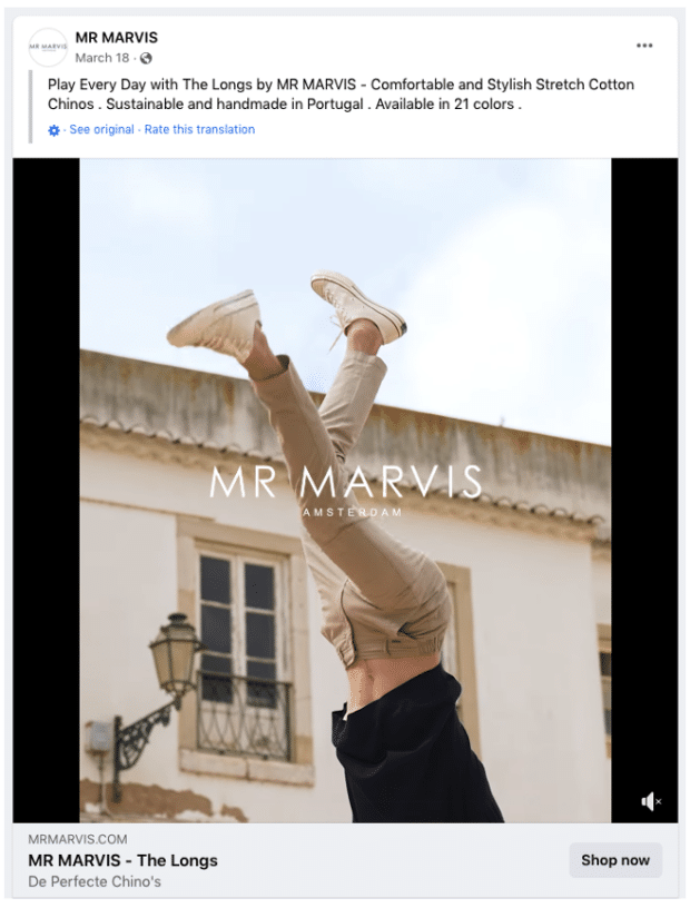
11. MR MARVIS
What can you learn from this ad?
- The MR MARVIS branding is present throughout the whole video, yet is subtle enough that it doesn’t distract from the rest of the ad.
- The video shows off the product with close-up shots to highlight features and benefits.
- Rather than serving visually appealing but not very informative lifestyle shots, the video highlights the product’s practicality.
- The “Shop now” CTA links directly to the specific product collection, streamlining the checkout process by reducing distractions and increasing the chance that viewers will purchase the product or service they saw in the ad.
Bonus: Get the Facebook advertising cheat sheet for 2022. The free resource includes key audience insights, recommended ad types, and tips for success.
Get the free cheat sheet now!
12. Renault
What can you learn from this ad?
- Sometimes simple is best. This ad uses two images and a simple transition, with no fancy animation or high-value production required
- Tip: Use this swipe transition to show before-and-after transformations. The ad copy can be used to tease something that’s revealed in the “after” layer of your design.
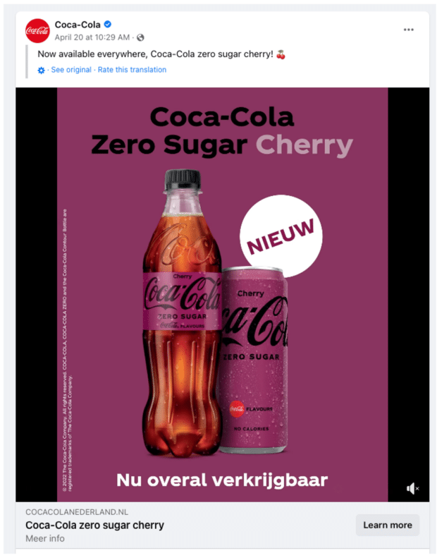
13. Coca-Cola
What can you learn from this ad?
- The color blocking in the ad is very eye-catching, with a large focal point (the “New” badge) directed towards the product.
- The “Nieuw” (new) label explains the purpose of the ad (and why someone might be targeted with it) — its purpose is not to raise brand awareness but to highlight a new product launch.
14. Amy Porterfield
What can you learn from this ad?
- Amy talks straight to the camera, which is a tactic that works well for service-based and coaching businesses (where the coach, instructor, or service provider is the “product”).
- The ad uses social proof to establish trust and prove results (“helped more than 45,000 entrepreneurs”).
- It promises an enticing outcome (grow your email list and make more money), well-tailored to the target audience.
- The price point of the service (“only $37”) is low enough to be attractive and worth listing in the ad copy.
Facebook stories ads examples
15. Datadog
What can you learn from this ad?
- The design of this ad is optimized for Stories placements (9×16).
- For lead generation ads that promote gated content, showing an ebook cover (rather than just mentioning the title) makes the value proposition feel more tangible.
- The ad uses a precise and relevant CTA (“Download”).
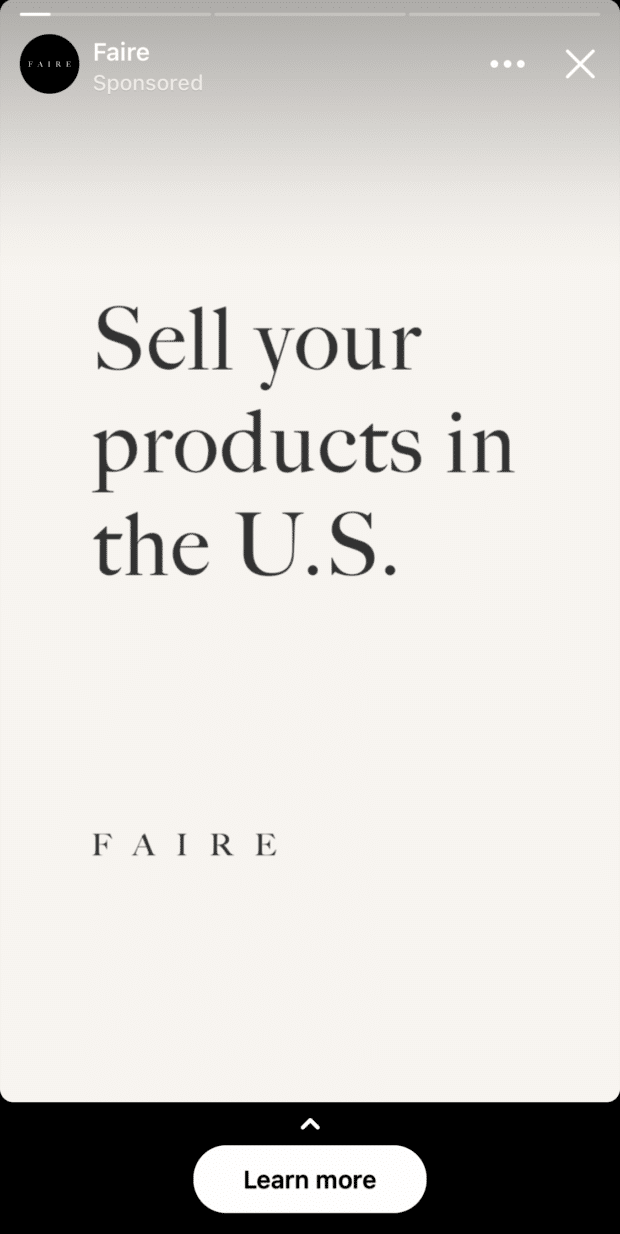
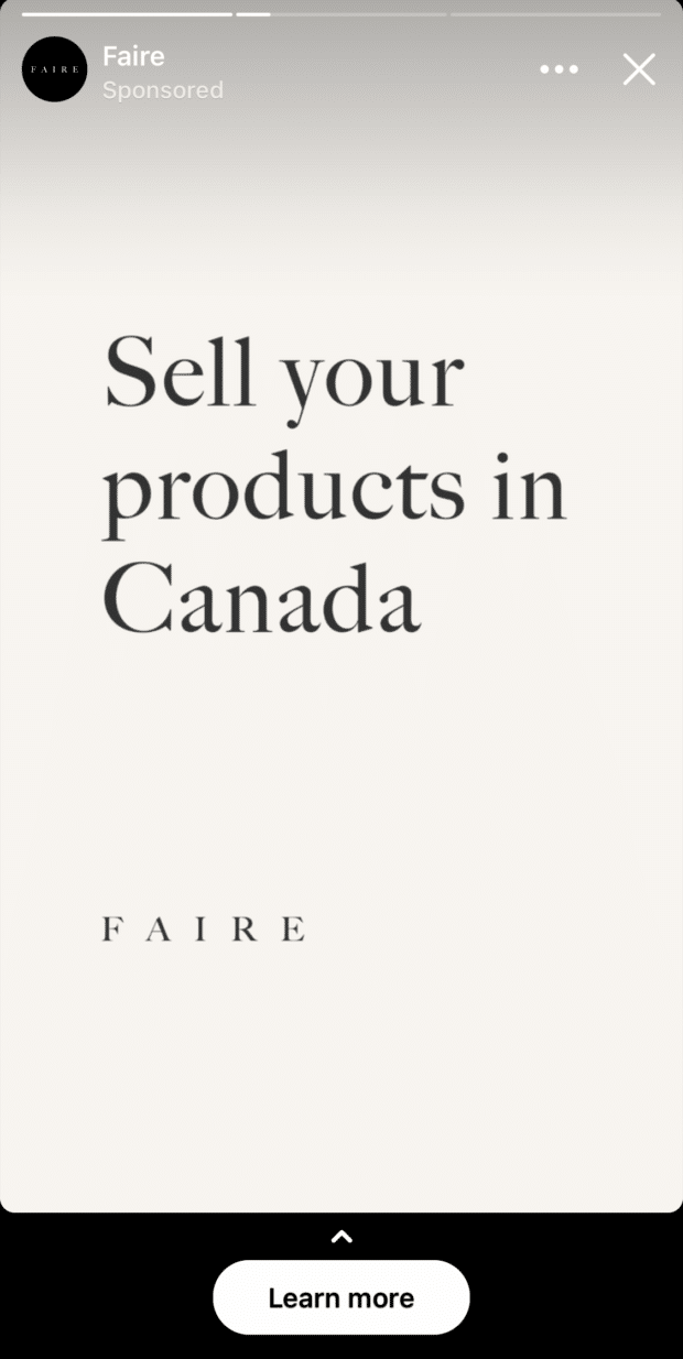
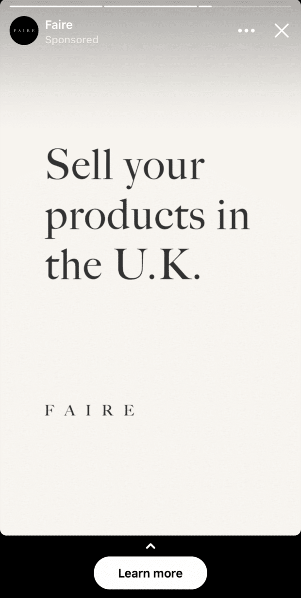
16. Faire
What can you learn from this ad?
- This Stories ad takes advantage of how people browse Stories (tapping through to the next one). Over the span of 3 frames, the information about shipping changes from “US” to “Canada” to “U.K.,” creating an effect similar to stop-motion animation.
- The ad design is simple — no video, animation, or graphics, just the value proposition written out with the logo.
- You could easily apply your branding to this ad’s design by adding your brand fonts and colors in addition to the logo (and swapping out the value prop for your own, of course).
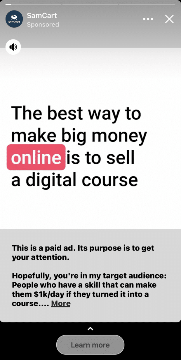
17. SamCart
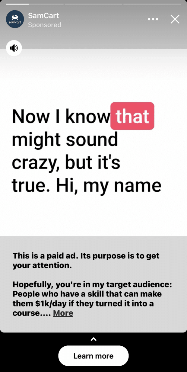
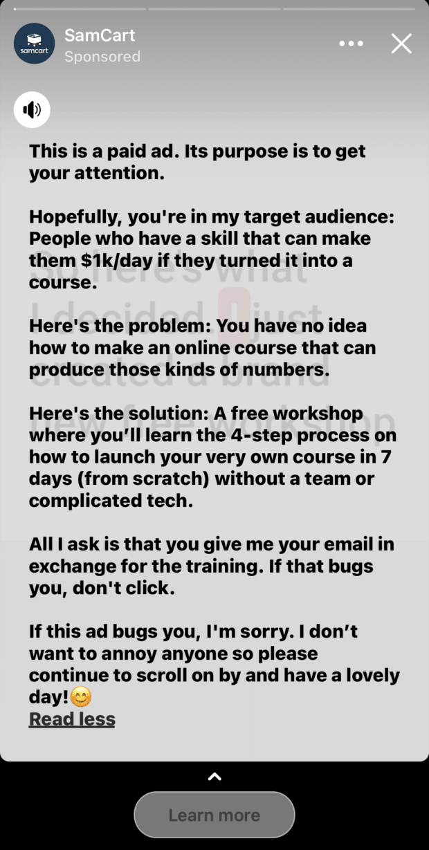
What can you learn from this ad?
- The ad uses a casual tone of voice, which makes it feel down-to-earth and personal.
- The self-awareness of the copy (“This is a paid ad, its purpose is to get your attention”) makes the ad stand out.
- Accessibility is important — this ad has subtitles for all spoken audio and thus is optimized for viewing without sound.
18. Lumen
What can you learn from this ad?
- This full-screen video ad uses the full 9×16 canvas to showcase the product’s benefits and explain how it works.
- The plain, blurred background makes the product stand out as the focal point in the ad.
- The branding and key takeaway are shown in the first 1-2 seconds of the ad, ensuring they’re seen before viewers skip or exit.
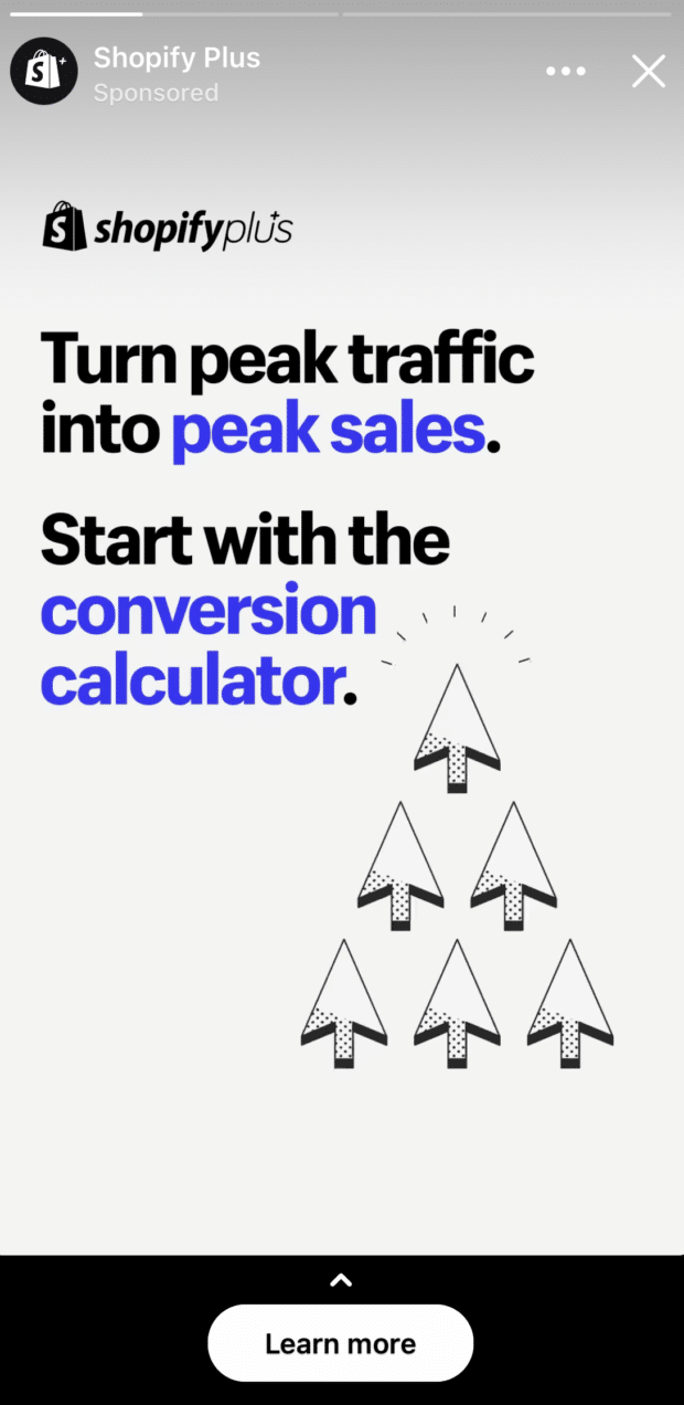
19. Shopify Plus
What can you learn from this ad?
- The ad uses a large font to make the text easy to read on mobile.
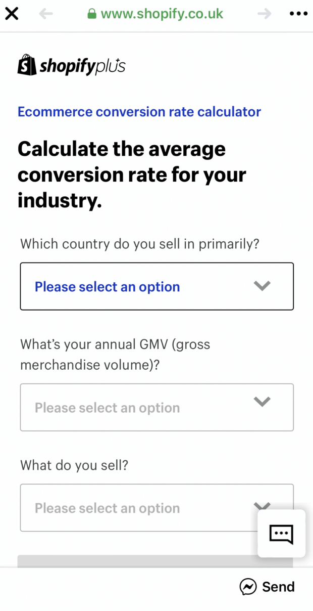
- Rather than trying to achieve direct sales through Facebook, Shopify is using its ads to generate leads and collect emails. This is a useful strategy to consider for B2B brands with higher-ticket items or long sales cycles, as social media users are less likely to make large and/or business purchases on mobile.
Facebook lead ads examples
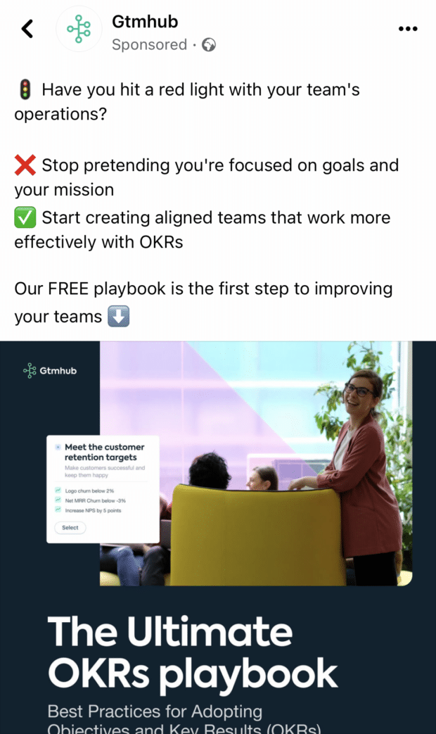
20. Gtmhub
What can you learn from this ad?
- The ad caption opens with a question related to a common pain point relevant to the audience (organizing teamwork).
- The
 and
and  emojis are immediately visible cues that communicate frustrations and benefits.
 - The caption is spaced out with one sentence per line, making the copy easy to skim.
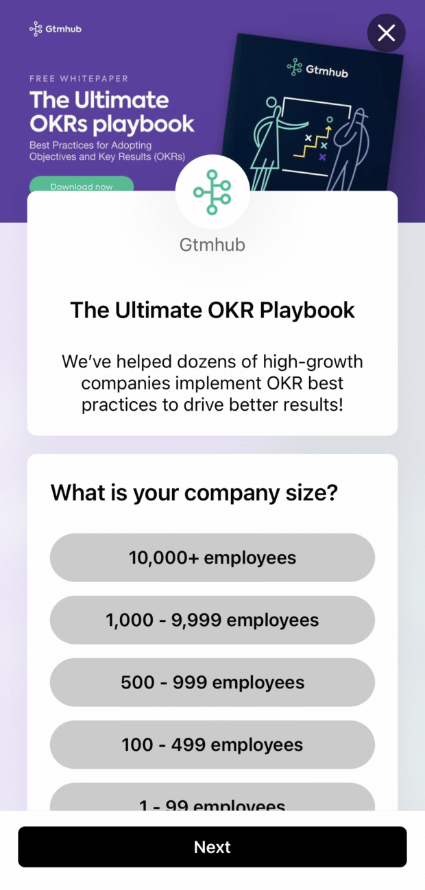
- The lead form asks for qualifying information (company size) before even contact info, which can both improve the quality of the leads and increase the number of submissions by putting an easy, non-personal question first.
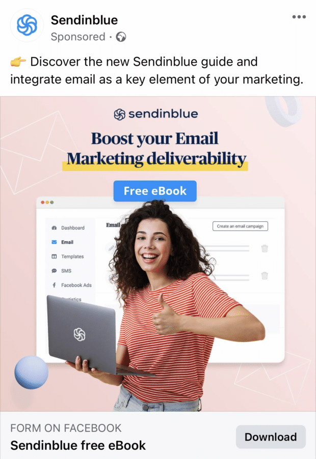
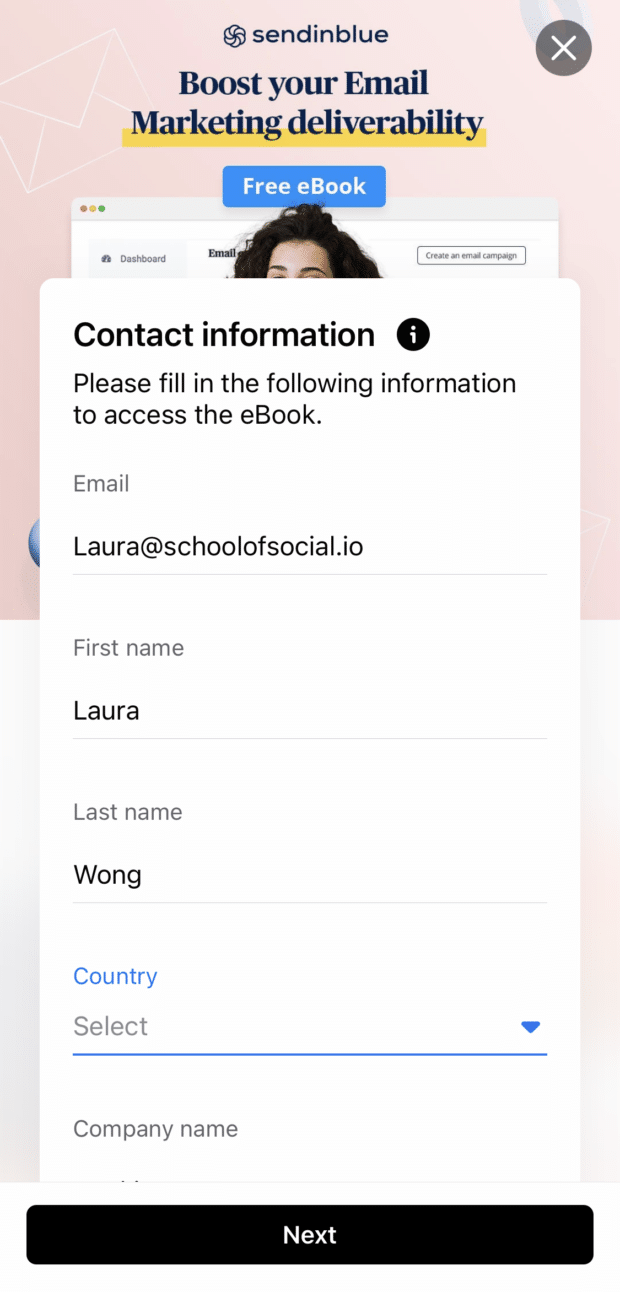
21. Sendinblue
What can you learn from this ad?
- The “Free eBook” value proposition stands out in the design — the accent color contrasts with the rest of the image.
- The ad caption is short and sweet (and fits “above the fold”).
- All of the text used in the design is purposeful: the logo, hook (“Boost your Email Marketing deliverability”) and the value proposition (“Free eBook”).
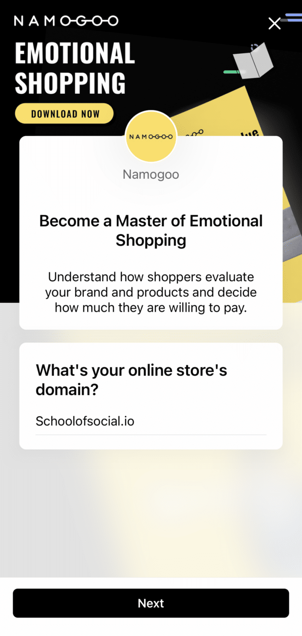
22. Namogoo
What can you learn from this ad?
- The use of bright color against a dark background makes the key elements (the eBook cover and the CTA) pop.
- The image aspect ratio (4×5) is optimized for mobile.
- The lead form asks for key information first (online store’s domain), acting as a quality filter by establishing that leads have an online store before even asking them to enter an email address.
What makes a great Facebook ad?
Based on the examples above, there are some clear copywriting tactics and design elements that make great Facebook ads. We’ve summarized them into a list of best practices that you can follow when creating your next Facebook ads campaign.
Eye-catching creatives
We know that social media users have ever-dwindling attention spans. As such, ad creatives need to be attention-grabbing enough to stop users from simply scrolling away.
Improve the quality of your ad creatives by:
- Minimizing the amount of text on images (while there’s no limit, Facebook recommends covering up less than 20% of your design with text)
- Adding movement to stop users mid-scroll (usually in video format or gifs)
- Keeping videos short and to the point (15 seconds or less)
- Focusing on storytelling (make your ads worth watching until the end!)
Mobile-first design
98.5% of users access Facebook via a mobile device. Therefore, you should always be designing your ads with mobile in mind. Here are a few ways to optimize your ads to be mobile-first:
- Uses vertical videos and/or photos (they take up more real estate on mobile screens)
- Hook the user’s attention within the first 3 seconds of your videos
- Design your ads for sound-off viewing — use captions and/or overlay text so that viewers still get the key message without sound
- Feature your brand and/or product early on in video ads (in case viewers don’t watch the full ad)
Short and snappy copy
In most of the examples, the ad captions didn’t fit above the fold (a.k.a. users have to tap “see more” to expand the full caption). So, it’s important to make the first line of your caption as attention-grabbing as possible. Here’s how:
- Write short, clear and concise copy (put the hook in the first sentence or two, above the fold)
- Keep short attention spans on mobile in mind (the shorter the better is a great rule of thumb)
Compelling CTAs
An ad’s call to action (CTA) is the most important part of the ad. It specifies what action you want viewers to do after seeing the ad. Here are some tips to optimize your CTA:
- Make sure the CTA matches the success metric for your campaign (do you want to ring in sales, collect emails, or drive newsletter signups?)
- The more specific your CTA, the better (avoid the generic “Learn more” — Facebook provides over 20 CTA button options across ad formats)
- Use A/B testing to discover which CTA resonates the most with your audience
Audience research and thoughtful targeting
The more relevant your messaging is to someone, the more likely they are to pay attention to and engage with your Facebook ad. Here’s how to tailor your ads to your audience:
- Adapt the ad’s messaging based on the targeting (interests, stage of the marketing funnel, age, location, etc.)
- Use separate ad sets to create different creatives for each audience segment
Ready to get started? Before going to the creative drawing board, be sure to check out our guides for all Facebook ad image sizes and the top Facebook trends in 2022.
Easily plan, manage and analyze organic and paid Facebook campaigns from one place with Hootsuite Social Advertising. See it in action.
Easily plan, manage and analyze organic and paid campaigns from one place with Hootsuite Social Advertising. See it in action.
Free DemoThe post 22 Facebook Ad Examples to Inspire Your Next Campaign appeared first on Social Media Marketing & Management Dashboard.
Categories
- 60% of the time… (1)
- A/B Testing (2)
- Ad placements (3)
- adops (4)
- adops vs sales (5)
- AdParlor 101 (43)
- adx (1)
- algorithm (1)
- Analysis (9)
- Apple (1)
- Audience (1)
- Augmented Reality (1)
- authenticity (1)
- Automation (1)
- Back to School (1)
- best practices (2)
- brand voice (1)
- branding (1)
- Build a Blog Community (12)
- Case Study (3)
- celebrate women (1)
- certification (1)
- Collections (1)
- Community (1)
- Conference News (1)
- conferences (1)
- content (1)
- content curation (1)
- content marketing (1)
- contests (1)
- Conversion Lift Test (1)
- Conversion testing (1)
- cost control (2)
- Creative (6)
- crisis (1)
- Curation (1)
- Custom Audience Targeting (4)
- Digital Advertising (2)
- Digital Marketing (6)
- DPA (1)
- Dynamic Ad Creative (1)
- dynamic product ads (1)
- E-Commerce (1)
- eCommerce (2)
- Ecosystem (1)
- email marketing (3)
- employee advocacy program (1)
- employee advocates (1)
- engineers (1)
- event marketing (1)
- event marketing strategy (1)
- events (1)
- Experiments (21)
- F8 (2)
- Facebook (64)
- Facebook Ad Split Testing (1)
- facebook ads (18)
- Facebook Ads How To (1)
- Facebook Advertising (30)
- Facebook Audience Network (1)
- Facebook Creative Platform Partners (1)
- facebook marketing (1)
- Facebook Marketing Partners (2)
- Facebook Optimizations (1)
- Facebook Posts (1)
- facebook stories (1)
- Facebook Updates (2)
- Facebook Video Ads (1)
- Facebook Watch (1)
- fbf (11)
- first impression takeover (5)
- fito (5)
- Fluent (1)
- Get Started With Wix Blog (1)
- Google (9)
- Google Ad Products (5)
- Google Analytics (1)
- Guest Post (1)
- Guides (32)
- Halloween (1)
- holiday marketing (1)
- Holiday Season Advertising (7)
- Holiday Shopping Season (4)
- Holiday Video Ads (1)
- holidays (4)
- Hootsuite How-To (3)
- Hootsuite Life (1)
- how to (5)
- How to get Instagram followers (1)
- How to get more Instagram followers (1)
- i don't understand a single thing he is or has been saying (1)
- if you need any proof that we're all just making it up (2)
- Incrementality (1)
- influencer marketing (1)
- Infographic (1)
- Instagram (39)
- Instagram Ads (11)
- Instagram advertising (8)
- Instagram best practices (1)
- Instagram followers (1)
- Instagram Partner (1)
- Instagram Stories (2)
- Instagram tips (1)
- Instagram Video Ads (2)
- invite (1)
- Landing Page (1)
- link shorteners (1)
- LinkedIn (22)
- LinkedIn Ads (2)
- LinkedIn Advertising (2)
- LinkedIn Stats (1)
- LinkedIn Targeting (5)
- Linkedin Usage (1)
- List (1)
- listening (2)
- Lists (3)
- Livestreaming (1)
- look no further than the new yorker store (2)
- lunch (1)
- Mac (1)
- macOS (1)
- Marketing to Millennials (2)
- mental health (1)
- metaverse (1)
- Mobile App Marketing (3)
- Monetizing Pinterest (2)
- Monetizing Social Media (2)
- Monthly Updates (10)
- Mothers Day (1)
- movies for social media managers (1)
- new releases (11)
- News (72)
- News & Events (13)
- no one knows what they're doing (2)
- OnlineShopping (2)
- or ari paparo (1)
- owly shortener (1)
- Paid Media (2)
- People-Based Marketing (3)
- performance marketing (5)
- Pinterest (34)
- Pinterest Ads (11)
- Pinterest Advertising (8)
- Pinterest how to (1)
- Pinterest Tag helper (5)
- Pinterest Targeting (6)
- platform health (1)
- Platform Updates (8)
- Press Release (2)
- product catalog (1)
- Productivity (10)
- Programmatic (3)
- quick work (1)
- Reddit (3)
- Reporting (1)
- Resources (34)
- ROI (1)
- rules (1)
- Seamless shopping (1)
- share of voice (1)
- Shoppable ads (4)
- Skills (28)
- SMB (1)
- SnapChat (28)
- SnapChat Ads (8)
- SnapChat Advertising (5)
- Social (169)
- social ads (1)
- Social Advertising (14)
- social customer service (1)
- Social Fresh Tips (1)
- Social Media (5)
- social media automation (1)
- social media content calendar (1)
- social media for events (1)
- social media management (2)
- Social Media Marketing (49)
- social media monitoring (1)
- Social Media News (4)
- social media statistics (1)
- social media tracking in google analytics (1)
- social media tutorial (2)
- Social Toolkit Podcast (1)
- Social Video (5)
- stories (1)
- Strategy (608)
- terms (1)
- Testing (2)
- there are times ive found myself talking to ari and even though none of the words he is using are new to me (1)
- they've done studies (1)
- this is also true of anytime i have to talk to developers (1)
- tiktok (8)
- tools (1)
- Topics & Trends (3)
- Trend (12)
- Twitter (15)
- Twitter Ads (5)
- Twitter Advertising (4)
- Uncategorised (9)
- Uncategorized (13)
- url shortener (1)
- url shorteners (1)
- vendor (2)
- video (10)
- Video Ads (7)
- Video Advertising (8)
- virtual conference (1)
- we're all just throwing mountains of shit at the wall and hoping the parts that stick don't smell too bad (2)
- web3 (1)
- where you can buy a baby onesie of a dog asking god for his testicles on it (2)
- yes i understand VAST and VPAID (1)
- yes that's the extent of the things i understand (1)
- YouTube (13)
- YouTube Ads (4)
- YouTube Advertising (9)
- YouTube Video Advertising (5)

