2024 Social Media Post Design Ideas and 100+ Free Templates
Great social media stands out, and eye-catching, engaging and creative design will help set you apart from the crowd. You’re not just any brand — you’re a cool brand, and your social media post design should reflect that.
We’ve got the resources to help you get the most out of every post (that rhyme was by design), on Instagram, Facebook, TikTok, Linkedin, and beyond. Think real examples, expert advice, tons of social media post templates, and recommendations for the apps that will make you feel like a graphic design champ.
10 social media post design ideas for 2024
Let’s start with some proof: these brands have the art of social media design on their side. Here’s how they did it.
1. Keep it simple
When you’re designing social media graphics for your business, clarity is important. Don’t get bogged down in the colours, graphics or text—sometimes, less is more.
Take this “We’re Hiring” announcement, for example. The text is conspicuous, the colour palette is minimal and the message is extremely clear.
Why this works:
- The image itself is meant to catch the eye and intrigue viewers, so only essential information is included.
- For those interested in the post, there are more details within the caption.
- The caption directs traffic to the link in bio, keeping all the nitty gritty (and not as pretty) information off of the feed.
2. Post a scrolling panorama carousel
This one’s for the ‘gram only. Instagram carousels are engagement magnets (on average, they get 3 times the engagement of a regular post) and also fantastic opportunities for creative design.
You can treat an Instagram carousel like a panorama (like Olivia Rodrigo’s social team did above) and create one long, scrollable image by editing together several still photos.
Psst: there’s apps for that—check out the last section of this post for details.
Why this works:
- The first image in the carousel is cut off, prompting your audience to scroll to the right and interact with your post for longer.
- You can fit more into each post, and are not obligated to follow Instagram’s regular dimensions for still photos.
- It’s just plain artsy! Even though it’s not super technical, this is an impressive way to post photos—low effort, high reward.
3. Design an album or series of posts
Give your feed a cohesive vibe by designing a group of posts in a similar fashion (the templates mentioned in the following section are an excellent beginner design tool).
This makeup brand’s series of Valentine’s Day-related social media images are all edited the same way and posted together, with engaging text that prompts their audience to check out the entire set.
Why this works:
- The images have similar colour stories and use identical fonts and layout styles, so clearly look like part of a set.
- Each individual image can also exist independently (you don’t need to see them all to “get it”).
- The text is short, sweet and clever—it spotlights the product but doesn’t come across as a traditional advertisement.
4. Create graphics with user-generated content
Work smarter, not harder. Instead of starting a post from scratch, try recycling positive reviews, comments and DMs and sharing them as content.
You can do this by screenshotting great reviews or repurposing the text entirely—this hair care brand did the latter. In the above post, words from happy customers appear like text messages (meaning, yeah, the social media manager was probably texting themselves for content… you gotta do what you gotta do).
Why this works:
- Real reviews from real people help to authenticate your brand.
- You don’t have to do your own copywriting—let the customers do the work.
- You can design the UGC to fit with your brand’s aesthetic.
5. For info dumps, go monochrome
Design trends come and go, but matching colours will always be in style. For more info-heavy posts, keep the colours to a minimum so your message really pops.
This event post, for example, contains a lot of information: the when, where and what to bring all need to be clear to the viewer. The all-blue colour palette ensures that the text, graphics and maps are prominent.
Why this works:
- The blue-on-blue colour palette is appealing to the eye.
- The information is easy to interpret.
- The single image contains all of the information, making it very sharable (like a party invitation).
6. Cover your carousels
Another carousel tip: because the first photo in your carousel is the only one that appears on your Instagram grid, that first design should “sum up” what’s to come. Think of it like the cover of a book.
This media outlet directs traffic to its website through engaging Instagram posts, and the above example shows how effective the first photo can be. The first photo displays an image, the story’s headline and the brand’s logo — a perfect snapshot of the story. From there, audiences can scroll through to find more photos, a quote, an excerpt from the story and even a graphic just directing traffic towards the website.
Why this works:
- The most aesthetic image is the first one in the carousel.
- The less beautiful (but more information-heavy) images are “covered” by the first photo.
- The brand is able to share lots of different styles of posts but still maintain a cohesive grid aesthetic.
7. Dress up the numbers
Percentages and statistics aren’t just for your slideshow presentations. Using some mindful design choices, you can transform relatively boring information (for example, your company’s Q3 report) into attractive graphics.
This Linkedin post walks the walk. The company’s use of hi-resolution photos, clear branding and modern fonts make the numbers look beautiful.
Why this works:
- Hi-res images and negative space keep the information from being too overwhelming.
- The most important figures are largest and most prominent.
- This looks like it was ripped straight from a report (in fact, it probably was) and gives off an insider, exclusive vibe, even though it’s public.
8. Get creative with stickers
Most social media apps offer stickers to jazz up your posts, but you don’t have to use them the way they were meant to—after all, rules were made to be broken.
Instagram’s question stickers, for instance, are interactive when they’re incorporated into stories. But this bubble tea brand instead used the sticker as a graphic on an Instagram post. It can’t be directly typed in, but it still asks a question and prompts followers to comment.
Why this works:
- The question sticker is familiar to Instagram users—they recognize that the brand is asking them to engage.
- The company’s branding is all over this image (there’s no question who the post belongs to) and the product is clearly displayed.
- The question asked is succinct and requires a low-effort answer, making viewers more likely to take the time to reply to it.
9. Chart it out
Charts, graphs and diagrams might not seem exciting, but they can be very engaging when designed thoughtfully and directed towards a specific audience.
This Venn diagram by Converse is simple and aesthetically pleasing. It shows off three styles of shoes in a single post, and leans into a silver theme.
Why this works:
- Diagrams aren’t nearly as common as photos, so this method of sharing information is refreshing for viewers.
- The theme—all silver everything–is used in both the background and the product images, creating a cohesive sparkling design.
- There isn’t too much info presented here (an overly complicated graph or diagram may overwhelm the user).
10. Embrace the memes
Creating social media content doesn’t always require design talent. Here’s some amazing news: not only are memes very effective marketing tools, but you don’t need to have an eye for graphic design to create them. In fact, bad graphics are part of the charm.
Meme queen Wendy’s is a perfect example. The memes may be blurry, they may be poorly edited, they may have nonsensical captions (like “My hands so her hands look like can look like this this”) but boy, are they shareable.
Why this works:
- Memes don’t feel like ads—users will share them because they find them funny, and the marketing is just a bonus.
- The post isn’t too polished; it comes across as authentic and real.
- The content communicates a timely idea (the vanilla frosty is temporarily back) and the meme embraces the urgency of the situation.
Free social media post design templates
Instagram post templates
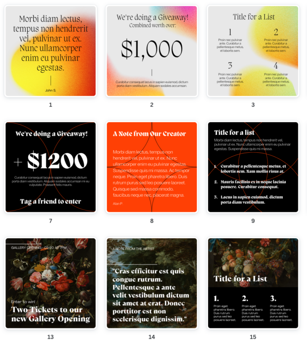
From vintage and dreamy to modern and bold, these 15 Instagram post templates will help get those creative juices flowing. The free Canva templates (Canva, we <3 you) have 5 different aesthetics, and each contain building blocks for three kinds of posts: giveaways, lists and messages.
The “message” could really be any decent-sized chunk of text—think a note from a company founder, an awesome customer review or even a business-related announcement that you want to jazz up.
These templates are all square, sizing up at 1080 x 1080 pixels.
Instagram carousel templates
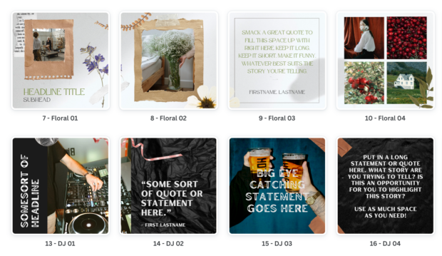
No more horseplay—it’s time to get serious about carousels. We’ve got 20 Instagram carousel templates to help boost your engagement (carousel posts get 3 times the engagement, on average, than a single photo post). After all, we all know how tempting swiping left is.
The Instagram carousel templates are offered in five different aesthetics (think “DJ” and “floral”) and each has four slides. There’s space for quotes, photos and lists. Like the post templates, these carousel templates are square and measure 1080 x 1080 pixels.
Instagram collage templates
Artsy alert. If you’ve got a lot of great photos to share, collage posts are the ideal more-is-more solution. To get you started quick and easy, here’s five Instagram post collage templates and five Instagram story collage templates offered in a range of different styles.
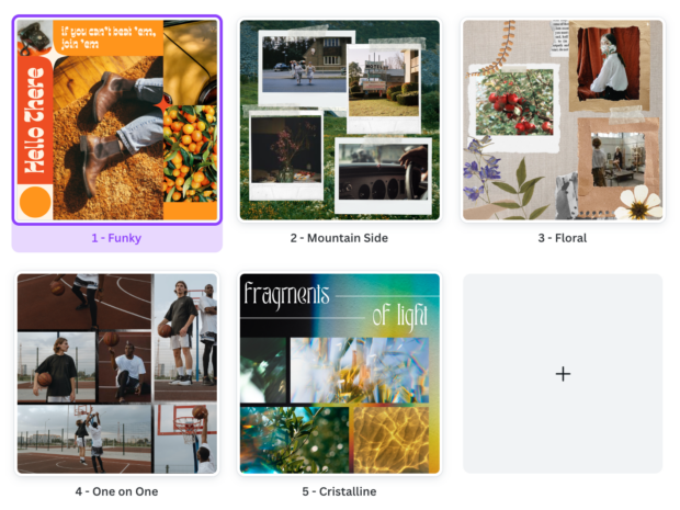
Hot tip: If you find the elements in these collage templates don’t fit with the look of your photos, you can easily make the elements match your uploaded photos using the “photo colours” option.
For example, the template below is very orange. If that’s not your vibe, you can change the colours of the orange elements by picking colours from your uploaded photos.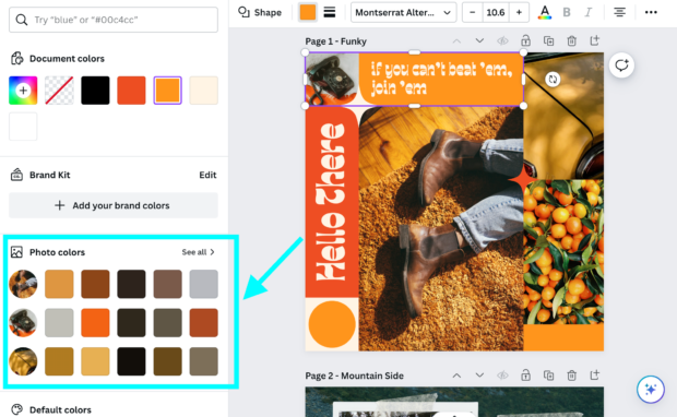
This goes for any Canva template, of course: templates were made to be modified.
Instagram Story templates
This one’s a beast. Not only do we have 72 Instagram Story templates at your fingertips, there’s also 30 aesthetic Instagram Story background templates for your consideration.
That’s 102 total (for you visual learners out there, that’s one more dalmatian than Cruella de Vil had).
The Instagram Story templates are offered in four themes, and each theme has 18 templates offering a range of text styles and spots for photos.
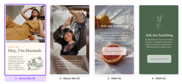
The background templates are more basic: cool images that you can layer your own content on top of, like a not-so-blank canvas.
Both sets of templates are sized at the standard dimensions for an Instagram story: 1080 x 1920 pixels.
Instagram Reels and TikTok templates
Design isn’t just for still photos, of course. Putting together Instagram Reels takes a discerning eye—or a really excellent template. Here’s four IG Reel templates with modern text, transitions and timing so you can edit like a pro. Psst: Reels and TikToks have the same specs, so you can use these templates for the ‘Tok, too.
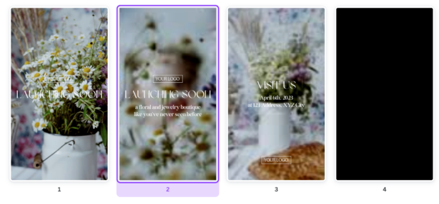
Oh, and don’t forget Reel covers (that’s the still image that shows up when you look at your Reel on your grid or on the Explore page). Well-designed Reel covers truly elevate your brand… and we’ve got 5 Reel cover templates to kick your social media game up a notch.
Instagram ad templates
Marketing on Instagram takes on many forms, but a traditional ad is one of the only guaranteed ways to make sure your post is reaching the right people. To make sure you’re putting 100% into the posts you pay for, try using one of these 15 Instagram ad templates. They’re specifically designed to attract, engage and of course, sell.
Pinterest templates
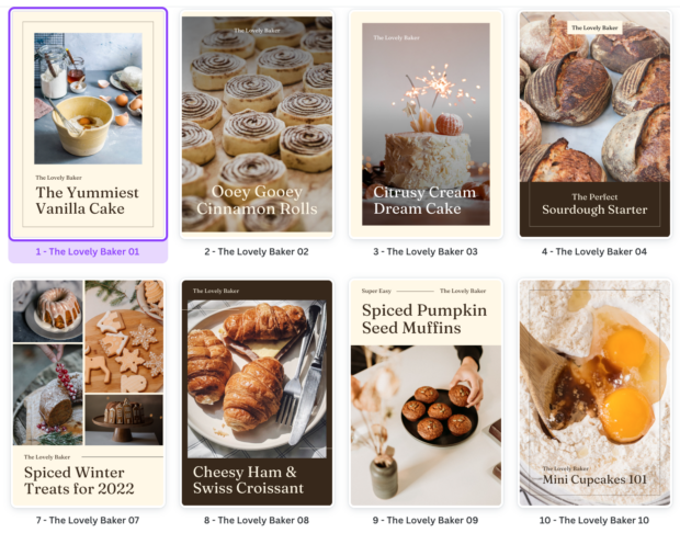
And last but certainly not least, there’s these 10 pin templates perfect for the picky Pinterester. They all happen to be very food-focused (for now, until you modify them with whatever gorgeous photo assets you have on hand) so don’t edit on an empty stomach.
Each measures 1000 x 1500 pixels.
The best apps for designing social media posts
These user-friendly apps can help you create beautiful posts without breaking a sweat.
Canva
In case you didn’t get the vibe from the hundreds of examples listed above: we love Canva. Even if this graphic design rockstar of an app wasn’t integrated with Hootsuite (and it is), we’d be singing its praises for the huge image library, awesome fonts and foolproof user interface. It’s a lifesaver and it’s free (heck yeah).
Adobe Express
Adobe Express uses AI to expertly recommend templates and remove image backgrounds (as well as all the standard cropping, resizing, filtering and photo editing software that’s classic for design-focused apps). Think Photoshop, but mobile-friendly.
Panorama Scroll Carousel Maker
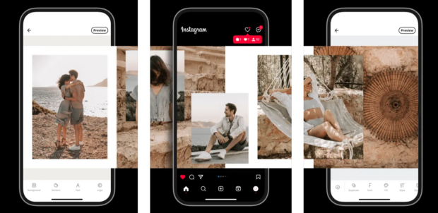
We waxed poetic about scrolling panoramas earlier in this blog post… but actually making those super-aesthetic posts is harder than it looks. To prevent a cropping disaster, try an app like Panorama Scroll Carousel Maker. Its main purpose is (you’ll never guess) creating flawless scrolling panoramas. Engagement, here you come.
Source: Panorama Scroll Carousel Maker
Save time managing your social media channels with Hootsuite. From a single dashboard you can publish and schedule posts, find relevant conversions, engage the audience, measure results, and more. Try it free today.
The post 2024 Social Media Post Design Ideas and 100+ Free Templates appeared first on Social Media Marketing & Management Dashboard.
Categories
- 60% of the time… (1)
- A/B Testing (2)
- Ad placements (3)
- adops (4)
- adops vs sales (5)
- AdParlor 101 (43)
- adx (1)
- AI (6)
- algorithm (1)
- Analysis (14)
- Apple (1)
- Audience (1)
- Augmented Reality (1)
- authenticity (1)
- Automation (1)
- Back to School (1)
- best practices (2)
- brand voice (1)
- branding (1)
- Build a Blog Community (12)
- Calculator (1)
- Case Studies (2)
- Case Study (3)
- celebrate women (1)
- certification (1)
- Collections (1)
- Community (1)
- Conference News (2)
- conferences (1)
- confluence (1)
- content (1)
- content creation (44)
- Content creators (3)
- content curation (1)
- content marketing (3)
- contests (1)
- Conversion Lift Test (1)
- Conversion testing (1)
- cost control (2)
- Creative (6)
- crisis (1)
- Curation (1)
- Custom Audience Targeting (4)
- Customer service (7)
- Digital Advertising (2)
- Digital Marketing (6)
- DPA (1)
- Dynamic Ad Creative (1)
- dynamic product ads (1)
- E-Commerce (1)
- eCommerce (2)
- email marketing (3)
- Employee advocacy (2)
- employee advocacy program (1)
- employee advocates (1)
- engineers (1)
- event marketing (1)
- event marketing strategy (1)
- events (3)
- Experiments (38)
- F8 (2)
- Facebook (64)
- Facebook Ad Split Testing (1)
- facebook ads (18)
- Facebook Ads How To (1)
- Facebook Advertising (30)
- Facebook Audience Network (1)
- Facebook Creative Platform Partners (1)
- facebook marketing (1)
- Facebook Marketing Partners (2)
- Facebook Optimizations (1)
- Facebook Posts (1)
- facebook stories (1)
- Facebook Updates (2)
- Facebook Video Ads (1)
- Facebook Watch (1)
- fbf (11)
- first impression takeover (5)
- fito (5)
- Fluent (1)
- Free tool (2)
- Get Started With Wix Blog (1)
- Google (9)
- Google Ad Products (5)
- Google Analytics (1)
- Government (1)
- Guest Post (1)
- Guide (4)
- Guides (32)
- Halloween (1)
- Healthcare (2)
- holiday marketing (1)
- Holiday Season Advertising (7)
- Holiday Shopping Season (4)
- Holiday Video Ads (1)
- holidays (4)
- Hootsuite How-To (3)
- Hootsuite HQ (1)
- Hootsuite Life (1)
- how to (6)
- How to get Instagram followers (1)
- How to get more Instagram followers (1)
- i don't understand a single thing he is or has been saying (1)
- if you need any proof that we're all just making it up (2)
- Incrementality (1)
- influencer marketing (2)
- Infographic (1)
- Instagram (39)
- Instagram Ads (11)
- Instagram advertising (8)
- Instagram best practices (1)
- Instagram followers (1)
- Instagram Partner (1)
- Instagram Stories (2)
- Instagram tips (1)
- Instagram Video Ads (2)
- invite (1)
- Landing Page (1)
- Legal (1)
- link shorteners (1)
- LinkedIn (22)
- LinkedIn Ads (2)
- LinkedIn Advertising (2)
- LinkedIn Stats (1)
- LinkedIn Targeting (5)
- Linkedin Usage (1)
- List (1)
- listening (2)
- Lists (3)
- Livestreaming (1)
- look no further than the new yorker store (2)
- lunch (1)
- Mac (1)
- macOS (1)
- Marketing to Millennials (2)
- mental health (1)
- metaverse (2)
- mobile (2)
- Mobile App Marketing (3)
- Monetizing Pinterest (2)
- Monetizing Social Media (2)
- Monthly Updates (10)
- Mothers Day (1)
- movies for social media managers (1)
- new releases (11)
- News (80)
- News & Events (11)
- no one knows what they're doing (2)
- Non-profit (2)
- OnlineShopping (2)
- or ari paparo (1)
- owly shortener (1)
- Paid Media (2)
- People-Based Marketing (3)
- performance marketing (5)
- Pinterest (34)
- Pinterest Ads (11)
- Pinterest Advertising (8)
- Pinterest how to (1)
- Pinterest Tag helper (5)
- Pinterest Targeting (6)
- platform health (1)
- Platform Updates (8)
- Press Release (2)
- product catalog (1)
- Productivity (10)
- Programmatic (3)
- quick work (1)
- Real estate (4)
- Reddit (3)
- reels (1)
- Report (1)
- Reporting (1)
- Resources (27)
- ROI (1)
- rules (1)
- Seamless shopping (1)
- share of voice (1)
- Shoppable ads (4)
- short-form video (2)
- shorts (2)
- Skills (25)
- SMB (1)
- SnapChat (28)
- SnapChat Ads (8)
- SnapChat Advertising (5)
- Social (146)
- social ads (1)
- Social Advertising (14)
- Social commerce (3)
- social customer service (1)
- Social Fresh Tips (2)
- Social listening (4)
- Social Media (5)
- Social Media Advertising (5)
- Social media analytics (20)
- social media automation (1)
- Social media benchmarks (1)
- Social media career (2)
- social media content calendar (1)
- Social media content creation (3)
- Social media engagement (10)
- social media for events (1)
- social media management (2)
- Social Media Marketing (49)
- social media monitoring (1)
- Social Media News (4)
- Social media scheduling (8)
- social media statistics (1)
- Social media stats (7)
- Social Media Strategy (73)
- social media tools (36)
- social media tracking in google analytics (1)
- Social media trends (9)
- social media tutorial (2)
- Social Toolkit Podcast (1)
- Social Video (20)
- stories (1)
- Strategy (889)
- Teamwork (2)
- Template (9)
- terms (1)
- Testing (2)
- there are times ive found myself talking to ari and even though none of the words he is using are new to me (1)
- they've done studies (1)
- this is also true of anytime i have to talk to developers (1)
- tiktok (14)
- tool (1)
- tools (1)
- Topics & Trends (3)
- Trend (12)
- Twitter (15)
- Twitter Ads (5)
- Twitter Advertising (4)
- Uncategorised (9)
- Uncategorized (13)
- url shortener (1)
- url shorteners (1)
- vendor (2)
- video (14)
- Video Ads (7)
- Video Advertising (8)
- virtual conference (1)
- we're all just throwing mountains of shit at the wall and hoping the parts that stick don't smell too bad (2)
- web3 (2)
- where you can buy a baby onesie of a dog asking god for his testicles on it (2)
- yes i understand VAST and VPAID (1)
- yes that's the extent of the things i understand (1)
- YouTube (13)
- YouTube Ads (4)
- YouTube Advertising (9)
- YouTube Video Advertising (5)

 (@wendys)
