7 Tips To Improve Your Instagram Grid Layout [Tips + Examples]
Sometimes, it’s nice to take a break from endlessly scrolling through your feed—and endlessly scroll through someone’s individual Instagram page instead.
Welcome to The Grid.
Lined up in neat rows of three, each Instagram post suddenly is part of a bigger picture. A peek into a brand’s soul…or, at the very least, their content strategy.
Instagram power users know how to use this viewpoint to their advantage, with artfully planned posts that, together, create a gorgeous Instagram grid layout.
If you haven’t thought about what your own rows of squares add up to, it’s about time.
Here’s all you need to know about building an attention-grabbing Instagram grid layout to grow your following and engagement.
Bonus: Claim your free pack of 15 creative Instagram post templates made by Hootsuite’s professional graphic designers. Easily customize them in Canva, and start getting more engagement today.
What is an Instagram grid layout and why does it matter?
An Instagram grid layout refers to how your own individual Instagram feed is organized. When someone follows you for the first time or navigates to your profile to check out your content, your Instagram photo grid is an opportunity to showcase your vibe or brand at a glance.
The grid gives you a birds-eye view of a user’s posting history. This is your first impression of their body of work: a visual, big-picture introduction to their personal or professional brand.
For individual users, creating a beautiful grid may not matter. Sure, color-coding your posts could be a fun personal challenge, but if you’re just on the ‘gram to connect with friends, not amass an audience, branding likely isn’t too important.
But consistency and style are critical for brands, creatives, or influencers, particularly if their accounts are focused on aesthetics or lifestyle.
After all, your grid is a quick and easy way to get your message across. Plus, anyone viewing your profile is thinking about following you. This is your chance to show exactly what you offer.
Are you avant-garde or on-trend? Will your content soothe or bring the drama? Is your brand consistent or chaotic? One look at a grid, and they’ll get the (sorry, not sorry) picture.
7 Instagram layout ideas
If you’ve never thought about getting creative with your Instagram grid layout before, we’ve got seven ideas to get you started, many of which are easy to manage even for small teams.
Read on to see examples of each one, plus how you can use it for your own feed.
1. Stick to a single color palette
This is probably the most common grid style going—not that I’m calling anyone lazy (don’t @ me!), but it really doesn’t get much easier than this.
Pick a color palette (pinks and grays?) or a certain tone (high contrast neons?) to feature in every photo. Viewed together, your gallery will look like a matching set, even if the content of your pics varies.
Take a look at the way @regentsantamonica has created a perfectly beachy feel by prioritizing sand-colored images throughout its feed:
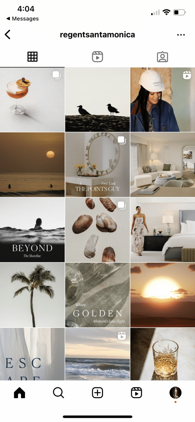
However, you don’t have to have a perfectly curated setup at your office to take similar photos. One easy way to make sure your photos all speak the same visual language is simply to use the same filter for every photo to help create a consistent tone.
A variation on this theme? Using a standard filter or color palette, but also working in an “accent” color or filter every few posts, too.
Maybe your Instagram feed is mostly dreamy, sepia-toned boho fantasy, but every few rows, we see a vibrant pop of forest green. Woo! You’re playing with fire!
Here’s another example of a feed that feels well put together simply because it’s prioritizing a single color.
@crislujewelry’s Instagram sticks to a light silver tone, matching perfectly with its products:

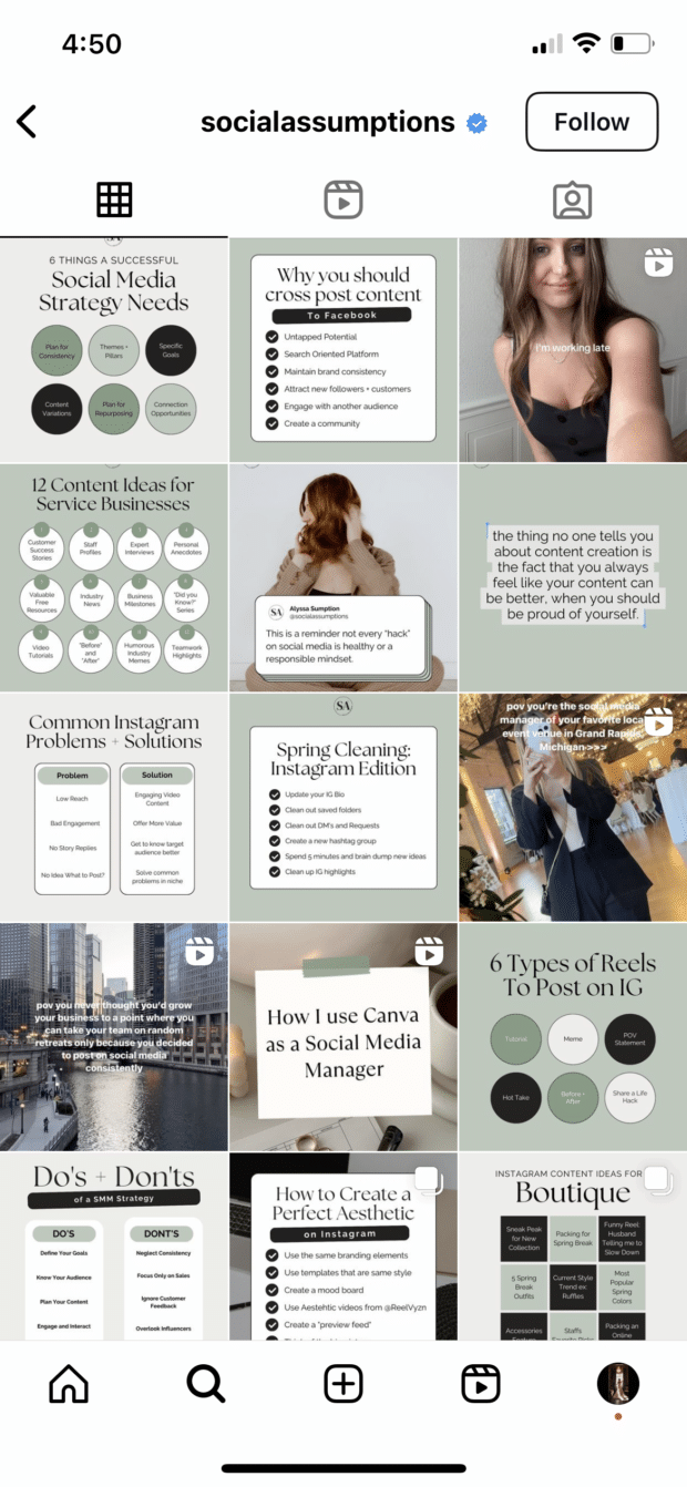
However, you don’t even have to stick fully to images. Take a look at how @socialassumptions uses graphics to pull together a cohesive, sage-green feed:
2. Create a checkerboard effect
By alternating the style of photos you post, you’ll easily create a checkerboard look on your grid. Try alternating text quotes with photography or mixing close-up shots with landscape photos. Going back and forth with two distinct colors can work, too.
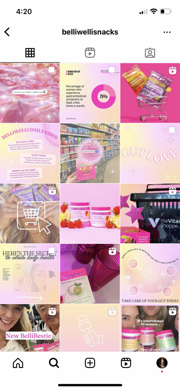
@belliwellisnacks created a visually appealing checkerboard by alternating graphics with a gradient background alongside other images, helping its feed feel intentional and put together:
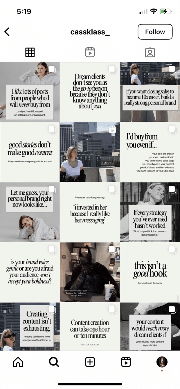
Similarly, @cassklass_ created a checkerboard effect using text graphics. Images and plain background graphics alternate to put together a stunning grid layout:
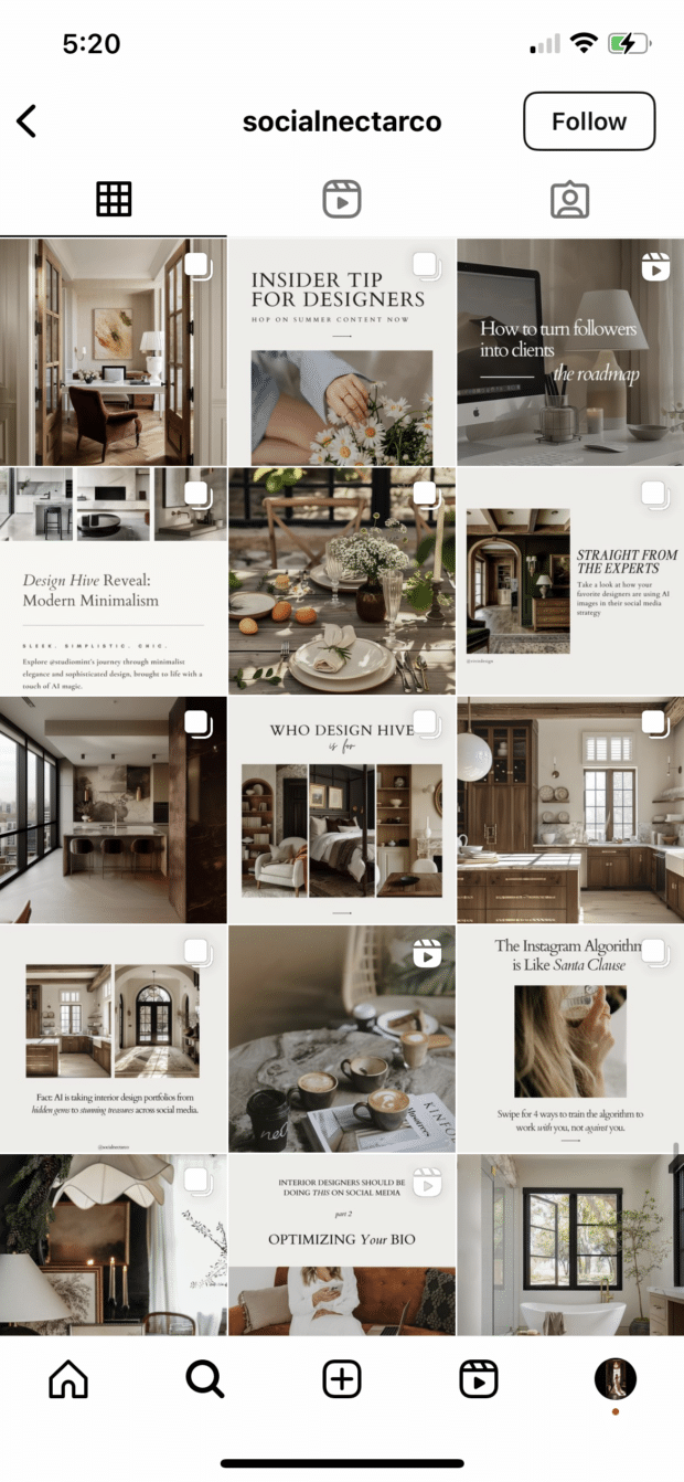
And @socialnectarco has created its own checkerboard by alternating graphics with a neutral background and full image posts:
Hot tip: if you’re using text-based posts, keep the background color or fonts consistent to really make the pattern clear. Check and mate.
(Need a little help on the graphic design front? There are tons of great tools and templates out there to create visuals that pop.)
3. Design row by row or column by column
Think outside the box…and inside the, um, row. Or column. Uniting the images on each row or column by theme or color can create a powerful impact across your feed.
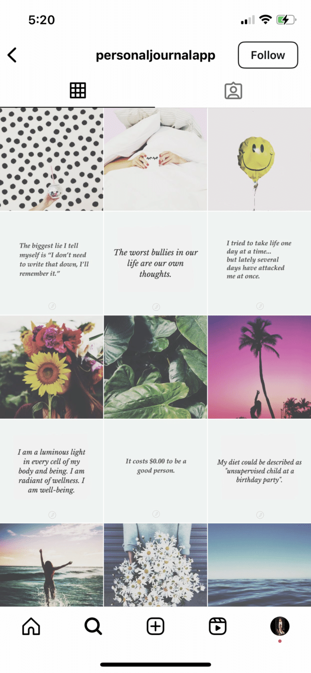
@personaljournalapp created a beautifully curated feed by alternating images and quote graphics row after row:
However, this same effect can be applied vertically, as well, focusing each column in your feed on a specific type of post.
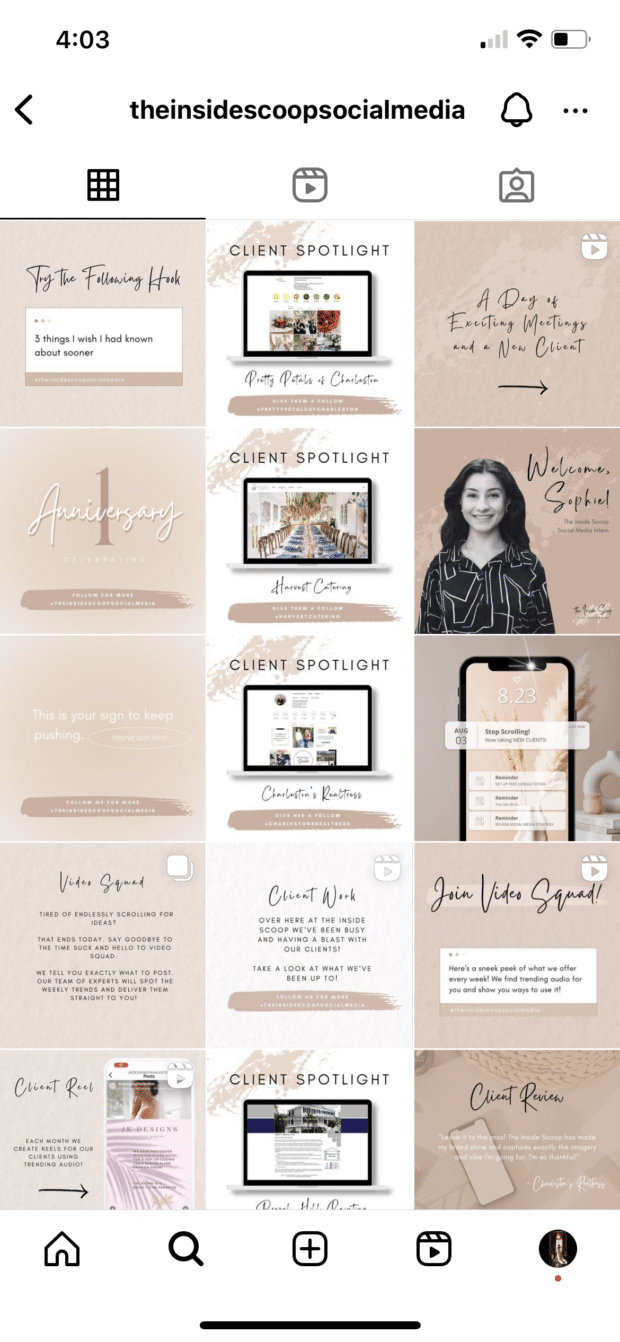
We get a great example of this below from @theinsidescoopsocialmedia’s feed.
One column—typically the one sharing client spotlights to help it stand out even more—is fully white backgrounds while the others are tan backgrounds:
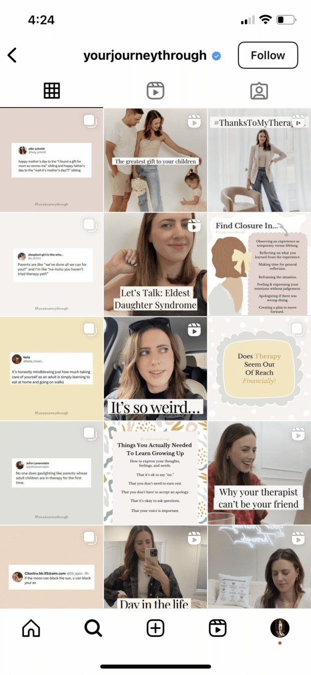
And below, on @yourjourneythrough’s feed, we see a single column dedicated to tweet graphics:
Then, for a twist, you could even recreate this in a diagonal design, like we see from @her.social below:
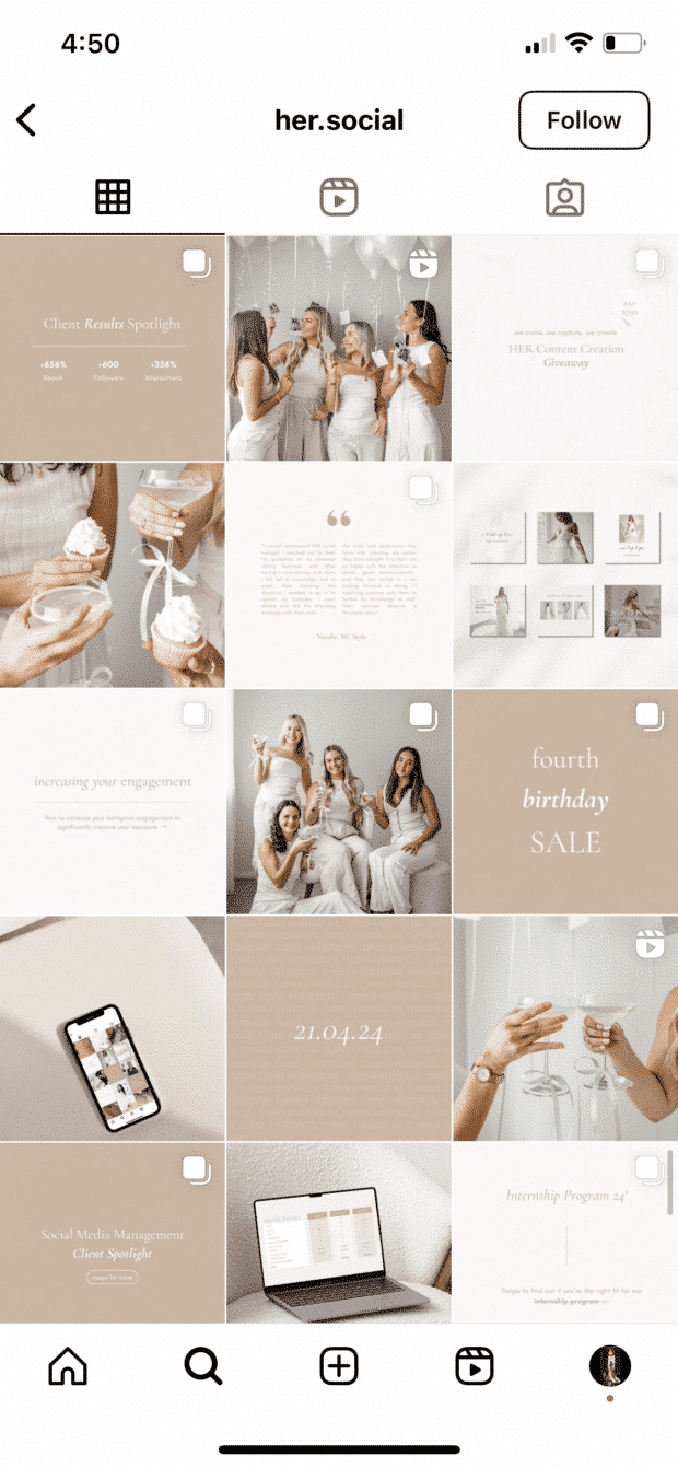
This type of Instagram grid layout is extremely simple to curate. Simply choose what you want each row or column to look like, then plan your content accordingly.
For a row-by-row look, you’ll post three similar photos in a row before moving on to the next design.
For a column-by-column look, you’ll post three different photos before moving on to similar versions of those three photos.
4. Let typography own your grid
Regularly including text in your posts can contribute to a striking, font-forward overall look. There are plenty of accounts out there that specialize in info-images, but even sprinkling in a text-heavy image among the photos can make for a stylish display.
Try thinking about your Instagram grid like the page of a magazine—by strategically scheduling images with words and visuals, you can create a balanced spread that’s full of interesting moments to draw the “reader” in.
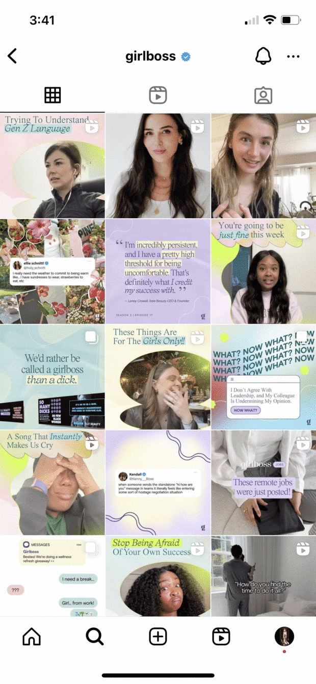
Below, we see how @girlboss has incorporated fonts and text-heavy posts to create a cohesive feed. By sticking with the same 1-2 fonts throughout, the brand has made its content easily recognizable, even when it’s not surrounded by the rest of its grid:
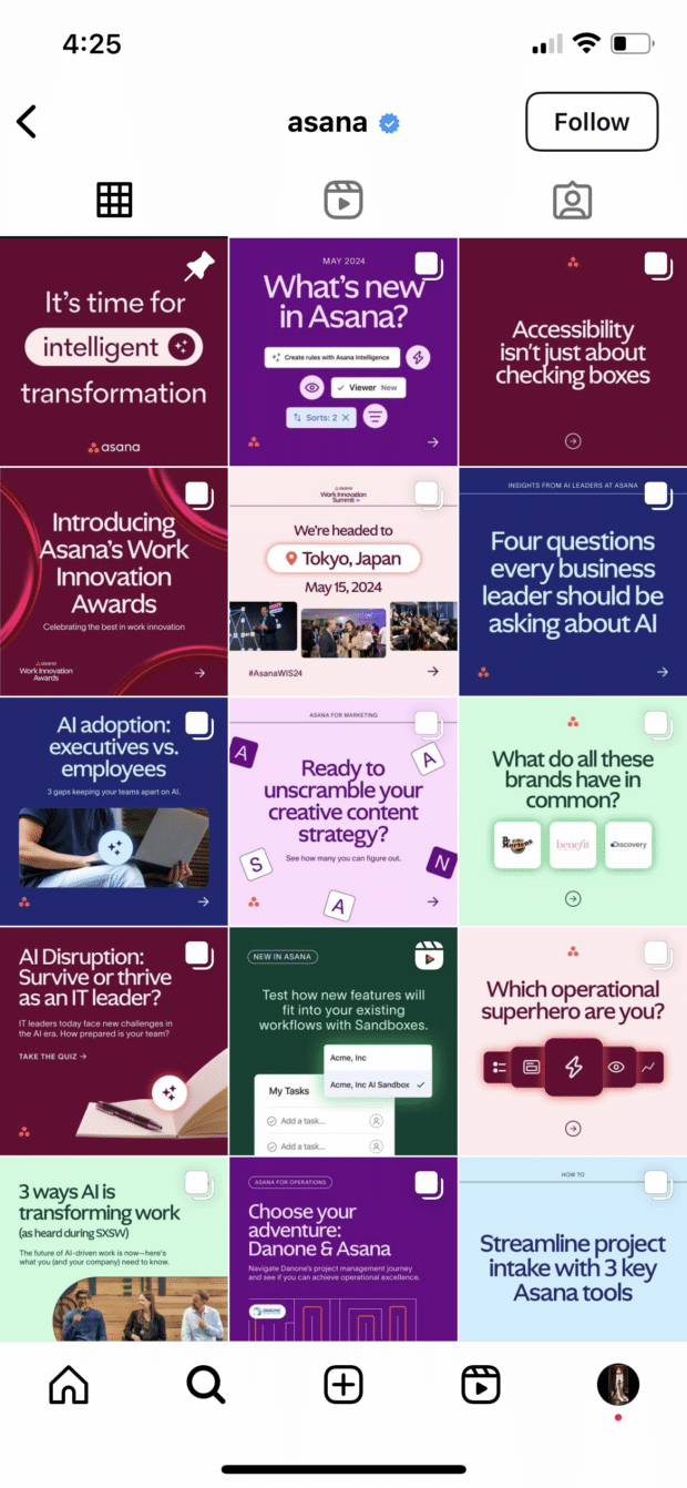
@asana gives us another great example of what a typography-heavy grid layout can look like, pairing its easy-to-read sans serif font with a number of bright and bold colors to help its images stand out:
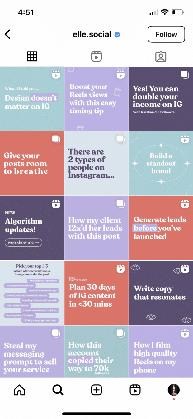
And then we have @elle.social, a grid layout that focuses entirely on similarly designed text graphics in alternating colors, yet another great way to utilize this design element:
5. Turn your grid into the rainbow
To pull this look off, you need both patience and a great color sense. The goal is to post regularly in one saturated color and slowly transition to the next shade in the rainbow with your next rows of posts.
To truly get the full effect of water bottle company @mybkr’s shifting palette, you’ll need to scroll, but they go through periods of being inspired by the color of one bottle and then move on to another…from aqua to light yellow, for example.
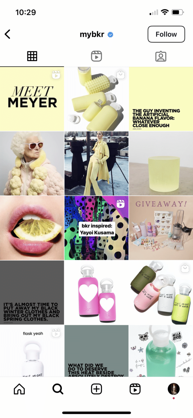
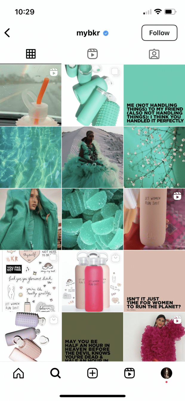
Obviously, @mybkr isn’t following the strict rainbow, but this shift in color scheme still makes for a stunning grid layout.
6. Embrace your brand color(s)
This option is similar to the first idea we shared, though rather than sticking to a color scheme that matches your brand’s “vibe” (i.e., sand colors for a beach and silver for a jewelry brand), this option is all about literally showcasing your brand’s color scheme.
To get the most out of this option, use your brand’s main color (and if you have multiple primary colors, choose just one) throughout your feed, ensuring that single color makes an appearance in pretty much every post.
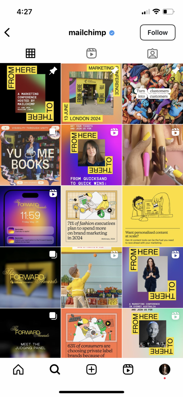
Take a look at how @mailchimp has done this with its signature yellow:
And how @raeforwellness includes its highlighter yellow brand color in every single post, even in the smallest ways:
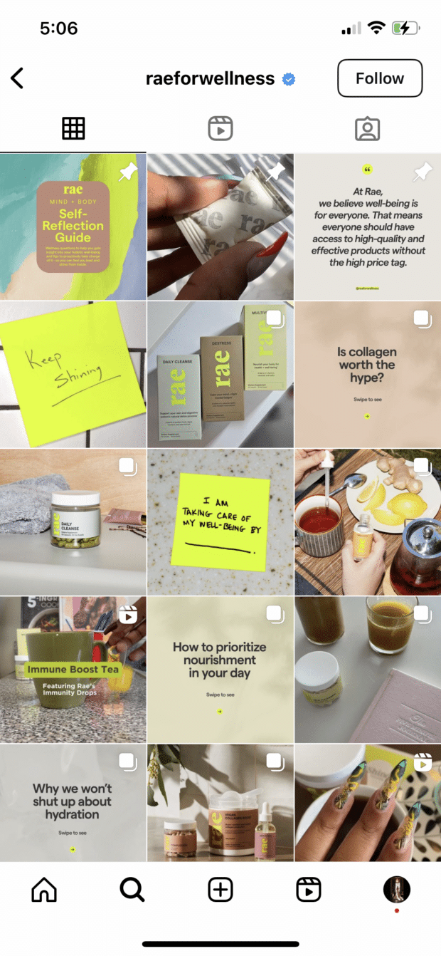
Choosing a single color to tie the feed together is a simple but effective way to create a cohesive yet recognizable feed.
7. Connect your photos across borders
This layout is a tricky one to pull off on a day-to-day basis, but for a big announcement or campaign or to launch a new account, this sort of puzzle grid certainly packs a punch.
A puzzle grid connects photos across image borders, creating one big, interconnected image out of some (or all, if you want to go crazy) of the squares. The key here is to make sure that your posts don’t look like nonsense individually, while also looking like a work of art when viewed together.
@snif.co does a fantastic job of connecting images across borders, typically working on just a single row at a time:
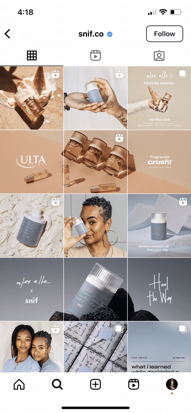
The images work perfectly as standalone posts while also building up to something bigger:
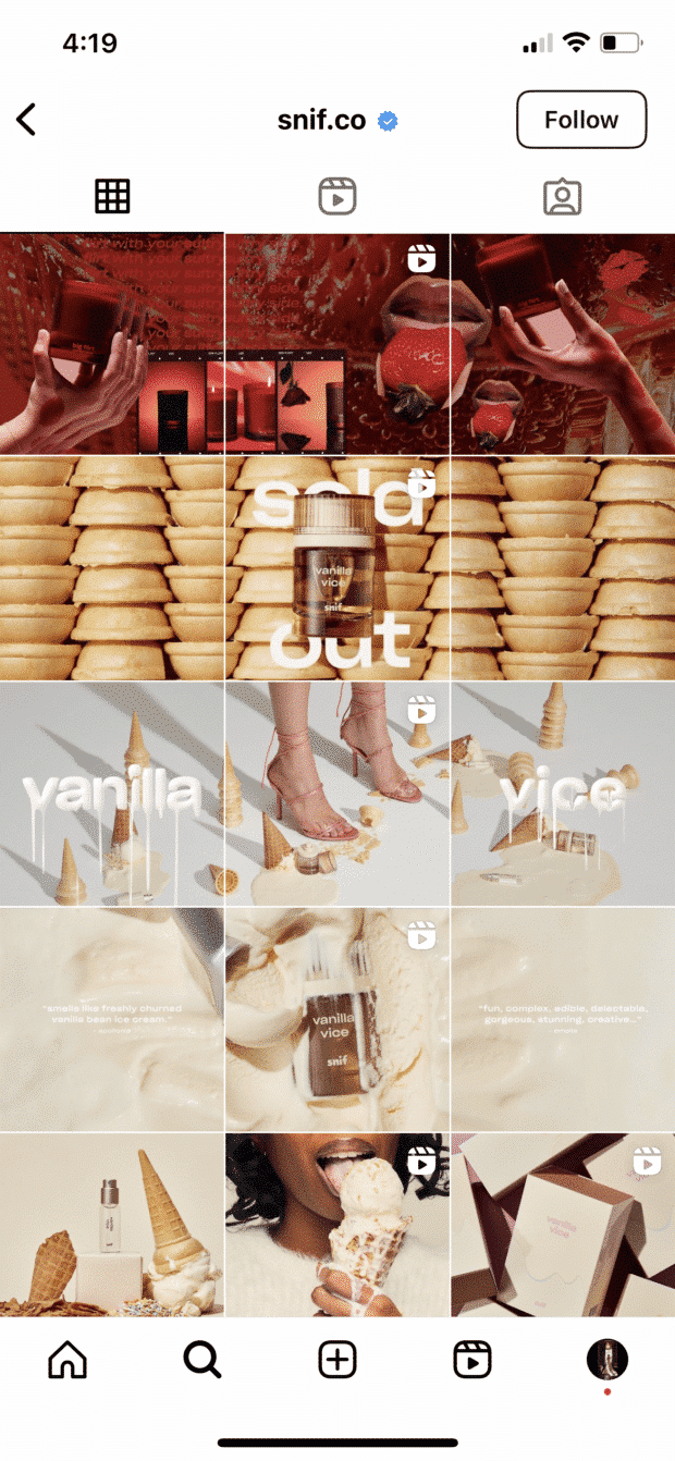
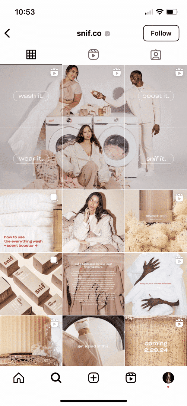
With some launches, the brand even goes for double rows, but outside of their puzzle grids, the images always still match with a similar vibe or color scheme:
6 best practices for planning your Instagram layout
Of course, none of these sleek grids for Instagram happen by accident. You gotta grind for that grid!
Here are some things to keep in mind as you’re planning out the big picture.
1. Preview first
Before you post it: map it.
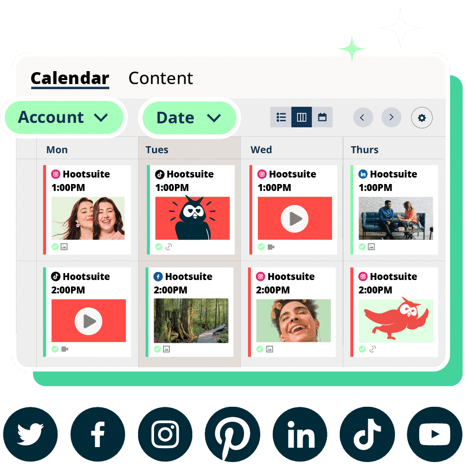
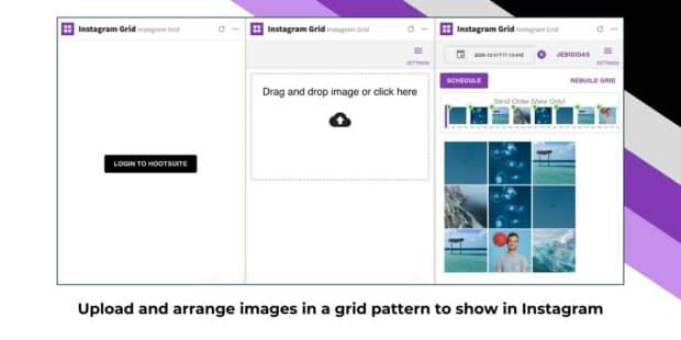
You could mock it up in photo-editing software, or use Hootsuite’s app integration that lets you preview your layout before it goes live… think of it as your Instagram grid template.
Create an Instagram grid layout of up to nine images, and then schedule them to go up in the exact right order via your Hootsuite dashboard.
2. Keep it consistent
Creating a great Instagram photo grid means sticking to a plan. One off-beat photo in the wrong color, the wrong filter, or in the wrong order can throw your whole look out of whack.
And trust us, your audience will be able to tell. That single out-of-place photo will stick out like a sore thumb.
3. Stay on brand
Ultimately, the goal of a grid isn’t just to impress your friends with your dedication to using a particular Lightroom preset filter. It’s to build a unified look for your brand.
So, if you’re a recruiting firm for high-level executives, having a playful rainbow grid might not quite fit the professional and serious tone you’re going for. A monochromatic, text-based series of posts, on the other hand…
4. Take advantage of image editing tools
In case you haven’t figured it out yet: Instagram is a visual medium…and it’s hard to put together a great grid unless the individual pictures also are great.
Luckily, there are tons of great photo editing tools out there, as well as expert advice around every corner. For example, our guides to taking great Instagram photos and staying on top of the hottest Instagram trends.
5. Don’t forget about Reels
Your Instagram Reels can live on your grid alongside your main posts, so don’t forget to select a suitable Reels cover photo. Or use one of our professionally-designed Reels cover templates to create a consistent look for your Reels.
Look back through all of our examples. In many, you’ll see the little Reels icon in the corner of some of the feed images. These brands are doing a fantastic job of ensuring their Reels cover photo fits in well with the rest of their feeds.
6. Schedule your posts in advance
Keep your gorgeous IG grid active and updated with the help of a scheduling tool that allows you to drop just the right filtered pic (or three) at just the right time. Hootsuite’s dashboard, for example, makes it easy to prep your best photos at your convenience. Get that grid going!
Of course, creating a great grid is just one way to capture attention on the ‘gram. For more marketing tips and tricks to take your account to the next level, check out our ultimate guide to Instagram marketing here.
4 tools to plan your Instagram grid
Need help planning out your Instagram grid? There are several tools made just for that. Previewing your grid ahead of time is a good idea to make sure you’re able to stay consistent and don’t post anything too off the mark.
1. Instagram Grid Hootsuite Integration
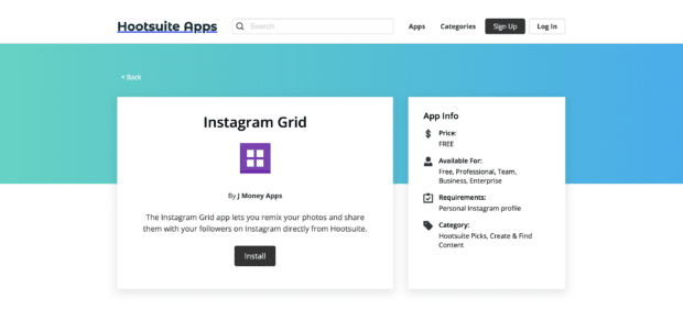
Hootsuite offers its own Instagram grid integration, perfect for those already taking advantage of our social media scheduling tools to use to plan out your grid layout ahead of time.
Create a grid of nine images at a time, setting their scheduling order. Once a few have gone live, you can head back in to perfect the next handful of images, ensuring everything lines up properly, matches, and is on brand.
This integration is completely free to use. Simply install it to add it to your Hootsuite dashboard and start organizing your Instagram grid layout.
2. Preview
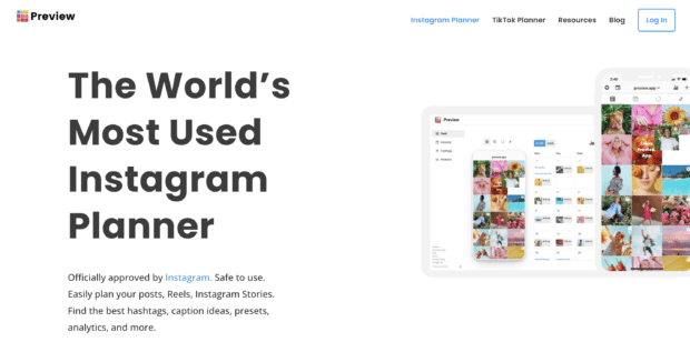
Preview is another Instagram planner available to help you get an idea of what your Instagram feed can look like. Upload as many photos as you need, rearrange them, and make sure they look exactly how you want them before you finalize the plan.
Preview even has the option to schedule your Instagram content so you don’t have to move it into a different tool, making the process as easy and straightforward as possible. The app has a free plan for a single user, but premium plans are affordable, starting at just $6.67/month.
3. Planoly
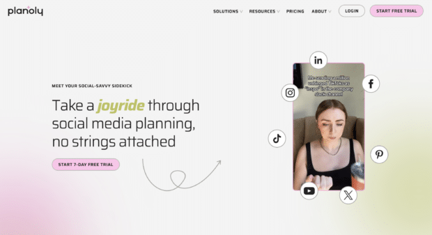
Planoly offers a number of social media management and planning features, but the main one we’re focusing on right now is its visual planner—perfect for organizing your new Instagram grid layout.
With Planoly, not only can you easily plan out your Instagram posts, but you can also include Instagram Reels—and their cover photos—as a part of your plan. Schedule out your content to go live, adding in your captions, hashtags, and anything else you need.
There’s no free plan available—though you can test it out during a seven-day free trial—and plans start at $14/month.
4. Planable
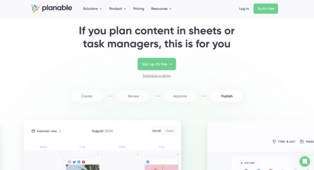
Planable is the last option on our list, a tool that makes planning out any content on any platform easy. This is due to its flexible planning interface that can switch between feed, calendar, list, and grid views.
Take advantage of the grid format to plan out and then schedule your Instagram posts. Planable is also perfect for larger teams as it offers capabilities for collaboration and approval on content before it goes live.
Planable has a free, limited plan for just 50 posts/month (and no Twitter scheduling or post analytics). Premium plans start at $11/user/month.
Start building your Instagram presence using Hootsuite. Schedule and publish posts directly to Instagram, engage your audience, measure performance, and run all your other social media profiles — all from one simple dashboard. Try it free today.
With files from Chloe West.
Boost engagement and save time with an AI writer, hashtag generator, and Canva in Hootsuite.
Free 30-Day TrialThe post 7 Tips To Improve Your Instagram Grid Layout [Tips + Examples] appeared first on Social Media Marketing & Management Dashboard.
Categories
- 60% of the time… (1)
- A/B Testing (2)
- Ad placements (3)
- adops (4)
- adops vs sales (5)
- AdParlor 101 (43)
- adx (1)
- AI (6)
- algorithm (1)
- Analysis (14)
- Apple (1)
- Audience (1)
- Augmented Reality (1)
- authenticity (1)
- Automation (1)
- Back to School (1)
- best practices (2)
- brand voice (1)
- branding (1)
- Build a Blog Community (12)
- Calculator (1)
- Case Studies (2)
- Case Study (3)
- celebrate women (1)
- certification (1)
- Collections (1)
- Community (1)
- Conference News (2)
- conferences (1)
- confluence (1)
- content (1)
- content creation (61)
- Content creators (7)
- content curation (1)
- content marketing (3)
- contests (1)
- Conversion Lift Test (1)
- Conversion testing (1)
- cost control (2)
- Creative (6)
- crisis (1)
- Curation (1)
- Custom Audience Targeting (4)
- Customer service (8)
- Digital Advertising (2)
- Digital Marketing (6)
- DPA (1)
- Dynamic Ad Creative (1)
- dynamic product ads (1)
- E-Commerce (1)
- eCommerce (2)
- Education (1)
- email marketing (3)
- Employee advocacy (3)
- employee advocacy program (1)
- employee advocates (1)
- engineers (1)
- event marketing (1)
- event marketing strategy (1)
- events (3)
- Experiments (41)
- F8 (2)
- Facebook (64)
- Facebook Ad Split Testing (1)
- facebook ads (18)
- Facebook Ads How To (1)
- Facebook Advertising (30)
- Facebook Audience Network (1)
- Facebook Creative Platform Partners (1)
- facebook marketing (1)
- Facebook Marketing Partners (2)
- Facebook Optimizations (1)
- Facebook Posts (1)
- facebook stories (1)
- Facebook Updates (2)
- Facebook Video Ads (1)
- Facebook Watch (1)
- fbf (11)
- first impression takeover (5)
- fito (5)
- Fluent (1)
- Free tool (3)
- Get Started With Wix Blog (1)
- Google (9)
- Google Ad Products (5)
- Google Analytics (1)
- Government (1)
- Guest Post (1)
- Guide (10)
- Guides (32)
- Halloween (1)
- Healthcare (2)
- holiday marketing (1)
- Holiday Season Advertising (7)
- Holiday Shopping Season (4)
- Holiday Video Ads (1)
- holidays (4)
- Hootsuite How-To (3)
- Hootsuite HQ (1)
- Hootsuite Life (1)
- how to (6)
- How to get Instagram followers (1)
- How to get more Instagram followers (1)
- i don't understand a single thing he is or has been saying (1)
- if you need any proof that we're all just making it up (2)
- Incrementality (1)
- influencer marketing (2)
- Infographic (1)
- Instagram (39)
- Instagram Ads (11)
- Instagram advertising (8)
- Instagram best practices (1)
- Instagram followers (1)
- Instagram Partner (1)
- Instagram Stories (2)
- Instagram tips (1)
- Instagram Video Ads (2)
- invite (1)
- Landing Page (1)
- Legal (1)
- link shorteners (1)
- LinkedIn (22)
- LinkedIn Ads (2)
- LinkedIn Advertising (2)
- LinkedIn Stats (1)
- LinkedIn Targeting (5)
- Linkedin Usage (1)
- List (1)
- listening (2)
- Lists (3)
- Livestreaming (1)
- look no further than the new yorker store (2)
- lunch (1)
- Mac (1)
- macOS (1)
- Marketing to Millennials (2)
- mental health (1)
- metaverse (2)
- mobile (2)
- Mobile App Marketing (3)
- Monetizing Pinterest (2)
- Monetizing Social Media (2)
- Monthly Updates (10)
- Mothers Day (1)
- movies for social media managers (1)
- new releases (11)
- News (80)
- News & Events (11)
- no one knows what they're doing (2)
- Non-profit (2)
- OnlineShopping (2)
- or ari paparo (1)
- owly shortener (1)
- Paid Media (2)
- People-Based Marketing (3)
- performance marketing (5)
- Pinterest (34)
- Pinterest Ads (11)
- Pinterest Advertising (8)
- Pinterest how to (1)
- Pinterest Tag helper (5)
- Pinterest Targeting (6)
- platform health (1)
- Platform Updates (8)
- Press Release (2)
- product catalog (1)
- Productivity (10)
- Programmatic (3)
- quick work (1)
- Real estate (4)
- Reddit (3)
- reels (1)
- Report (1)
- Reporting (1)
- Resources (27)
- ROI (1)
- rules (1)
- Seamless shopping (1)
- share of voice (1)
- Shoppable ads (4)
- short-form video (2)
- shorts (2)
- Skills (25)
- SMB (1)
- SnapChat (28)
- SnapChat Ads (8)
- SnapChat Advertising (5)
- Social (145)
- social ads (1)
- Social Advertising (14)
- Social commerce (5)
- social customer service (1)
- Social Fresh Tips (2)
- Social listening (9)
- Social Media (5)
- Social Media Advertising (16)
- Social media analytics (30)
- social media automation (1)
- Social media benchmarks (2)
- Social media career (2)
- social media content calendar (1)
- Social media content creation (3)
- Social media engagement (12)
- social media for events (1)
- social media management (2)
- Social Media Marketing (49)
- social media monitoring (1)
- Social Media News (4)
- Social media scheduling (18)
- social media statistics (1)
- Social media stats (17)
- Social Media Strategy (128)
- social media tools (51)
- social media tracking in google analytics (1)
- Social media trends (13)
- social media tutorial (2)
- Social Toolkit Podcast (1)
- Social Video (25)
- stories (1)
- Strategy (1)
- Strategy (909)
- Teamwork (2)
- Template (19)
- terms (1)
- Testing (2)
- there are times ive found myself talking to ari and even though none of the words he is using are new to me (1)
- they've done studies (1)
- this is also true of anytime i have to talk to developers (1)
- tiktok (14)
- tool (1)
- tools (1)
- Topics & Trends (3)
- Trend (12)
- Twitter (15)
- Twitter Ads (5)
- Twitter Advertising (4)
- Uncategorised (9)
- Uncategorized (13)
- url shortener (1)
- url shorteners (1)
- vendor (2)
- video (14)
- Video Ads (7)
- Video Advertising (8)
- virtual conference (1)
- we're all just throwing mountains of shit at the wall and hoping the parts that stick don't smell too bad (2)
- web3 (2)
- where you can buy a baby onesie of a dog asking god for his testicles on it (2)
- yes i understand VAST and VPAID (1)
- yes that's the extent of the things i understand (1)
- YouTube (13)
- YouTube Ads (4)
- YouTube Advertising (9)
- YouTube Video Advertising (5)

