How to Make Stunning Social Media Graphics Even if You’re Not an Artist
Not every social media manager is a pro graphic designer, but it’s often an expectation of the job. Luckily, we have recommendations for tips and tools to help you fool your followers.
Read on to learn how to make social media graphics that look professional.
Download your free pack of 72 customizable Instagram Stories templates now. Save time and look professional while promoting your brand in style.
What are social media graphics?
Social media graphics are pieces of visual content that are shared via social networks.
This can include Instagram Stories, Facebook photos, TikTok videos, Twitter gifs, Pinterest pins, LinkedIn infographics, and more.
Other visual formats included under the ‘social media graphics’ umbrella include cover art, typographic images, digital posters, and screenshots. But basically: if it’s graphic, and if it’s on social, it’s a social media graphic.
While many social networks were launched with a focus on text posts (remember the glory days of the circa-2005 Facebook status?), graphics have taken over as the communication format of choice for every social network.
It’s not hard to understand why. Strong visual content can communicate an idea immediately. Studies also show that images stick with us longer than text: humans are 65% more likely to remember information if it includes an image.
Plus, graphics are a great way to cement a visual identity for your brand or business.
Check out Fresh Prep transforming a cut-and-dry testimonial into a pretty pull-quote graphic:
… or Adidas’s eye-catching video collage.
… or Owlet’s colorful infographic:
Social graphics also tend to have a higher engagement rate than written posts.
Facebook posts with photos, for instance, get more likes and comments, and LinkedIn posts with images have a whopping 98% higher comment rate on average. Meanwhile, Tweets that include visual content are three times more likely to get engagement.
If you don’t fancy yourself an artsy type though, don’t worry. Read on for a crash course in designing social media graphics, inspiring examples, and the tools that’ll help you fake it ‘til you make it.
8 tips for creating simple and effective social media graphics
Use the correct dimensions
If you upload an image or video with the incorrect aspect ratio, it’s going to get stretched, cropped, or squished out of proportion. Not a good look.
Avoid the humiliation of an awkward re-size or auto-crop by tailoring your content according to each platform’s unique specifications. We’ve even assembled a social media image size guide to help you. How convenient!
And no matter the dimensions, make sure to always aim for the highest possible image quality. That includes pixels and resolution.
Whether their images are just text or photos and text, Get Clever always makes sure its images are looking flawless on the feed. We dare you to find a weird crop here!
Follow accessibility guidelines
While social media accessibility isn’t technically a requirement under Web Content Accessibility Guidelines (WCGA)’s latest compliance standards, it’s just good marketing practice to make content that everyone can enjoy.
Inclusive social media marketing is a nice thing to do and it’s good for business: win-win. You can find more info about inclusive design principles for social media here, but some key components to consider are:
- Social media graphic text. Text in your social media graphics should be bold, legible, straightforward, and concise. Creating high-contrast images makes reading easy for everyone (the Web Content Accessibility Guidelines (WCGA) recommend using a contrast of 4.5 to 1).
- Captions and alt-text. Use closed captioning and alt-text descriptions where possible to help any visually impaired followers to experience your social media graphics and videos. ( Here are some tips for writing great alt-text captions.)
Source quality stock photography
Maybe you’ve done your homework and already read our blog post on how to take good Instagram photos… but sometimes, the professionals just do it best.
Which is why you should bookmark this master list of free stock photo sites.
As you’re looking for imagery, though, it’s a good idea to try to be mindful of representation. Do the people in the photos reinforce stereotypes? Are you showcasing a diverse range of humans in terms of gender, race, age, body type, and ability? There are lots of photo banks now that specifically aim to amp up the diversity in stock photography, so consider sourcing pictures from one of these:
- Vice’s Gender Spectrum Collection goes “beyond the binary” with its photos
- Refinery29 and Getty Images’ The 67% Collection is intended to promote body positivity
- Brewers Collective created two free disability-inclusive stock image libraries
- Getty Images and AARP’s Disrupt Aging Collection fights ageism
Create one focal point
Images that are too busy or chaotic, with no clear main focal point, are less likely to catch anyone’s eye as they’re scrolling. Plus, if a social media graphic has 14 different visual components crowding for attention in one little square, it’s tough for the viewer to understand what the message or point is.
This Nike Running post, for instance, draws the eye directly to amputee runner Marko Cheseto, with the textured backdrop and orange hand-drawn elements acting as the supporting players.
Instead, make one element the focus of the image… though that doesn’t necessarily mean it has to be in the dead center. Remember the rule of thirds and place your image in the left or right third of the image to really please the eye.
Ooh, one last hot tip about image layout: don’t put anything important in the upper and lower 250-310 pixels, in case it gets cropped on certain devices.
Stick to your style guide
To ensure your social graphics are consistent with your brand and company goals, it’s helpful to create a social media style guide… and then follow it with every post.
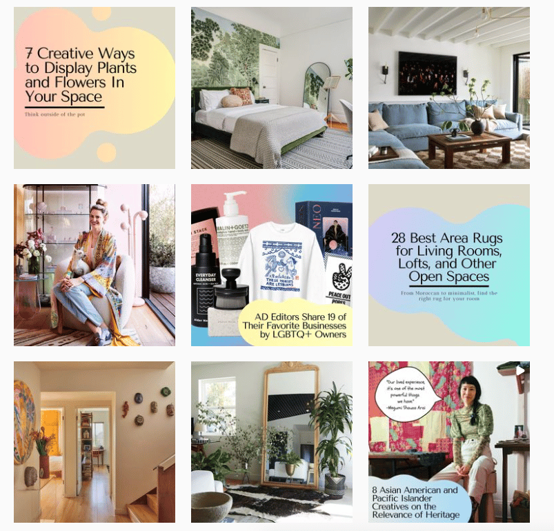
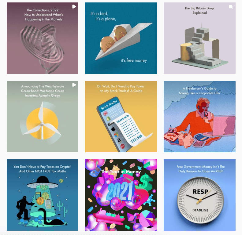
On the Wealthsimple Instagram, their social team sticks to a simple combo of illustrations, their sans serif brand font, and a muted solid backdrop. Every. Single. Time. (Well, except for their New Year’s spectacular — but hey, there are exceptions to every rule.)
Visual strategies should be informed by audience research: what does your unique mix of followers and fans like to see on their feed? Are they a group who would appreciate lo-fi memes or people who prefer inspirational quotes rendered in soft pastels?
Once you’ve got a handle on what your audience vibes with, create a mood board with colors, textures, graphic elements, and inspiring visuals to help communicate your desired direction.
Your style guide should also include direction on how each channel will execute the vision: for Pinterest, do you have a specific way you’d like to design your pin board cover art every time? Share your style guide with everyone involved in your social strategy to keep everyone on the same (beautiful) page.
Download your free pack of 72 customizable Instagram Stories templates now. Save time and look professional while promoting your brand in style.
Download the templates now!Brush up on your design basics
While your social media graphics are certainly an opportunity to get creative and express yourself, there are also certain universal design principles that every image should follow for maximum impact.
- Contrast: High-contrast images are attractive and memorable. Contrast gives an image balance, and makes the image and text easier to read.
- Repetition: Repeat a visual element (like color or shape) in the design to tie together otherwise separate parts.
- Alignment: Nothing should be slapped on the canvas arbitrarily; aligning elements helps create structure and order for the viewer, even subconsciously.
- Colors: Get familiar with a color wheel and choose complementary colors for your designs
This Adidas pic hits all the marks:
Keep it simple
We may have six thousand filters and effects and stickers available to us… but just because these tools are at your disposal, doesn’t mean you should always use them. Keep it simple: making sure your social media graphic is easy to understand is more important than showing off all the bells and whistles.
Resist the temptation to over-edit, and increase saturation with caution.
Allbirds resists the temptation to get too crazy with its announcement of a new sandal line: the backdrop is fun without being distracting, and lets the real star of the show (shoes! glorious shoes!) be the focus.
Treat text with respect
Using text on your social media graphic? Make sure it serves a purpose: you want the text to improve, not obscure, your creative.
If you’re overlaying words onto the image, use a solid background or a photo or illustration that visually leaves room for it.
Take care with font selection — this decision can impact both legibility and tone. Futura and Times New Roman have very different vibes, you know? (That being said, if you’re going to mix fonts, pair a serif with a sans serif.)
Don’t forget to triple-check your spelling and grammar. If possible, ask someone else to give it a quick proofread, just in case.
Examples of social media graphics to learn from
Snack shop Dank Mart knows its audience is young, playful, and hungry, and so its Instagram account reflects that with vibrant colors and youthful themes.
Here, instead of just posting a picture of the latest inventory item, they overlaid the jar atop a colorful backdrop alongside cut-out graphic elements. It’s like they’ve dusted this whole post with cinnamon sugar, and proved even the most boring of grocery item can look hip and fun in the right context.
Business magazine Fast Company didn’t have custom portraits for all of the people they named on their Queer 50 list. But they were still able to create a consistent look for their social with graphic shapes and bold, contrasting colors.
BarDown didn’t necessarily have the best photo in the world (no offense to the “I woke up like this” Stanley Cup)… but it still looks professional thanks to the overlay of a Tweet and the logo in the top corner. The trick they’re using here to look professional is alignment: the Tweet is nicely centered and the logo gives a little room at the margins.
Sharing a quote or mantra is a surefire way to earn your post some attention. The key to doing it right is to make sure the color and font aligns with your brand as much as the actual sentiment does. With cool-girl skincare brand Summer Friday, the trendy sans serif and chic neutrals feel absolutely on-point.
At first glance, this post from Nike is just a cool, retro-inspired ad for the brand’s shoes. But subtle movements in the animated text catch the eye and draw you in.
Adding a thick border around a standard fashion shot is going to help this Frank and Oak post stand out as you scroll.
Helpful social media graphics tools
With the help of these apps, programs, and templates, even the most amateur designer can produce something compelling.
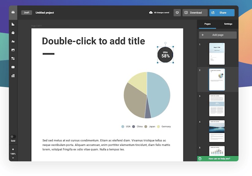
Venngage
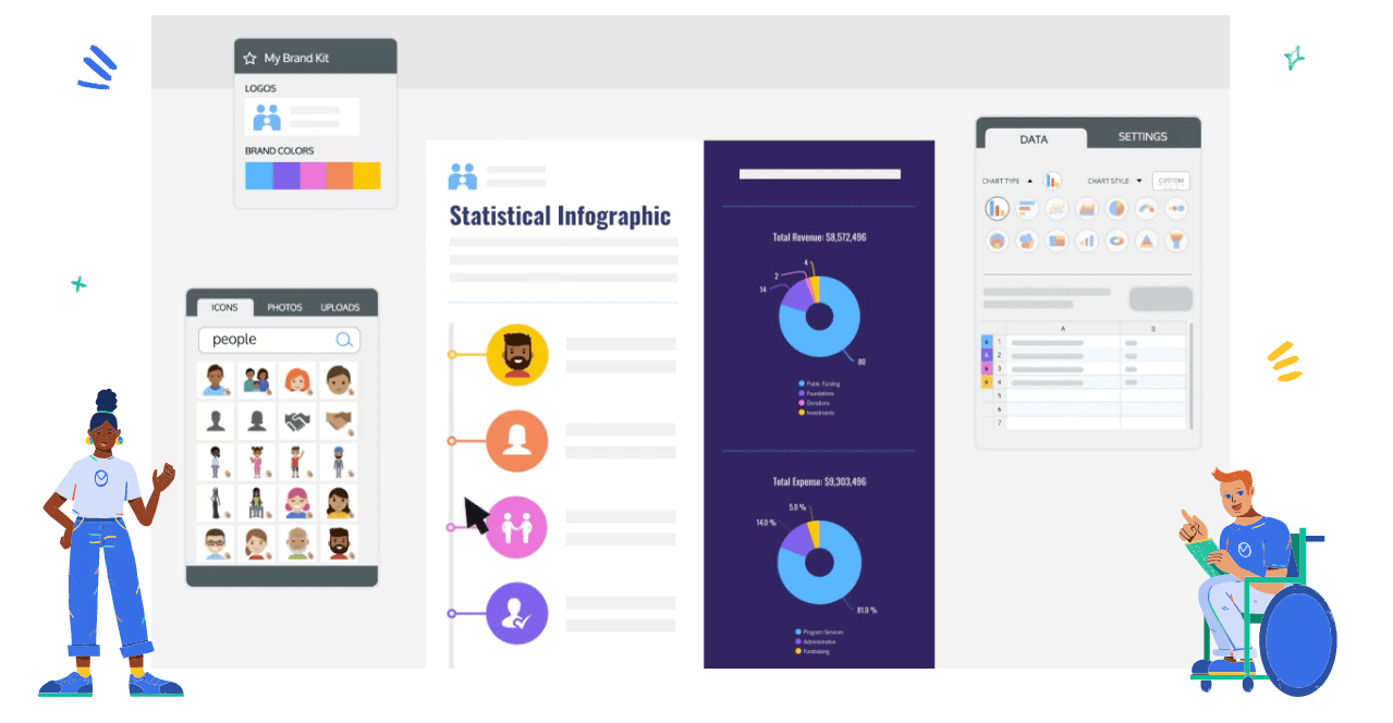
The online web app can help you design graphics for all sorts of projects. Yes, it’s helpful for social media graphics, but you can also use it for presentations and reports.
The intuitive editor is great for design newbies, plus you get access to social-media-ready templates, a library of icons, and a chart generator. We particularly like the ability to add your brand colors/logo to any template with just a click.
Adobe Express
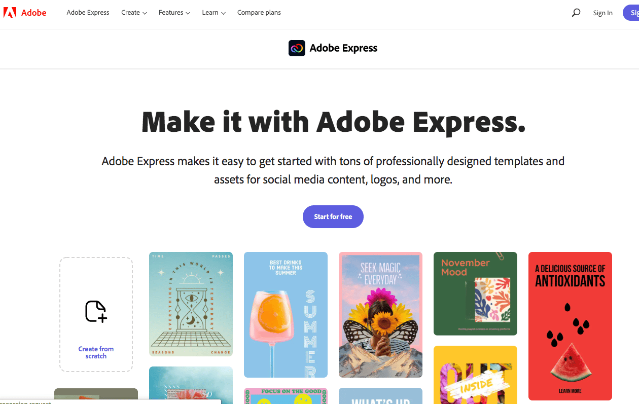
Adobe’s creative suite offers a whole bunch of different tools for a pro designer, but the quick-and-dirty Express (formerly Adobe Spark) is an excellent option for the beginner. Featuring a ton of professionally designed templates and assets for social media content, it’s a great way to dive in and generate some professional-looking graphics in a snap.
Try it out with our free templates, why don’t you?
Adobe Photoshop
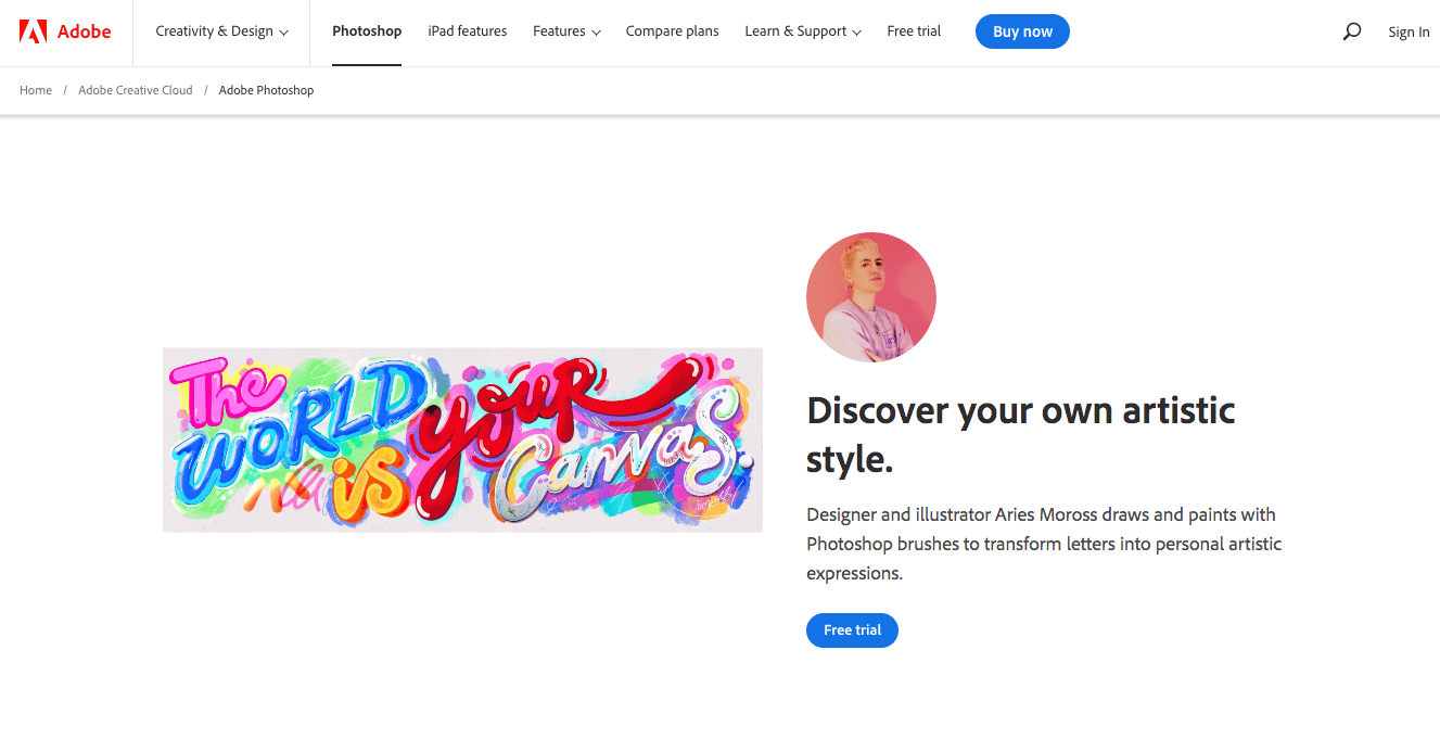
The king of image editing software, Adobe Photoshop offers a huge swath of tools to make any of your visual dreams come true.
Cropping, color-correctly, combining images and type: anything is possible. It’s a little more robust than Express (above) so the learning curve is certainly higher, but put in some time with Adobe’s tutorials, and you’ll be lassoing and layering like a champ in no time.
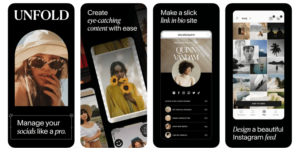
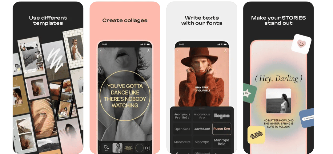
Stylize your Instagram feed with Unfold’s full suite of template collections. There are 400 custom templates here, with exclusive stickers, filters and fonts, too. No wonder it’s one of our favorite apps to recommend to businesses on Instagram. (Even Selena Gomez is a fan!)
Instagram Grid Hootsuite integration
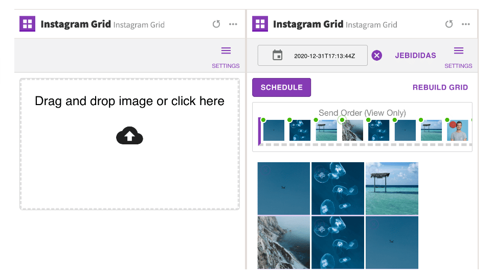
If you’re thinking big picture with your visual identity on Instagram, you’re going to want to play around with Hootsuite’s Instagram Grid integration.
Use the app to create a grid of up to nine images, and then publish them directly to your Instagram account right from the Hootsuite dashboard. (Hot tip: Hootsuite’s scheduling capability lets you publish them when your audience is the most active on Instagram, for maximum engagement.)
Try it free for 30 days. Cancel anytime.
Looking for some gridspiration? We’ve got you covered.
Layout From Instagram
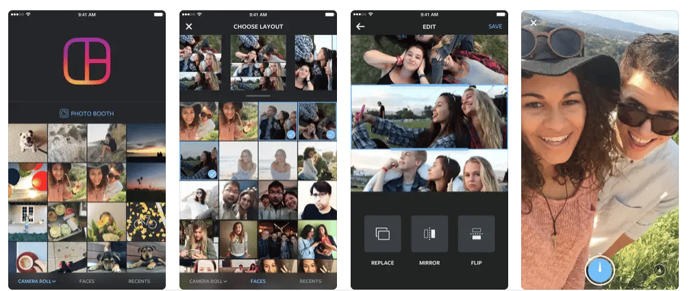
This free app from Instagram itself allows you to create collages with ease. Compile up to nine photos or images in a variety of layout combinations. You can then personalize the collage with filters and other elements before sharing to Insta.
AppForType
If you’re a typography lover, you’re going to fall hard for this one. There are 60 fonts to choose from to overlay on your photos or graphics, but you can also upload your own handwriting to use as a custom font.
A Design Kit on App Store
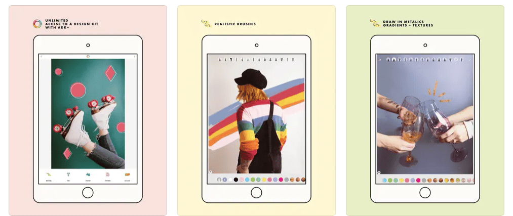
From the makers of the ever-popular A Color Story, A Design Kit features collage layout tools, stickers, 60-plus fonts, textured and patterned backdrops, and realistic paintbrush tools. Create a graphic here, even with the templates, and you’ll have something truly one-of-a-kind to share with your followers.
Infogram
Use Infogram to generate reports and infographics, including maps, dashboards, and charts. After all, using data in your posts might just convince your audience that you’re credible and authentic… and have the receipts to prove it.
This should be plenty to get you started on your social graphics design journey, but if you’re hungry for more expert advice, we sure don’t blame you. Now that you’ve got the skills, it’s time to talk strategy. Here are 12 tips for creating engaging visual content on social media.
Create more beautiful social media posts — and schedule them in advance — with Hootsuite. You can also monitor mentions of your brand on social media, engage with your audience, measure results, and more. Try it free for 30 days.
Do it better with Hootsuite, the all-in-one social media toolkit. Stay on top of things, grow, and beat the competition.
Free 30-Day Trial (risk-free!)The post How to Make Stunning Social Media Graphics Even if You’re Not an Artist appeared first on Social Media Marketing & Management Dashboard.
Categories
- 60% of the time… (1)
- A/B Testing (2)
- Ad placements (3)
- adops (4)
- adops vs sales (5)
- AdParlor 101 (43)
- adx (1)
- algorithm (1)
- Analysis (9)
- Apple (1)
- Audience (1)
- Augmented Reality (1)
- authenticity (1)
- Automation (1)
- Back to School (1)
- best practices (2)
- brand voice (1)
- branding (1)
- Build a Blog Community (12)
- Case Study (3)
- celebrate women (1)
- certification (1)
- Collections (1)
- Community (1)
- Conference News (1)
- conferences (1)
- content (1)
- content curation (1)
- content marketing (1)
- contests (1)
- Conversion Lift Test (1)
- Conversion testing (1)
- cost control (2)
- Creative (6)
- crisis (1)
- Curation (1)
- Custom Audience Targeting (4)
- Digital Advertising (2)
- Digital Marketing (6)
- DPA (1)
- Dynamic Ad Creative (1)
- dynamic product ads (1)
- E-Commerce (1)
- eCommerce (2)
- Ecosystem (1)
- email marketing (3)
- employee advocacy program (1)
- employee advocates (1)
- engineers (1)
- event marketing (1)
- event marketing strategy (1)
- events (1)
- Experiments (21)
- F8 (2)
- Facebook (64)
- Facebook Ad Split Testing (1)
- facebook ads (18)
- Facebook Ads How To (1)
- Facebook Advertising (30)
- Facebook Audience Network (1)
- Facebook Creative Platform Partners (1)
- facebook marketing (1)
- Facebook Marketing Partners (2)
- Facebook Optimizations (1)
- Facebook Posts (1)
- facebook stories (1)
- Facebook Updates (2)
- Facebook Video Ads (1)
- Facebook Watch (1)
- fbf (11)
- first impression takeover (5)
- fito (5)
- Fluent (1)
- Get Started With Wix Blog (1)
- Google (9)
- Google Ad Products (5)
- Google Analytics (1)
- Guest Post (1)
- Guides (32)
- Halloween (1)
- holiday marketing (1)
- Holiday Season Advertising (7)
- Holiday Shopping Season (4)
- Holiday Video Ads (1)
- holidays (4)
- Hootsuite How-To (3)
- Hootsuite Life (1)
- how to (5)
- How to get Instagram followers (1)
- How to get more Instagram followers (1)
- i don't understand a single thing he is or has been saying (1)
- if you need any proof that we're all just making it up (2)
- Incrementality (1)
- influencer marketing (1)
- Infographic (1)
- Instagram (39)
- Instagram Ads (11)
- Instagram advertising (8)
- Instagram best practices (1)
- Instagram followers (1)
- Instagram Partner (1)
- Instagram Stories (2)
- Instagram tips (1)
- Instagram Video Ads (2)
- invite (1)
- Landing Page (1)
- link shorteners (1)
- LinkedIn (22)
- LinkedIn Ads (2)
- LinkedIn Advertising (2)
- LinkedIn Stats (1)
- LinkedIn Targeting (5)
- Linkedin Usage (1)
- List (1)
- listening (2)
- Lists (3)
- Livestreaming (1)
- look no further than the new yorker store (2)
- lunch (1)
- Mac (1)
- macOS (1)
- Marketing to Millennials (2)
- mental health (1)
- metaverse (1)
- Mobile App Marketing (3)
- Monetizing Pinterest (2)
- Monetizing Social Media (2)
- Monthly Updates (10)
- Mothers Day (1)
- movies for social media managers (1)
- new releases (11)
- News (72)
- News & Events (13)
- no one knows what they're doing (2)
- OnlineShopping (2)
- or ari paparo (1)
- owly shortener (1)
- Paid Media (2)
- People-Based Marketing (3)
- performance marketing (5)
- Pinterest (34)
- Pinterest Ads (11)
- Pinterest Advertising (8)
- Pinterest how to (1)
- Pinterest Tag helper (5)
- Pinterest Targeting (6)
- platform health (1)
- Platform Updates (8)
- Press Release (2)
- product catalog (1)
- Productivity (10)
- Programmatic (3)
- quick work (1)
- Reddit (3)
- Reporting (1)
- Resources (34)
- ROI (1)
- rules (1)
- Seamless shopping (1)
- share of voice (1)
- Shoppable ads (4)
- Skills (28)
- SMB (1)
- SnapChat (28)
- SnapChat Ads (8)
- SnapChat Advertising (5)
- Social (169)
- social ads (1)
- Social Advertising (14)
- social customer service (1)
- Social Fresh Tips (1)
- Social Media (5)
- social media automation (1)
- social media content calendar (1)
- social media for events (1)
- social media management (2)
- Social Media Marketing (49)
- social media monitoring (1)
- Social Media News (4)
- social media statistics (1)
- social media tracking in google analytics (1)
- social media tutorial (2)
- Social Toolkit Podcast (1)
- Social Video (5)
- stories (1)
- Strategy (602)
- terms (1)
- Testing (2)
- there are times ive found myself talking to ari and even though none of the words he is using are new to me (1)
- they've done studies (1)
- this is also true of anytime i have to talk to developers (1)
- tiktok (8)
- tools (1)
- Topics & Trends (3)
- Trend (12)
- Twitter (15)
- Twitter Ads (5)
- Twitter Advertising (4)
- Uncategorised (9)
- Uncategorized (13)
- url shortener (1)
- url shorteners (1)
- vendor (2)
- video (10)
- Video Ads (7)
- Video Advertising (8)
- virtual conference (1)
- we're all just throwing mountains of shit at the wall and hoping the parts that stick don't smell too bad (2)
- web3 (1)
- where you can buy a baby onesie of a dog asking god for his testicles on it (2)
- yes i understand VAST and VPAID (1)
- yes that's the extent of the things i understand (1)
- YouTube (13)
- YouTube Ads (4)
- YouTube Advertising (9)
- YouTube Video Advertising (5)

