How to Make the Best YouTube Channel Art (+5 Free Templates)
Your YouTube channel art is one of the most important parts of your YouTube channel—aside from your actual video content, of course.
It’s basically a giant billboard for your brand at the top of your YouTube profile.
It’s the first thing people see when they visit your channel, and it links potential followers to your other social channels.
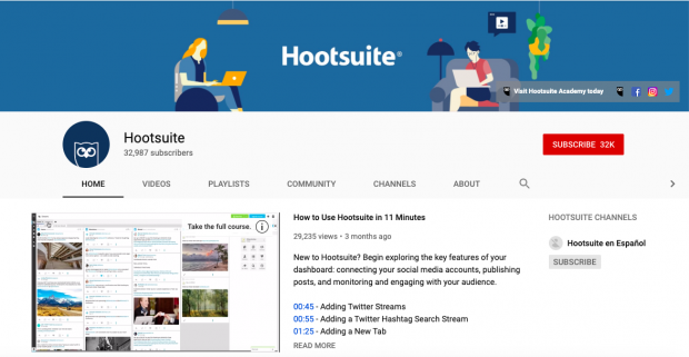
But you don’t need to be a professional designer to make your YouTube channel art look professional. We’ve included five customizable templates in this article that anyone—designer or not—can use to create their own YouTube banner.
And we’ve broken down the process into eight easy steps. Read on to start creating your own designer YouTube channel art.
Bonus: Attract more views and subscribers in minutes with one of our 5 free customizable YouTube channel art templates. Download them now.
The 5 elements of engaging YouTube channel art
1. Your logo, in the right place
First things first. Who are you? Make sure that’s clear right off the bat. New visitors to your page will want to know.
Place your logo in an obvious, visible spot against a color that makes it pop. Also, make sure it’s within the “safe area” (more on that below).
Not sure where to put your logo? Our templates offer suggestions.
2. Simple image with a clear focal point
Like any billboard ad, the simpler the message, the easier it will be received. Don’t try to do too much with your YouTube channel art.
Instead, use this small space wisely to convey what you want viewers to focus on about your brand. Stick to one image and a logo against a simple background.
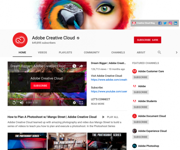
Or maybe it’s just your logo against a background that makes it clear what your brand is all about, as Epicurious does.

If you’re a really well known brand with top YouTube talent, you could even skip the logo, and simply feature the stars of your channel. It seems to work for Bon Appetit.

Whichever direction you choose to go in, remember: the rest of your YouTube page already has a lot going on. If you want people to take an action—subscribe, follow you on another social channel, or watch one of your videos—don’t let your banner overwhelm them.
3. Optimization for both desktop and mobile
Seventy percent of YouTube views come from mobile. That means although your YouTube banner is technically 2,560 x 1,440 px, most people will see an area much smaller than this.
Make sure to include the most important information (like your logo) in the “safe area” of your YouTube banner, i.e., within an area of 1,546 x 423 px. Our templates mark out this area very clearly, so you don’t have to worry about missing anything important.
4. Consistent brand colors
This almost goes without saying, but make sure your YouTube banner is consistent with the way you present your brand elsewhere online. Otherwise, viewers will get confused.
This rule stands even if your YouTube presence is more laid back or wackier than your other social channels. You don’t want to disorient viewers who are more likely to click that follow button if they know they’ve got the “right” version of you on YouTube.
Pro tip: Make sure to update your channel art when you refresh your brand, or run a special campaign. WIRED magazine updates their YouTube channel art for every new issue they put out.

5. Social media and website links
Your YouTube banner includes the option to link to your other social platforms and website. This is great! Because chances are if someone has taken the time to visit your YouTube page, they’re also interested in the rest of your online presence.
It’ll be important to design your YouTube channel art with nothing important in the right hand corner—except for a background color that helps your icons stand out.
YouTube channel art dimensions
Your YouTube channel art will appear on desktop, mobile, and even TV displays. This means larger images may get cropped.
Make sure to include all the most important visual elements in the “safe area” of your image (dimensions noted below).
Bonus: Attract more views and subscribers in minutes with one of our 5 free customizable YouTube channel art templates. Download them now.
Get the templates now!Use the following YouTube channel art dimensions to ensure your image shows up correctly:
- For best results on all devices: 2,560 x 1440 px
- Minimum dimension for upload: 2,048 x 1152 px
- Minimum safe area for text and logos: 1,546 x 423 px
- Maximum width: 2,560 x 423 px
- File size: 6MB or smaller
If you’re not sure about the width and height of an image, don’t worry. You can always start by customizing one of our YouTube channel art templates, which are pre-populated with the correct dimensions.
How to make YouTube channel art
Starting with a professionally designed template makes it easier to create your own YouTube channel art. Here’s how to customize our templates for your brand. You will need Adobe Photoshop to get started.
Bonus: Attract more views and subscribers in minutes with one of our 5 free customizable YouTube channel art templates. Download them now.
1. After you’ve downloaded the YouTube channel art templates, you’ll notice that the fonts and image files are separate. Double click on the font file of your selected theme to upload the font to your computer. Click install font.
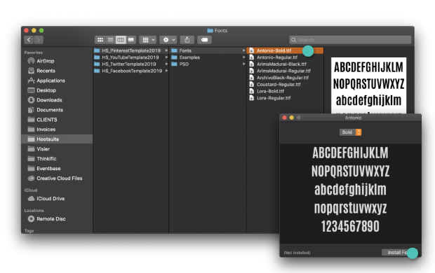
2. Double click the image file to open it in Photoshop.
3. Select the YouTube channel art template that you’d like to work with first.
4. To edit text: double click the text you would like to edit. You can change fonts and colors in the menu on the left-hand side.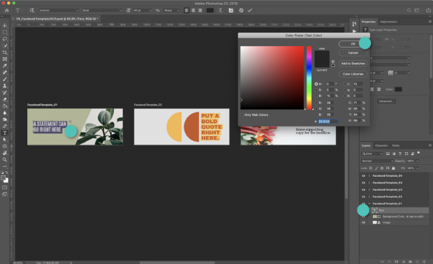
5. To edit a color block or background: double click the color block you would like to edit. Change the size or use the menu on the left-hand side to change the color.
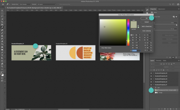
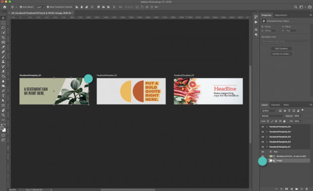
6. To edit a photo or image: double click the photo you would like to edit and click insert new image. Resize image as necessary.
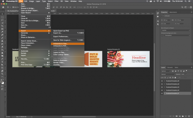
7. To save the template: Select the template you would like to use and go to Save>Export As>Artboard to Files. Make sure to save as a .jpg or .png.
8. Upload your YouTube channel art by following the steps below.
How to upload or change YouTube channel art
- Sign in to YouTube on your desktop.
- Select My Channel from the top-right menu.
- Click Add channel art. (If you’re just editing existing channel art, hover your cursor over the existing banner and click Edit).
- Upload an image or photo from your computer or click the Gallery tab to choose an image from the YouTube photo library.
- From here, you can preview how the art will appear on different devices. To make changes, click Adjust the crop.
- Click Select.
And that’s all there is to it. Now you have a beautiful, branded graphic prominently displayed on your channel. The next step is making sure your content is equally compelling. Check out our complete guide to crafting a winning YouTube strategy for more on that.
The post How to Make the Best YouTube Channel Art (+5 Free Templates) appeared first on Hootsuite Social Media Management.
Categories
- 60% of the time… (1)
- A/B Testing (2)
- Ad placements (3)
- adops (4)
- adops vs sales (5)
- AdParlor 101 (43)
- adx (1)
- algorithm (1)
- Analysis (9)
- Apple (1)
- Audience (1)
- Augmented Reality (1)
- authenticity (1)
- Automation (1)
- Back to School (1)
- best practices (2)
- brand voice (1)
- branding (1)
- Build a Blog Community (12)
- Case Study (3)
- celebrate women (1)
- certification (1)
- Collections (1)
- Community (1)
- Conference News (1)
- conferences (1)
- content (1)
- content curation (1)
- content marketing (1)
- contests (1)
- Conversion Lift Test (1)
- Conversion testing (1)
- cost control (2)
- Creative (6)
- crisis (1)
- Curation (1)
- Custom Audience Targeting (4)
- Digital Advertising (2)
- Digital Marketing (6)
- DPA (1)
- Dynamic Ad Creative (1)
- dynamic product ads (1)
- E-Commerce (1)
- eCommerce (2)
- Ecosystem (1)
- email marketing (3)
- employee advocacy program (1)
- employee advocates (1)
- engineers (1)
- event marketing (1)
- event marketing strategy (1)
- events (1)
- Experiments (21)
- F8 (2)
- Facebook (64)
- Facebook Ad Split Testing (1)
- facebook ads (18)
- Facebook Ads How To (1)
- Facebook Advertising (30)
- Facebook Audience Network (1)
- Facebook Creative Platform Partners (1)
- facebook marketing (1)
- Facebook Marketing Partners (2)
- Facebook Optimizations (1)
- Facebook Posts (1)
- facebook stories (1)
- Facebook Updates (2)
- Facebook Video Ads (1)
- Facebook Watch (1)
- fbf (11)
- first impression takeover (5)
- fito (5)
- Fluent (1)
- Get Started With Wix Blog (1)
- Google (9)
- Google Ad Products (5)
- Google Analytics (1)
- Guest Post (1)
- Guides (32)
- Halloween (1)
- holiday marketing (1)
- Holiday Season Advertising (7)
- Holiday Shopping Season (4)
- Holiday Video Ads (1)
- holidays (4)
- Hootsuite How-To (3)
- Hootsuite Life (1)
- how to (5)
- How to get Instagram followers (1)
- How to get more Instagram followers (1)
- i don't understand a single thing he is or has been saying (1)
- if you need any proof that we're all just making it up (2)
- Incrementality (1)
- influencer marketing (1)
- Infographic (1)
- Instagram (39)
- Instagram Ads (11)
- Instagram advertising (8)
- Instagram best practices (1)
- Instagram followers (1)
- Instagram Partner (1)
- Instagram Stories (2)
- Instagram tips (1)
- Instagram Video Ads (2)
- invite (1)
- Landing Page (1)
- link shorteners (1)
- LinkedIn (22)
- LinkedIn Ads (2)
- LinkedIn Advertising (2)
- LinkedIn Stats (1)
- LinkedIn Targeting (5)
- Linkedin Usage (1)
- List (1)
- listening (2)
- Lists (3)
- Livestreaming (1)
- look no further than the new yorker store (2)
- lunch (1)
- Mac (1)
- macOS (1)
- Marketing to Millennials (2)
- mental health (1)
- metaverse (1)
- Mobile App Marketing (3)
- Monetizing Pinterest (2)
- Monetizing Social Media (2)
- Monthly Updates (10)
- Mothers Day (1)
- movies for social media managers (1)
- new releases (11)
- News (72)
- News & Events (13)
- no one knows what they're doing (2)
- OnlineShopping (2)
- or ari paparo (1)
- owly shortener (1)
- Paid Media (2)
- People-Based Marketing (3)
- performance marketing (5)
- Pinterest (34)
- Pinterest Ads (11)
- Pinterest Advertising (8)
- Pinterest how to (1)
- Pinterest Tag helper (5)
- Pinterest Targeting (6)
- platform health (1)
- Platform Updates (8)
- Press Release (2)
- product catalog (1)
- Productivity (10)
- Programmatic (3)
- quick work (1)
- Reddit (3)
- Reporting (1)
- Resources (34)
- ROI (1)
- rules (1)
- Seamless shopping (1)
- share of voice (1)
- Shoppable ads (4)
- Skills (28)
- SMB (1)
- SnapChat (28)
- SnapChat Ads (8)
- SnapChat Advertising (5)
- Social (169)
- social ads (1)
- Social Advertising (14)
- social customer service (1)
- Social Fresh Tips (1)
- Social Media (5)
- social media automation (1)
- social media content calendar (1)
- social media for events (1)
- social media management (2)
- Social Media Marketing (49)
- social media monitoring (1)
- Social Media News (4)
- social media statistics (1)
- social media tracking in google analytics (1)
- social media tutorial (2)
- Social Toolkit Podcast (1)
- Social Video (5)
- stories (1)
- Strategy (608)
- terms (1)
- Testing (2)
- there are times ive found myself talking to ari and even though none of the words he is using are new to me (1)
- they've done studies (1)
- this is also true of anytime i have to talk to developers (1)
- tiktok (8)
- tools (1)
- Topics & Trends (3)
- Trend (12)
- Twitter (15)
- Twitter Ads (5)
- Twitter Advertising (4)
- Uncategorised (9)
- Uncategorized (13)
- url shortener (1)
- url shorteners (1)
- vendor (2)
- video (10)
- Video Ads (7)
- Video Advertising (8)
- virtual conference (1)
- we're all just throwing mountains of shit at the wall and hoping the parts that stick don't smell too bad (2)
- web3 (1)
- where you can buy a baby onesie of a dog asking god for his testicles on it (2)
- yes i understand VAST and VPAID (1)
- yes that's the extent of the things i understand (1)
- YouTube (13)
- YouTube Ads (4)
- YouTube Advertising (9)
- YouTube Video Advertising (5)
