How to Create a Standout Instagram Aesthetic [Free Templates]
IG is a visual-focused social media platform, and commitment to a cohesive Instagram aesthetic is one of the best ways to make your brand stand out from the rest.
Scroll on for aesthetic advice when it comes to posts, captions, stories, bios and more (and, perhaps most importantly, how to get that elusive aesthetic grid). Examples included, of course.
Bonus: Claim your free pack of 15 creative Instagram post templates made by Hootsuite’s professional graphic designers. Easily customize them in Canva, and start getting more engagement today.
What is an Instagram aesthetic?
The term “aesthetic” is basically a synonym for beautiful (like, you know, the Northern Lights or Blake Lively). But when it comes to Instagram, your aesthetic is about more than purely visuals: it’s about the mood that those visuals convey, and the overall vibe (if any) that can be felt from the content as a whole.
The biggest component of an Instagram aesthetic is a color palette (which should be part of your style guide). Picking a cohesive, consistent and eye-catching color scheme as a guide for all of your Instagram content is the best way to curate a specific aesthetic. That said, your use of fonts, spacing, and even emojis can contribute to your aesthetic, as well.
Usually, Instagram aesthetics are beautiful—for example, there’s the warm, natural vibe of this interior design studio’s profile.
Source: Instagram
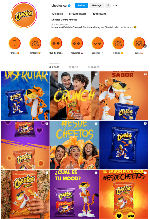
There’s more bold examples, too—take the IG profile of Cheetos Central America.
Source: Instagram
The concept of an aesthetic might be simple, but not every account has one (actor Jake Gyllenhaal, for example, has yet to find a cohesive vibe).
Source: Instagram
Instagram aesthetic examples
Visual learners, you’re in luck: the best way to learn more about different Instagram aesthetics is to study examples. Here are some standouts on the ‘gram.
Aesthetic Instagram bios
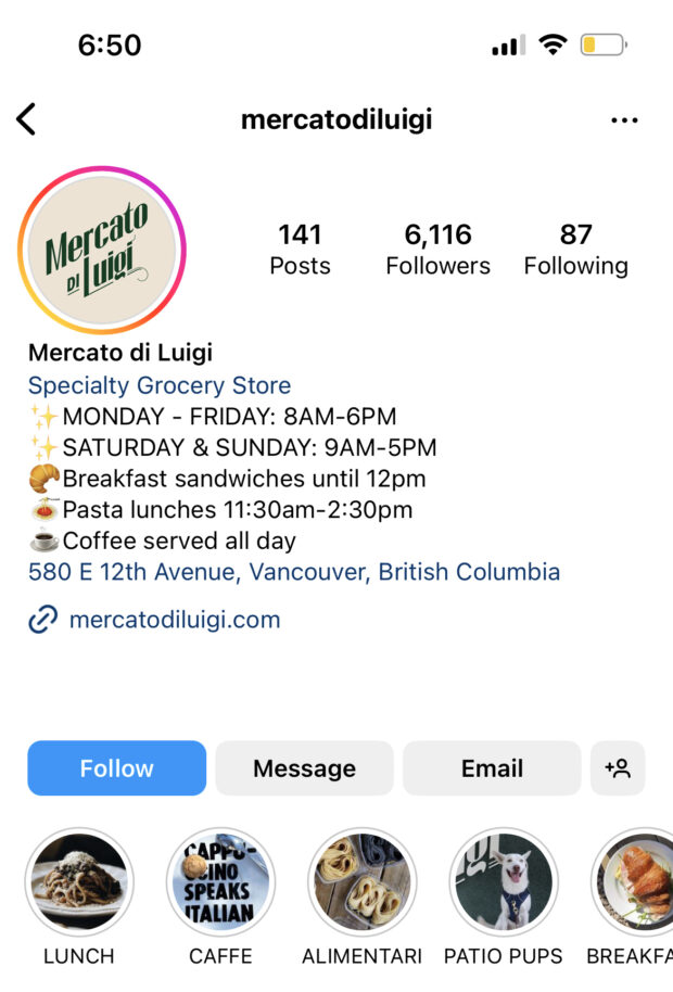
There isn’t a ton of flexibility when it comes to IG bios, meaning that you have to be creative to come up with a unique aesthetic. Emojis are your friend.
For example, you can pick an emoji for each snippet of information in your bio (exemplified below). This gives your profile a clean, organized look, and also injects a bit of personality into the feed.
Source: Instagram
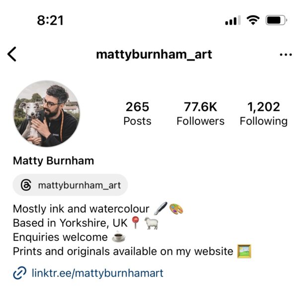
Another, even cleaner option is to pick your favorite emoji and use it over and over, almost like a bullet point. If it’s a weird, niche emoji no one’s ever seen before, even better.
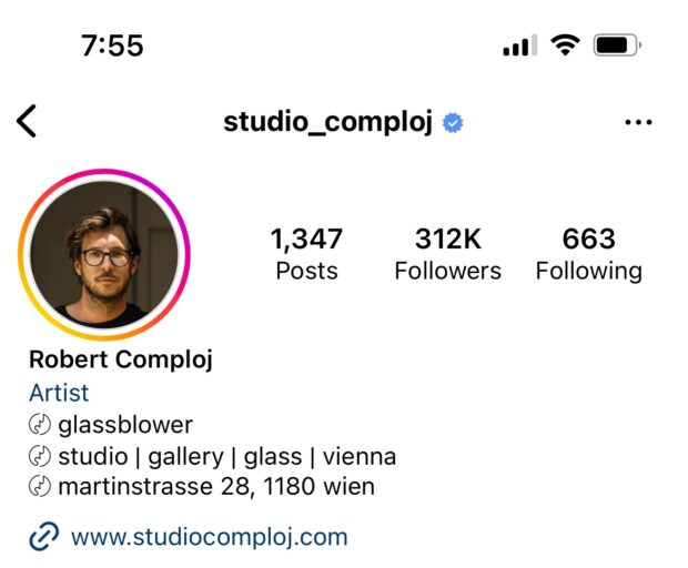
Source: Instagram
Or switch it up and put your emojis at the end—it’s a less organized look, but also creates a cartoony vibe.
Source: Instagram
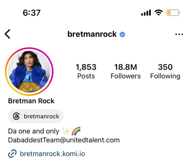
You can also use an Instagram font generator to change the look of the font in your bio, creating an aesthetic that stands out immediately.
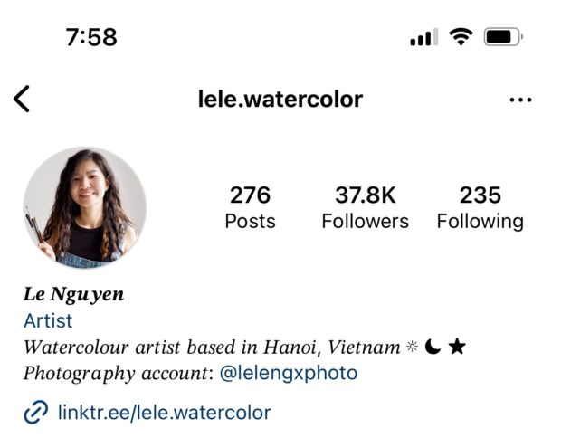
Source: Instagram
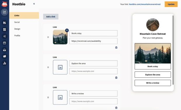
Whether your bio leans more minimalist or info-packed, whether you use emojis liberally or not at all, don’t forget to use a link in bio to drive traffic—you can link to your blog, YouTube channel, online store, etc. using this handy-dandy link. Hootbio is one of the best (okay, we’re biased!) link-in-bio solutions there is.
Aesthetic Instagram Highlight covers
Instagram Highlight covers are an effective and simple way to give your profile some extra oomph—plus, they’re an opportunity to really unify your aesthetic. The key to Highlight covers is keeping them simple: because they’re so small on the screen, less is definitely more.
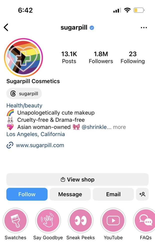
This cosmetic company uses icons for Instagram highlight covers. They are clean, clear and communicative, and use a single color that matches the brand’s visual identity and Instagram palette. Highlight covers like these can be made easily using Canva (and if you need a template to get started, here’s 40).
Source: Instagram
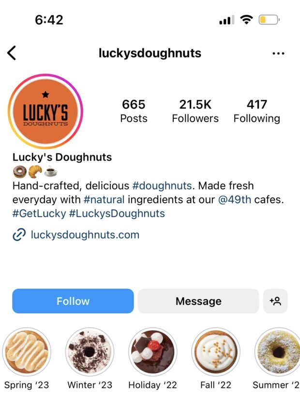
This donut shop’s creative covers show off the drool-worthy donuts (donuts are round, highlight covers are round—it’s delicious serendipity).
Source: Instagram
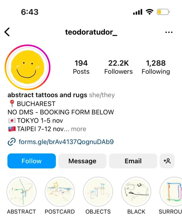
And this tattoo artist’s highlight covers feature some of their artwork. Because the background color is consistent, these highlight covers have a unified, professional look, despite the fact that the actual drawings are quite different from one another.
Source: Instagram
Not sure where to start? Hootsuite offers 40 free templates for aesthetic Instagram highlight covers — download them here.
Aesthetic Instagram captions
Aesthetics are mostly about visuals, but you can communicate a consistent brand aesthetic in your captions, too.
For example, this flower company’s minimal captions all employ the same spacing, punctuation and use of a few choice emojis (plus some relevant hashtags, of course).
You can also create an aesthetic caption by using hard returns to make sure that your entire caption isn’t visible on someone’s feed. In the post below, the account uses spacing, colons and vertical bars to make the caption—which is quite long—easy to digest.
Here’s another example of careful spacing—at first scroll, only the recipe title and emoji are visible, so the entire caption doesn’t clutter up a viewer’s feed.
Aesthetic Instagram profile pictures
Just like highlight covers, Instagram profile pictures are small—but they’re also the single image that most represents your brand.
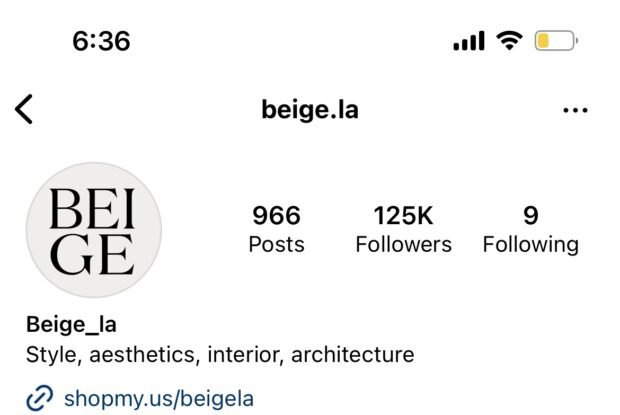
Still, you don’t have to overthink it. Below is an example of a straightforward but aesthetic profile picture: it’s the brand’s logo, in colors that match the rest of the feed.
Source: Instagram
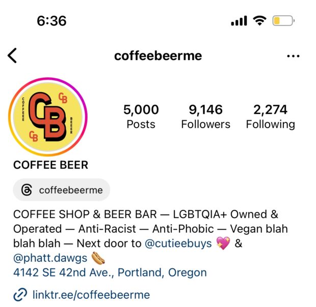
Or, there’s a bolder take: if bright colors and high-impact fonts are your brand’s thing, make that statement in your profile picture.
Source: Instagram
Another way to go? Just choose an excellent photo—one that incorporates your brand’s identity and the overall vibe you want to communicate to your target audience. (Life hack: to test the impact of a potential new PFP, post it on your story or feed first to see what kind of engagement it gets).
Source: Instagram
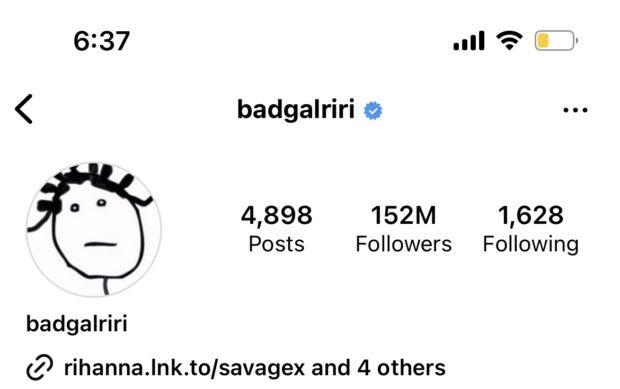
All of the above considered, a profile picture doesn’t have to be beautiful to make an impact—Rihanna has a pretty iconic image repping her personal brand, and it’s not exactly a masterpiece.
Source: Instagram
(Maybe this isn’t a great example of “aesthetic,” but it is a great example of how you can use different parts of Instagram to show off different parts of your personality.)
Aesthetic Instagram story backgrounds
If something you want to post on your story doesn’t quite fit your overall aesthetic, no fear: use a story background to keep that cohesion going.
Say you’re sharing a post to your story and want a more unified look—just pick an aesthetic photo from your camera roll and set it as the background to create more dimension.
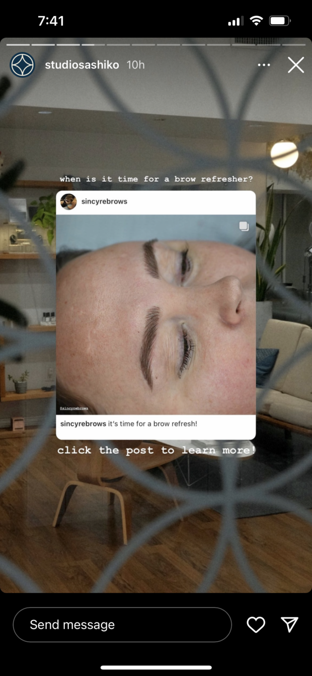
Source: Instagram
The same goes if you just want to post a link on your IG story—don’t just use the “Create” option for those standard ombre backgrounds (you’re better than that). Pick a beautiful, engaging photo to grab your audience’s attention, and layer the link over top.
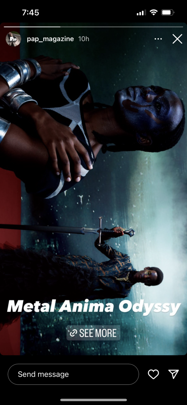
Source: Instagram
Using images in a frame as a story background is another beautiful way to incorporate your aesthetic into your stories (if you’re stuck on where to start, we’ve shared 30 aesthetic Instagram story background templates at the very end of this blog post).
Source: Instagram
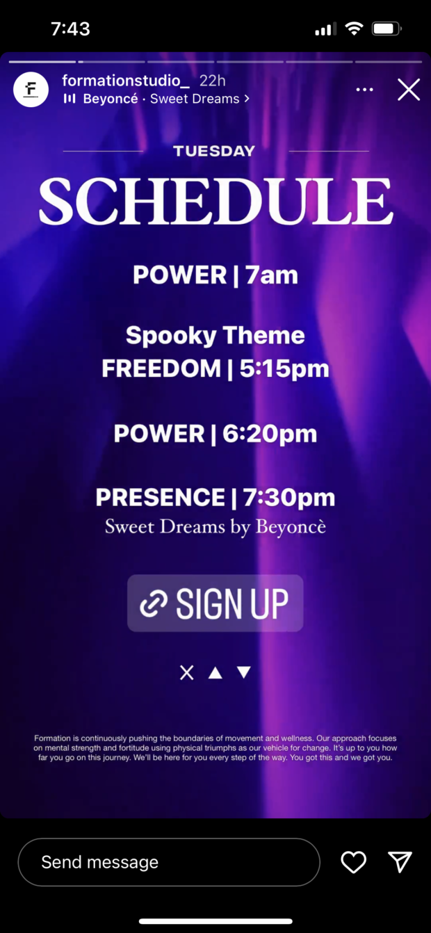
These next two are going to be video examples (bear with me—screenshots can’t quite convey video).
The information presented in the story below isn’t super interesting; it’s a class schedule for a fitness studio. But the brand used an oscillating, lava-lamp-like video behind the text, creating instant movement and visual interest.
Source: Instagram
You can also use a GIF as a story background. It creates a similar effect as above: instant motion, compelling imagery and a reason to keep watching. In the post below, a GIF of different images runs in the background of the central image.
Source: Instagram
Aesthetic Instagram posts
Here’s where the Insta magic happens: your feed posts are the backbone of your aesthetic.
There’s really nothing a delicious-looking food photo can’t do, as is exemplified here by this ice cream product shot. Rather than just a simple pic of a pint, this post adds interest with apples and apple pie, giving the viewer a more visceral idea of what the ice cream tastes like. It’s high-quality, well-lit and jibes with the rest of the brand’s Instagram feed posts (we’ll talk more about curating an overall grid in the next part).
And sometimes, simple doesn’t cut it—this post of a grandma-core, maximalist living space proves it. This post is bright, eclectic and detailed, with plenty of different elements to focus on. All together, it’s a very unique look (one that probably isn’t for everyone, but inarguably shows off a signature style).
The post below is also bright and colorful, but there’s a grid-like rigidity to it—organized chaos is a one-way ticket to aesthetic success.
And lastly, one more aesthetic hack: when in doubt, go for nature. Landscapes and photos taken outside almost always have a serene, organic vibe. If it suits your business or personal brand, use as many outdoor photos as possible, and you’ll naturally (pun intended) create a consistent aesthetic.
Need more post ideas? Owlywriter AI can help generate awesome concepts for your content—get the ball rolling with a little robot assistance.
OwlyWriter AI instantly generates captions and content ideas for every social media network. It’s seriously easy.
Start free 30-day trialAesthetic Instagram profile grids
Time for the work on your aesthetic to really come together. A profile grid is a snapshot of a brand’s aesthetic (or lack thereof). Here are some excellent examples from folks who got it right.
To start, there’s the neutral-heavy aesthetic of this designer’s Instagram (artists and designers are often the best at curating a signature look—turn to them for the best examples). This grid is almost 100% photos of home interiors, with lots of natural light and natural materials.
Source: Instagram
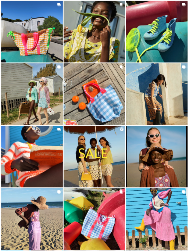
Then, there’s the pretty pastel posts from this fashion brand. Soft pinks, blues, greens and yellows dominate this grid. There’s also lots of sunshine and smiles—the brand trades the usual model-esque smolder for big grins, creating a more fun, lighthearted vibe.
Source: Instagram
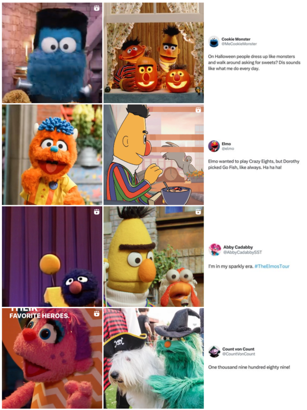
Another way to make your Instagram grid appear more aesthetic is to make use of the layout. Profiles measure three posts across, regardless of what platform you’re viewing IG on, and you can use those specs to create a pattern. Every third post that Sesame Street makes is a screenshot of a Tweet, which forms a very uniform-looking feed (despite the rest of the posts being rather random).
Source: Instagram
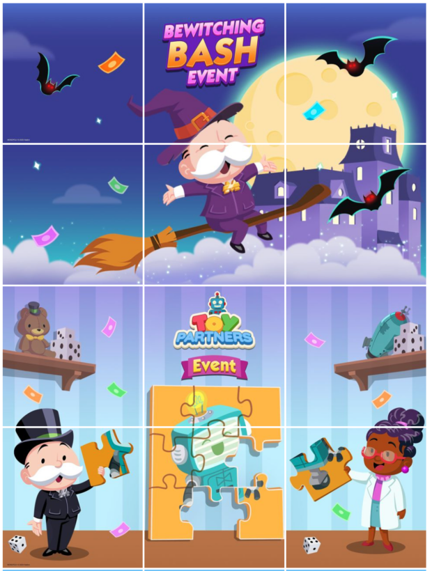
Or, you can go full grid boss and create an image on your profile–that’s the way that Monopoly Go does it. Each post is ⅙ of the full picture. This is effective when it comes to your grid as a whole, but each individual post looks kind of strange (exhibit A) so consider that when choosing this kind of post pattern… you’re essentially committing to post in groups for eternity, or have your feed appear all Rubix-cubed in the future.
Source: Instagram
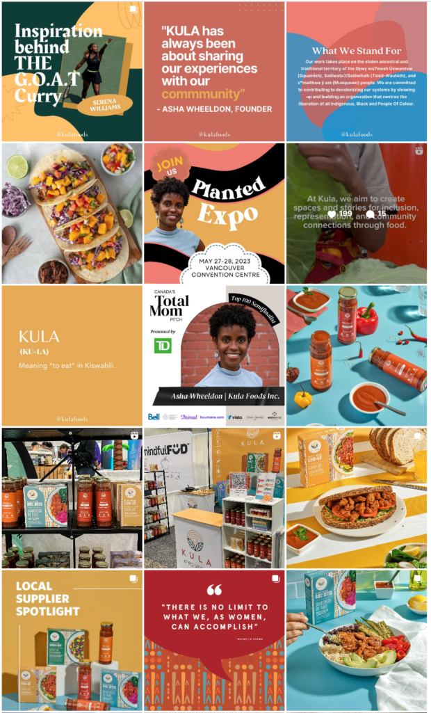
Not every single post needs to have the same color palette and mood to create an aesthetic profile grid: as long as the majority of posts fit your brand’s aesthetic, you’re golden. That’s exemplified below in this food producer’s grid. Most of the posts use the brand’s dusty pinks, oranges and blues, but not all of them do—don’t dismiss posting a photo just because it doesn’t fit your aesthetic. Rules were made to be broken.
Source: Instagram
The easiest way to create a beautiful grid is to make a plan and schedule your posts—that way, you know they’ll go live in the order they need to. You can plan and schedule posts ahead using the Hootsuite Composer.
126 free templates that will help you build a cohesive Instagram aesthetic
Canva is a social media manager’s best friend—and it’s also Hootsuite’s best friend (Hootsuite has a built-in Canva integration!). All of the templates below are editable in Canva.
15 Instagram post templates
Text plus images? A match made in heaven. This super-editable, super-free template has 15 square Instagram posts that you can modify to suit your aesthetic (for example, use your brand fonts to replace the template fonts).
72 Instagram Story templates
Here’s a story for you. Our free Instagram story templates contain four different pre-built aesthetics, with 18 different stories in each one–that’s 72 total templates if you’re counting. From colorful and retro to modern and neutral, these templates will set you up for success.
4 Instagram Reels templates
It’s not just still images that make up a beautiful Instagram page: videos are included in the aesthetic equation. Here’s four stunning templates to make editing your reels a breeze (and you don’t even need to use IG’s extraordinarily frustrating native software to do it).
5 Instagram carousel templates
Carousel posts on Instagram can get about three times more engagement than single photos—so if better IG engagement is what you seek (and it should be), try making carousel posts. While photo dumps have their purpose, aesthetics are our focus now: start with these five templates for Instagram carousels, each one with four different slides.
30 aesthetic Instagram Story background templates
Psst: you don’t even really need to stick to your aesthetic when posting on your story—throw any pic on to a background that fits your branding and you’re all set. These 30 diverse Instagram story backgrounds range from cute fruit to minimal patterns to funky frames. Save to camera roll, STAT.
What, 126 templates for Instagram isn’t enough for you? The feed is always hungry—here’s over 200 templates specifically designed for IG.
Start building your Instagram presence using Hootsuite. Schedule and publish posts directly to Instagram, engage your audience, measure performance, and run all your other social media profiles — all from one simple dashboard. Try it free today.
Easily create, analyze, and schedule Instagram posts, Stories, and Reels with Hootsuite. Save time and get results.
Free 30-Day TrialThe post How to Create a Standout Instagram Aesthetic [Free Templates] appeared first on Social Media Marketing & Management Dashboard.
Categories
- 60% of the time… (1)
- A/B Testing (2)
- Ad placements (3)
- adops (4)
- adops vs sales (5)
- AdParlor 101 (43)
- adx (1)
- AI (4)
- algorithm (1)
- Analysis (14)
- Apple (1)
- Audience (1)
- Augmented Reality (1)
- authenticity (1)
- Automation (1)
- Back to School (1)
- best practices (2)
- brand voice (1)
- branding (1)
- Build a Blog Community (12)
- Calculator (1)
- Case Studies (2)
- Case Study (3)
- celebrate women (1)
- certification (1)
- Collections (1)
- Community (1)
- Conference News (2)
- conferences (1)
- confluence (1)
- content (1)
- content creation (31)
- Content creators (2)
- content curation (1)
- content marketing (3)
- contests (1)
- Conversion Lift Test (1)
- Conversion testing (1)
- cost control (2)
- Creative (6)
- crisis (1)
- Curation (1)
- Custom Audience Targeting (4)
- Customer service (7)
- Digital Advertising (2)
- Digital Marketing (6)
- DPA (1)
- Dynamic Ad Creative (1)
- dynamic product ads (1)
- E-Commerce (1)
- eCommerce (2)
- Ecosystem (1)
- email marketing (3)
- Employee advocacy (2)
- employee advocacy program (1)
- employee advocates (1)
- engineers (1)
- event marketing (1)
- event marketing strategy (1)
- events (3)
- Experiments (34)
- F8 (2)
- Facebook (64)
- Facebook Ad Split Testing (1)
- facebook ads (18)
- Facebook Ads How To (1)
- Facebook Advertising (30)
- Facebook Audience Network (1)
- Facebook Creative Platform Partners (1)
- facebook marketing (1)
- Facebook Marketing Partners (2)
- Facebook Optimizations (1)
- Facebook Posts (1)
- facebook stories (1)
- Facebook Updates (2)
- Facebook Video Ads (1)
- Facebook Watch (1)
- fbf (11)
- first impression takeover (5)
- fito (5)
- Fluent (1)
- Free tool (2)
- Get Started With Wix Blog (1)
- Google (9)
- Google Ad Products (5)
- Google Analytics (1)
- Government (1)
- Guest Post (1)
- Guide (2)
- Guides (32)
- Halloween (1)
- Healthcare (2)
- holiday marketing (1)
- Holiday Season Advertising (7)
- Holiday Shopping Season (4)
- Holiday Video Ads (1)
- holidays (4)
- Hootsuite How-To (3)
- Hootsuite HQ (1)
- Hootsuite Life (1)
- how to (6)
- How to get Instagram followers (1)
- How to get more Instagram followers (1)
- i don't understand a single thing he is or has been saying (1)
- if you need any proof that we're all just making it up (2)
- Incrementality (1)
- influencer marketing (2)
- Infographic (1)
- Instagram (39)
- Instagram Ads (11)
- Instagram advertising (8)
- Instagram best practices (1)
- Instagram followers (1)
- Instagram Partner (1)
- Instagram Stories (2)
- Instagram tips (1)
- Instagram Video Ads (2)
- invite (1)
- Landing Page (1)
- Legal (1)
- link shorteners (1)
- LinkedIn (22)
- LinkedIn Ads (2)
- LinkedIn Advertising (2)
- LinkedIn Stats (1)
- LinkedIn Targeting (5)
- Linkedin Usage (1)
- List (1)
- listening (2)
- Lists (3)
- Livestreaming (1)
- look no further than the new yorker store (2)
- lunch (1)
- Mac (1)
- macOS (1)
- Marketing to Millennials (2)
- mental health (1)
- metaverse (2)
- mobile (2)
- Mobile App Marketing (3)
- Monetizing Pinterest (2)
- Monetizing Social Media (2)
- Monthly Updates (10)
- Mothers Day (1)
- movies for social media managers (1)
- new releases (11)
- News (80)
- News & Events (12)
- no one knows what they're doing (2)
- Non-profit (2)
- OnlineShopping (2)
- or ari paparo (1)
- owly shortener (1)
- Paid Media (2)
- People-Based Marketing (3)
- performance marketing (5)
- Pinterest (34)
- Pinterest Ads (11)
- Pinterest Advertising (8)
- Pinterest how to (1)
- Pinterest Tag helper (5)
- Pinterest Targeting (6)
- platform health (1)
- Platform Updates (8)
- Press Release (2)
- product catalog (1)
- Productivity (10)
- Programmatic (3)
- quick work (1)
- Real estate (4)
- Reddit (3)
- reels (1)
- Reporting (1)
- Resources (27)
- ROI (1)
- rules (1)
- Seamless shopping (1)
- share of voice (1)
- Shoppable ads (4)
- short-form video (2)
- shorts (2)
- Skills (25)
- SMB (1)
- SnapChat (28)
- SnapChat Ads (8)
- SnapChat Advertising (5)
- Social (148)
- social ads (1)
- Social Advertising (14)
- Social commerce (3)
- social customer service (1)
- Social Fresh Tips (2)
- Social listening (3)
- Social Media (5)
- Social Media Advertising (3)
- Social media analytics (11)
- social media automation (1)
- Social media benchmarks (1)
- Social media career (2)
- social media content calendar (1)
- Social media content creation (3)
- Social media engagement (8)
- social media for events (1)
- social media management (2)
- Social Media Marketing (49)
- social media monitoring (1)
- Social Media News (4)
- Social media scheduling (6)
- social media statistics (1)
- Social media stats (4)
- Social Media Strategy (42)
- social media tools (25)
- social media tracking in google analytics (1)
- Social media trends (5)
- social media tutorial (2)
- Social Toolkit Podcast (1)
- Social Video (14)
- stories (1)
- Strategy (863)
- Teamwork (2)
- Template (5)
- terms (1)
- Testing (2)
- there are times ive found myself talking to ari and even though none of the words he is using are new to me (1)
- they've done studies (1)
- this is also true of anytime i have to talk to developers (1)
- tiktok (14)
- tool (1)
- tools (1)
- Topics & Trends (3)
- Trend (12)
- Twitter (15)
- Twitter Ads (5)
- Twitter Advertising (4)
- Uncategorised (9)
- Uncategorized (13)
- url shortener (1)
- url shorteners (1)
- vendor (2)
- video (14)
- Video Ads (7)
- Video Advertising (8)
- virtual conference (1)
- we're all just throwing mountains of shit at the wall and hoping the parts that stick don't smell too bad (2)
- web3 (2)
- where you can buy a baby onesie of a dog asking god for his testicles on it (2)
- yes i understand VAST and VPAID (1)
- yes that's the extent of the things i understand (1)
- YouTube (13)
- YouTube Ads (4)
- YouTube Advertising (9)
- YouTube Video Advertising (5)




 Elyssia Ward
