We Ran $557k in E-Commerce Facebook Ads. Here’s What We Learned.
A/B Testing, Facebook, facebook ads, Facebook Advertising, Social Media Marketing
Last month we ran $557,388 in Facebook ads for two e-commerce clothing brands.
Beyond driving sales, we also wanted to use the campaigns to unearth what makes certain ads crush it, and others fall flat.
So we applied our Intel Tags to every piece of ad creative to track individual elements like background color, image composition, and product types.
Doing this allowed us to answer a variety of questions like, “Does the carousel format work better than single images for driving clicks?”
Let’s take a look at the six takeaways from our analysis to find out.
 Result: Ads featuring images without copy produced click-through rates that were 40% higher among women, and 54% higher among men.
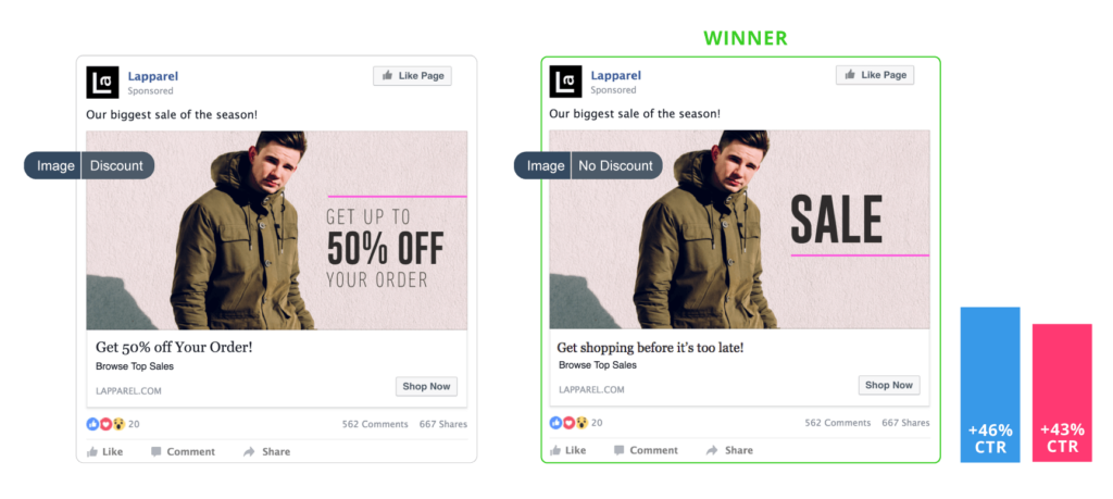 Result: Ads that didn’t mention a specific discount amount produced click-through rates that were 46% higher among women, and 43% higher among men.
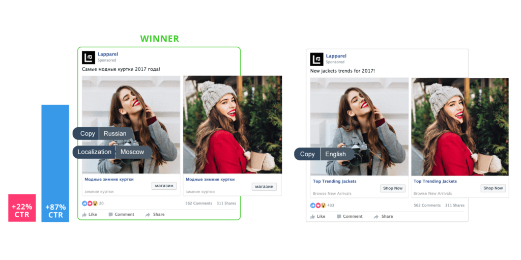 Result: Ads that used localized copy produced click-through rates that were 22% higher among women, and 87% higher among men.
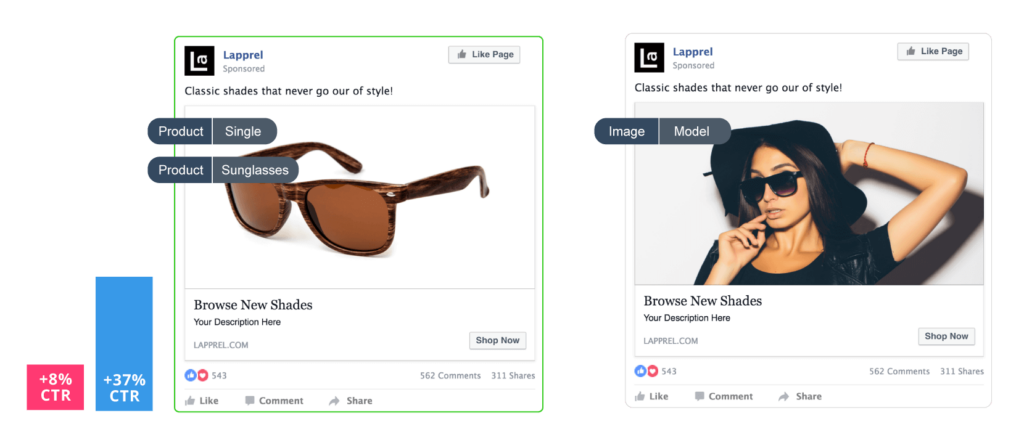 Result: Ads that focused on a product instead of a model wearing the product produced nominally better click-through rates among women (8% higher) and moderately better click-through rates among men (37% higher).
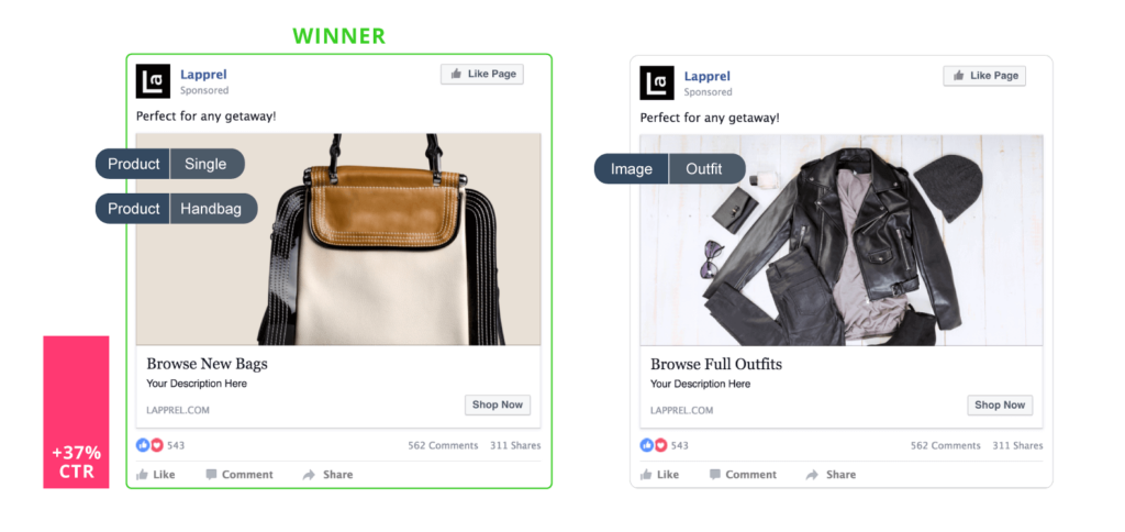 Result: Ads that focused on a product instead of multiple products produced click-through rates that were 37% higher among women.
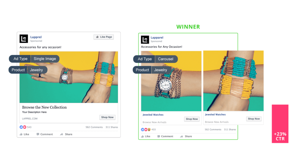 Result: Ads that featured a carousel instead of a single image produced click-through rates that were 23% higher among women.
CAMPAIGN SCOPE
- Objective: Link Clicks
- Campaign Length: 42 days
- Countries: United States, Hong Kong, Australia, Russia, UK, Canada, Korea
- Targeting: Interest-based and focused on premium brands, shopping keywords, and apparel keywords
IMAGES WITH COPY VS IMAGES WITHOUT COPY (WOMEN & MEN)
 Result: Ads featuring images without copy produced click-through rates that were 40% higher among women, and 54% higher among men.
DISCOUNT VS NO DISCOUNT (WOMEN & MEN)
 Result: Ads that didn’t mention a specific discount amount produced click-through rates that were 46% higher among women, and 43% higher among men.
LOCALIZATION VS NO LOCALIZATION (WOMEN & MEN)
 Result: Ads that used localized copy produced click-through rates that were 22% higher among women, and 87% higher among men.
PRODUCT IMAGES VS MODELS WEARING PRODUCTS (WOMEN & MEN)
 Result: Ads that focused on a product instead of a model wearing the product produced nominally better click-through rates among women (8% higher) and moderately better click-through rates among men (37% higher).
MULTIPLE PRODUCTS VS SINGLE PRODUCT (WOMEN ONLY)
 Result: Ads that focused on a product instead of multiple products produced click-through rates that were 37% higher among women.
SINGLE IMAGE VS CAROUSEL (WOMEN ONLY)
 Result: Ads that featured a carousel instead of a single image produced click-through rates that were 23% higher among women.
KEY TAKEAWAYS
So what did we learn from running $557k in e-commerce Facebook ads?- There were a few standout elements that significantly improved the performance of ads shown to both men and women, including:
- Using images without copy
- Not mentioning specific discounts in ads
- For men, using their native language in the ad drastically increased click-through rates, yet this did not hold true for women.
- Though not tested in ads shown to men, focusing on just a single product in ads shown to women, rather than including a variety of products in ad creative, tended to provide a boost to click-through rates.
Related Posts
Categories
- 60% of the time… (1)
- A/B Testing (2)
- Ad placements (3)
- adops (4)
- adops vs sales (5)
- AdParlor 101 (43)
- adx (1)
- algorithm (1)
- Analysis (9)
- Apple (1)
- Audience (1)
- Augmented Reality (1)
- authenticity (1)
- Automation (1)
- Back to School (1)
- best practices (2)
- brand voice (1)
- branding (1)
- Build a Blog Community (12)
- Case Study (3)
- celebrate women (1)
- certification (1)
- Collections (1)
- Community (1)
- Conference News (1)
- conferences (1)
- content (1)
- content curation (1)
- content marketing (1)
- contests (1)
- Conversion Lift Test (1)
- Conversion testing (1)
- cost control (2)
- Creative (6)
- crisis (1)
- Curation (1)
- Custom Audience Targeting (4)
- Digital Advertising (2)
- Digital Marketing (6)
- DPA (1)
- Dynamic Ad Creative (1)
- dynamic product ads (1)
- E-Commerce (1)
- eCommerce (2)
- Ecosystem (1)
- email marketing (3)
- employee advocacy program (1)
- employee advocates (1)
- engineers (1)
- event marketing (1)
- event marketing strategy (1)
- events (1)
- Experiments (21)
- F8 (2)
- Facebook (64)
- Facebook Ad Split Testing (1)
- facebook ads (18)
- Facebook Ads How To (1)
- Facebook Advertising (30)
- Facebook Audience Network (1)
- Facebook Creative Platform Partners (1)
- facebook marketing (1)
- Facebook Marketing Partners (2)
- Facebook Optimizations (1)
- Facebook Posts (1)
- facebook stories (1)
- Facebook Updates (2)
- Facebook Video Ads (1)
- Facebook Watch (1)
- fbf (11)
- first impression takeover (5)
- fito (5)
- Fluent (1)
- Get Started With Wix Blog (1)
- Google (9)
- Google Ad Products (5)
- Google Analytics (1)
- Guest Post (1)
- Guides (32)
- Halloween (1)
- holiday marketing (1)
- Holiday Season Advertising (7)
- Holiday Shopping Season (4)
- Holiday Video Ads (1)
- holidays (4)
- Hootsuite How-To (3)
- Hootsuite Life (1)
- how to (5)
- How to get Instagram followers (1)
- How to get more Instagram followers (1)
- i don't understand a single thing he is or has been saying (1)
- if you need any proof that we're all just making it up (2)
- Incrementality (1)
- influencer marketing (1)
- Infographic (1)
- Instagram (39)
- Instagram Ads (11)
- Instagram advertising (8)
- Instagram best practices (1)
- Instagram followers (1)
- Instagram Partner (1)
- Instagram Stories (2)
- Instagram tips (1)
- Instagram Video Ads (2)
- invite (1)
- Landing Page (1)
- link shorteners (1)
- LinkedIn (22)
- LinkedIn Ads (2)
- LinkedIn Advertising (2)
- LinkedIn Stats (1)
- LinkedIn Targeting (5)
- Linkedin Usage (1)
- List (1)
- listening (2)
- Lists (3)
- Livestreaming (1)
- look no further than the new yorker store (2)
- lunch (1)
- Mac (1)
- macOS (1)
- Marketing to Millennials (2)
- mental health (1)
- metaverse (1)
- Mobile App Marketing (3)
- Monetizing Pinterest (2)
- Monetizing Social Media (2)
- Monthly Updates (10)
- Mothers Day (1)
- movies for social media managers (1)
- new releases (11)
- News (72)
- News & Events (13)
- no one knows what they're doing (2)
- OnlineShopping (2)
- or ari paparo (1)
- owly shortener (1)
- Paid Media (2)
- People-Based Marketing (3)
- performance marketing (5)
- Pinterest (34)
- Pinterest Ads (11)
- Pinterest Advertising (8)
- Pinterest how to (1)
- Pinterest Tag helper (5)
- Pinterest Targeting (6)
- platform health (1)
- Platform Updates (8)
- Press Release (2)
- product catalog (1)
- Productivity (10)
- Programmatic (3)
- quick work (1)
- Reddit (3)
- Reporting (1)
- Resources (34)
- ROI (1)
- rules (1)
- Seamless shopping (1)
- share of voice (1)
- Shoppable ads (4)
- Skills (28)
- SMB (1)
- SnapChat (28)
- SnapChat Ads (8)
- SnapChat Advertising (5)
- Social (169)
- social ads (1)
- Social Advertising (14)
- social customer service (1)
- Social Fresh Tips (1)
- Social Media (5)
- social media automation (1)
- social media content calendar (1)
- social media for events (1)
- social media management (2)
- Social Media Marketing (49)
- social media monitoring (1)
- Social Media News (4)
- social media statistics (1)
- social media tracking in google analytics (1)
- social media tutorial (2)
- Social Toolkit Podcast (1)
- Social Video (5)
- stories (1)
- Strategy (601)
- terms (1)
- Testing (2)
- there are times ive found myself talking to ari and even though none of the words he is using are new to me (1)
- they've done studies (1)
- this is also true of anytime i have to talk to developers (1)
- tiktok (8)
- tools (1)
- Topics & Trends (3)
- Trend (12)
- Twitter (15)
- Twitter Ads (5)
- Twitter Advertising (4)
- Uncategorised (9)
- Uncategorized (13)
- url shortener (1)
- url shorteners (1)
- vendor (2)
- video (10)
- Video Ads (7)
- Video Advertising (8)
- virtual conference (1)
- we're all just throwing mountains of shit at the wall and hoping the parts that stick don't smell too bad (2)
- web3 (1)
- where you can buy a baby onesie of a dog asking god for his testicles on it (2)
- yes i understand VAST and VPAID (1)
- yes that's the extent of the things i understand (1)
- YouTube (13)
- YouTube Ads (4)
- YouTube Advertising (9)
- YouTube Video Advertising (5)
