Storytelling with data: Strategies to captivate your audience
Once upon a time, there was this magical beast called data that social media managers slayed. And that time is now, because data storytelling isn’t a fairytale: it’s an effective visual marketing strategy that can help you build trust, engagement, and sales for your brand.
We sat down with Vancouver-based digital marketing manager Leeann Froese of Town Hall Brands for expert insight on every chapter of data storytelling. Read on for industry insights, examples, and advice on using numbers in social media narratives.
What is data storytelling?
Data storytelling uses facts, statistics, and quantitative information to create a compelling story. In other words, data storytelling uses (real) numbers to support an engaging story, and authenticate the story’s message.
“Using data to tell stories from a brand’s point of view can be very effective, as it bridges that place between logic and emotion and lets a brand connect with a reader on a deeper level,” says Froese.
Data can “prove” the validity of a story (for example, sheep are smart: they can recognize up to 50 other sheep by sight) and help sell a brand or product (Ie: when “four out of five dentists” recommend a specific toothpaste).
And despite the bad rap that numbers get, storytelling with data can help build an emotional connection, too. If I told you that 20% of roses feel pain when cut, would you look at Valentine bouquets differently?
That brings us to another important part of data storytelling: the numbers need to be true, unaltered, and preferably provided by a trusted third party. Making up numbers or bending statistics to suit your own needs is a dangerous game, especially on social media.
Why does data storytelling matter in social media?
Social media might not be “real life,” but what we post (especially from a business perspective) has real-life consequences. As technology progresses and social platforms grow, information spreads quickly… and so does misinformation.
When you use data storytelling in social media, you’re arming your content with an extra layer of validity. By offering proof, sharing statistics and being transparent about numbers, you can set your brand apart from the rest.
“Data is not just numbers — it’s an opportunity to connect, inspire, and differentiate a brand in a crowded market,” says Froese.
“When paired with a compelling narrative, data can turn abstract figures into relatable, emotionally resonant stories that build trust.” Some parts of social media can feel a bit superficial, but that only makes the interesting, meaningful stories stand out more — and drive more engagement and shares.
Data storytelling legitimizes your content in a compelling, accessible way.
Plus, storytelling with data can make complex ideas more concise and approachable for a social media audience. Most users are turning to social media for entertainment, not to study up on an elaborate or complicated concept.
Using clear, carefully selected data, you can effectively capture the attention of your audience — then, you can guide them towards your own website or blog for more information.
6 steps to effective data storytelling
1. Identify and understand your audience
“Start with who you are talking to,” advises Froese.
Understanding your audience will help you decide which stories (and which data) will resonate most with them.
Psst: For a full step-by-step case study of how audience research can make a campaign successful, read up on Wealthsimple’s social media campaign strategy.
2. Find trusted data sources
It matters where your data comes from. Using a trusted, verified source to get your facts and figures limits any risk of spreading misinformation or dealing with a PR disaster. Just because a statistic is widespread doesn’t automatically make it true, so be sure to check your sources before posting.
“Presenting verified, peer-reviewed data or trusted sources can further enhance credibility, reassuring audiences that a brand is trustworthy and responsible,” says Froese. “Transparency fosters stronger relationships, demonstrating that a brand is not just selling but also sharing meaningful insights.”
Ironically, social media can be a tricky place for getting data — anyone can post a TikTok saying just about anything. Stick to professional sources that you trust instead of using data from other social media users.
If your data is more internal, for example, a fact about how many sales you made or a stat about your target audience — double-check that that information is correct, too.
3. Select the right data
Not all data is useful for storytelling, so be selective about the numbers you share. Pinterest’s Trend Forecasts are an excellent example of curating data into manageable groups that tell a story.
The Pinterest team would have access to an almost unlimited library of data about how people use the app, but specific points are chosen to communicate a narrative.

Source: Pinterest Predicts
In the above trend forecast, Pinterest collects data about search terms relevant to a specific theme (in this case, using scraps to create new things and reduce waste).
By choosing to share growing search terms like “Discard recipes” and “Scrap quilts patterns leftover fabric,” Pinterest effectively tells the story of a growing trend.
4. Craft a clear narrative
“Data alone may feel abstract, but when woven into a narrative, it evokes feelings, builds trust and helps a brand stand out from competitors,” says Froese.
Think about what the data means and what message you want to convey to your audience. Then, use the data to bolster that narrative.
“Introduce the context, share the data, and finish with an actionable takeaway,” Froese suggests. She uses a caption for a resort’s Instagram post as an example: “Over 90% of our guests rated their stay as excellent — join them and discover why!”
5. Design compelling visuals
A picture says a thousand data points, right? “The brain processes visual information much faster than text — up to 60,000 times faster, as frequently cited in communication studies,” says Froese.
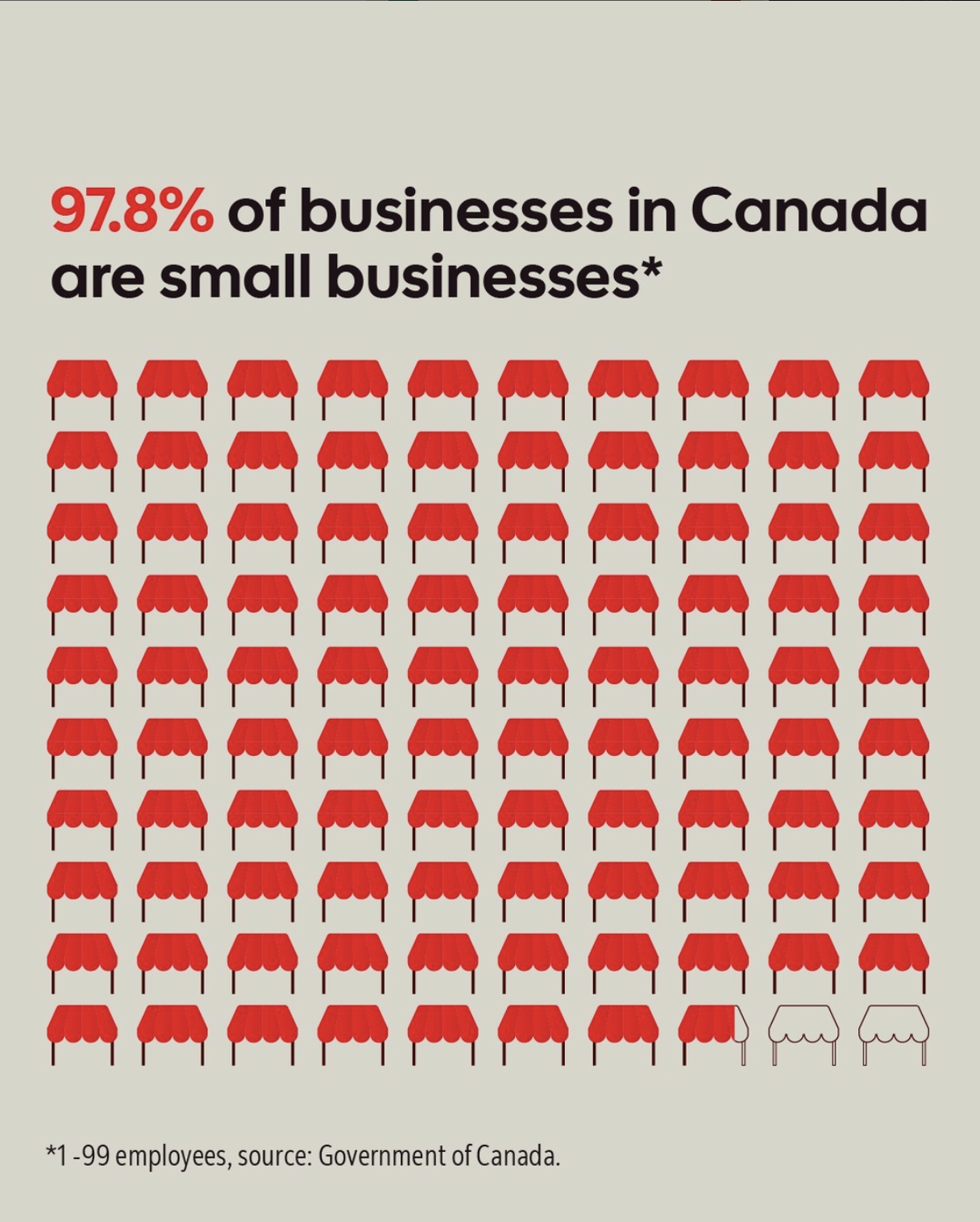
Using a social media editing app to craft engaging, clear visuals will ensure that your data and story is accessible. This social media graphic from Scotiabank is a great example.

Source: @scotiabank
Using effective visuals like visual displays, pie charts, and use of color (see above, red) can enhance the impact of your storytelling.
6. Cite your sources
Do we need to state the obvious? We will. “Don’t make things up,” Froese asserts. “Reference trusted and peer-reviewed data where possible to establish credibility and responsibility.”
And hey, if you’re going to all that trouble to find trusted sources, you might as well share them — that gives you an even bigger transparency boost.
If you’re not comfortable revealing your sources in your social post, ask yourself why. It might be a sign that you need to do more research before sharing the data publicly.
5 examples of successful storytelling with data
1. Impact’s stats and facts
Instagram account @impact has a feed full of successful storytelling with data. From stats on women’s sports to hard facts about the environmental harm of Black Friday, the carousel posts published by Impact often get tens of thousands of shares.
Timeliness matters when it comes to sharing data, too. The below carousel all about exam culture in the U.S. was posted around finals season for high school and university students, making it instantly relevant (and sharable) content.
“Data shows the best when presented with clean, bold, eye-catching graphics to convey it — people remember visual cues better than numbers or text alone,” says Froese.

Source: @impact
Along with facts and figures, Impact uses strong visuals to engage viewers and cites sources at the end of posts. Plus, the posts almost always end with a question that prompts engagement: in this case, it’s “What are your thoughts on exam culture?”
Key takeaways:
- Use data that is timely and relevant to what is happening, now — plan ahead and schedule your posts to be part of the current conversation.
- Cite verified, credible sources whenever you can for maximum transparency.
- Ask your audience what they think about the data you’ve presented to encourage comments (and boost your engagement rate).
2. Farmers Pick’s Zucchini TikTok
Hooks are especially important on TikTok, because you only have a few seconds to capture your audience’s attention before they scroll away. This TikTok from Farmers Pick in Australia demonstrates how data can make an excellent hook.

Source: @farmerspickau
Starting the video with data (“1,500 zucchinis rejected by the supermarkets because it doesn’t meet their ridiculous beauty standards”) gives this TikTok a bit of shock value.
“The surprise of someone in a high-visibility vest with thousands of zucchinis is not something you see every day, so that hooks you in,” Froese adds. Then, the video continues to explain and show evidence of that data.
This TikTok incited a huge emotional reaction — Froese points out how successful this video was at informing people about food waste: “The more than 12,000 reaction comments show that this was effective.”
Key takeaways:
- Data can make an effective hook for TikTok.
- When you can, combine a figure or statistic with a visual (like a video) demonstrating the data.
- Once you’ve hooked your audience, take time to explain the data to further position yourself as an expert.
3. Dove’s “Hard Knocks” YouTube video
Skin and hair care brand Dove has established an excellent reputation for creating compelling, often tear-jerking narratives that are effective not only in growing the brand but in moving towards social change.
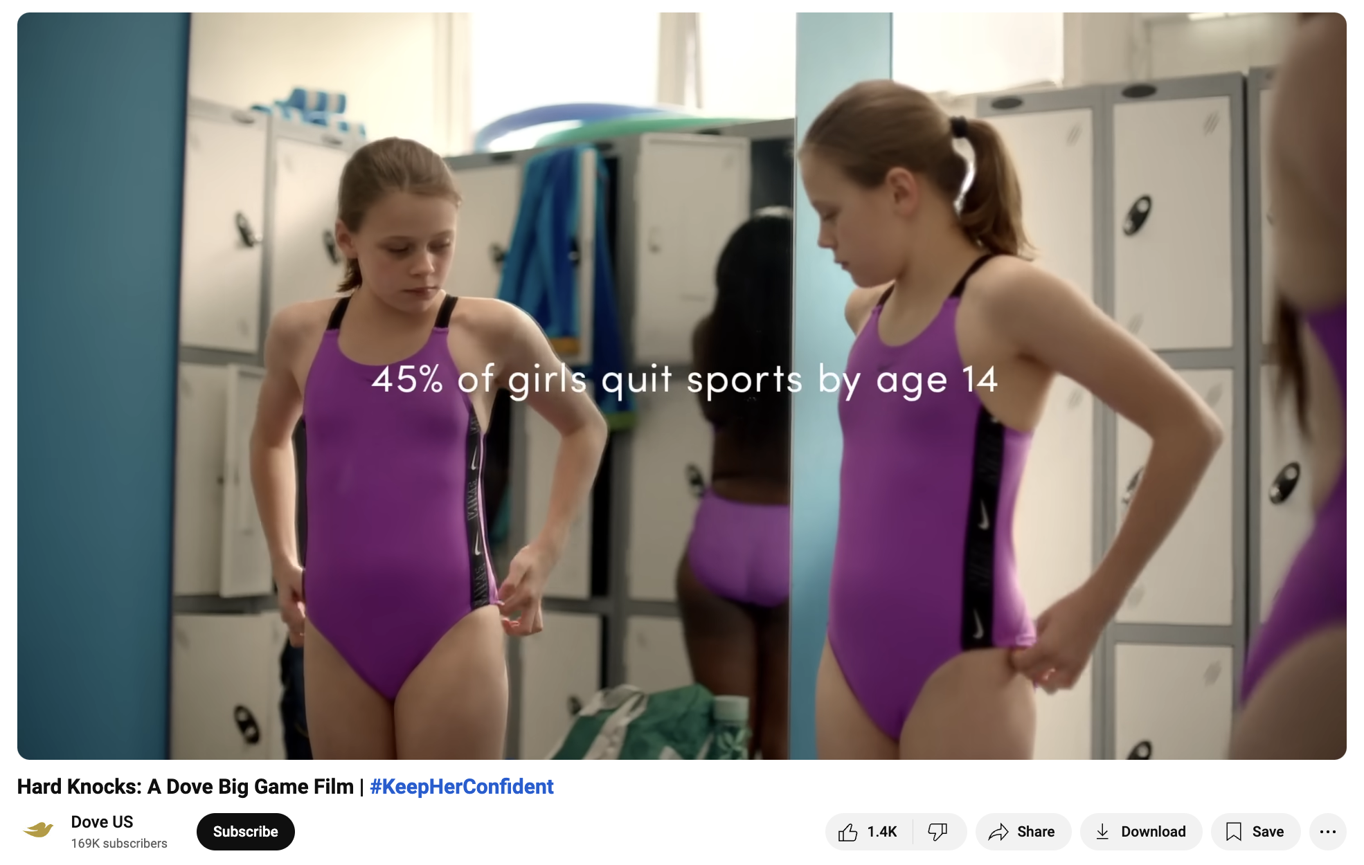
The “Hard Knocks” campaign is one great example: it starts with funny, home-movie style clips of girls falling down while playing various sports, then moves into a hard-hitting message about how body confidence affects their participation, ending with the stat: “45% of girls quit sports by age 14.”
“This creates a big emotional reaction with the viewer,” says Froese, “because, by this part of the video, we are rooting for these girls.”
 Source: Dove US
Often, data is used to hook an audience in, but this video does the opposite – the data is presented at the end, as a jarring reality check. The caption also presents a clear, branded call to action: “Want to help #KeepHerConfident in sports? Visit Dove.com/confidentsports.”
Key takeaways:
- Combining hard data with more playful, humorous content can create a very striking message.
- Experiment with where in your story you want to present your data: it may make an effective hook, or it could be a compelling ending.
- If the data you’re presenting leans more negative, use a call to action to rally your audience and encourage them to make change.
4. The BC SPCA’s donor graphic
Does a photo of an adorable puppy even need data to tell an engaging story? Maybe not, but it sure helps. This post from the BC SPCA shows how simple data storytelling can be.

Source: @bcspca
“A cute puppy stops the scroll, and as our eye travels around the image we encounter the data,” says Froese. “It makes us want to read the caption, which further explains.”
The beauty of this “data” is that it’s arguably not data at all — it’s a fact presented in a quantitative way. Instead of saying that SPCA donors fund animal protection investigations, there’s a (albeit basic) statistic used that makes the message more effective.
It’s not rooted in any specific event or time, so it can also be reposted and reshared over and over again.
Key takeaways:
- Be creative about what data you want to share. Even if you don’t have access to studies or stats in your niche, you can storytell with your brand’s own numbers.
- Data storytelling can make great evergreen content, and is good to have in your media library when planning your social media calendar.
- When presenting data, keep the other design elements basic so you don’t overwhelm the viewer—a single photo works well.
5. OG Slimes’ Slimify Wrapped TikTok
Some forms of data are easier to understand because they are more present in current pop culture — for example, Spotify Wrapped.
Spotify gathering each listener’s stats for the year and presenting it in a clear, sharable graphic is excellent marketing. Plus, it tells a story (sometimes, an embarrassing one… there should be a support group for people who have the Glee cast in their top five artists).
Other brands use Spotify Wrapped as a jumping off point for their own data storytelling, like this video from OG Slimes.

Source: @ogslimes
By keeping track of sales and sharing the numbers, this brand is demonstrating transparency and celebrating its most popular products (and subtly encouraging people to buy). Plus, the video is visually interesting: “Who doesn’t want to watch the dopamine-producing satisfying slime pulls?” says Froese.
Key takeaways:
- For inspo, research another brand’s data storytelling strategy, then put your own twist on it.
- You can use data storytelling as a way to share your brand’s proudest stats.
- Make sure to give your audience something to look at besides just the numbers, especially on TikTok.
4 tips for engaging data storytelling, from the experts
1. Start with a catchy hook
“Whether it’s a surprising statistic or an emotional anecdote, the first impression is crucial,” says Froese. Think about what part of your content is most engaging and present it first to capture your audience’s attention.
This is especially important for business professionals and social media managers, as a strong hook can make or break their data communications.
Psst: If you need inspiration for social media hooks, we’ve got 18 awesome examples for you.
2. Simplify complex data
Froese advises breaking down numbers into digestible insights so that you don’t overwhelm your audience. She gives an example from a distillery looking to present their total production volume for a year.
Instead of presenting the number in litres (which, for a lot of us, isn’t easy to visualize), Froese suggests something like: “This year’s whisky production could fill 10,000 glasses!”
3. Use interactive elements
Interactive elements give your audience another way to engage with your data visualization (remember the examples from @impact?) and result in them spending more time experiencing your content.
See, data analysts (and now you!) understand that these interactive features make it easier for people to explore and understand in-depth data without feeling lost in a world of ineffective graphs.
“Interactive elements like carousels can elevate storytelling skills,” says Froese. Tools like Tableau and machine learning models also allow more dynamic, immersive ways to tell data stories that captivate your audience.
For real-world examples, take a peek at this blog post for 15 smart ways to use Instagram carousels, which showcases how data viz can be brought to life in engaging, interactive formats.
4. Humanize the data
“Relatable comparisons or real-life anecdotes make abstract numbers more tangible,” says Froese. Think about sharing personal stories along with your data analysis in order to give your audience a specific example to ponder.
In the case of a restaurant sharing how many 5-star reviews it has received, the social media manager may also want to share an example of one of those reviews. Humanizing the data helps with transparency and trust, too — proof that you’re walking the talk.
Save time managing your social media presence with Hootsuite. Publish and schedule posts, find relevant conversions, engage your audience, measure results, and more — all from one dashboard. Try it free today.
The post Storytelling with data: Strategies to captivate your audience appeared first on Social Media Marketing & Management Dashboard.
Categories
- 60% of the time… (1)
- A/B Testing (2)
- Ad placements (3)
- adops (4)
- adops vs sales (5)
- AdParlor 101 (43)
- adx (1)
- AI (11)
- algorithm (1)
- Analysis (17)
- Apple (1)
- Audience (1)
- Augmented Reality (1)
- authenticity (1)
- Automation (1)
- Back to School (1)
- best practices (2)
- brand voice (1)
- branding (1)
- Build a Blog Community (12)
- Calculator (2)
- Case Studies (2)
- Case Study (3)
- celebrate women (1)
- certification (1)
- Collections (1)
- Community (1)
- Conference News (2)
- conferences (1)
- confluence (1)
- content (1)
- content creation (74)
- Content creators (10)
- content curation (1)
- content marketing (4)
- contests (1)
- Conversion Lift Test (1)
- Conversion testing (1)
- cost control (2)
- Creative (6)
- creative strategy (1)
- crisis (1)
- Curation (1)
- Custom Audience Targeting (4)
- Customer service (12)
- Digital Advertising (2)
- Digital Marketing (6)
- does DCM charge you by the report? (1)
- DPA (1)
- Dynamic Ad Creative (1)
- dynamic product ads (1)
- E-Commerce (1)
- eCommerce (2)
- Education (2)
- email marketing (3)
- Employee advocacy (4)
- employee advocacy program (1)
- employee advocates (1)
- engineers (1)
- event marketing (1)
- event marketing strategy (1)
- events (3)
- Experiments (41)
- F8 (2)
- Facebook (64)
- Facebook Ad Split Testing (1)
- facebook ads (18)
- Facebook Ads How To (1)
- Facebook Advertising (30)
- Facebook Audience Network (1)
- Facebook Creative Platform Partners (1)
- facebook marketing (1)
- Facebook Marketing Partners (2)
- Facebook Optimizations (1)
- Facebook Posts (1)
- facebook stories (1)
- Facebook Updates (2)
- Facebook Video Ads (1)
- Facebook Watch (1)
- fbf (11)
- feels good to be back (1)
- Financial services (3)
- first impression takeover (5)
- fito (5)
- Fluent (1)
- Free tool (4)
- Get Started With Wix Blog (1)
- Google (9)
- Google Ad Products (5)
- Google Analytics (1)
- Government (4)
- Guest Post (1)
- Guide (12)
- Guides (32)
- Halloween (1)
- Healthcare (2)
- holiday marketing (1)
- Holiday Season Advertising (7)
- Holiday Shopping Season (4)
- Holiday Video Ads (1)
- holidays (4)
- Hootsuite How-To (3)
- Hootsuite HQ (2)
- Hootsuite Life (1)
- how to (8)
- How to get Instagram followers (1)
- How to get more Instagram followers (1)
- i don't understand a single thing he is or has been saying (2)
- i’ll take ‘things that’ve never happened’ for $1000 (1)
- if you need any proof that we're all just making it up (2)
- Incrementality (1)
- influencer marketing (3)
- Infographic (1)
- Instagram (39)
- Instagram Ads (11)
- Instagram advertising (8)
- Instagram best practices (1)
- Instagram followers (1)
- Instagram Partner (1)
- Instagram Stories (2)
- Instagram tips (1)
- Instagram Video Ads (2)
- invite (1)
- Landing Page (1)
- Legal (1)
- link shorteners (1)
- LinkedIn (22)
- LinkedIn Ads (2)
- LinkedIn Advertising (2)
- LinkedIn Stats (1)
- LinkedIn Targeting (5)
- Linkedin Usage (1)
- List (1)
- listening (2)
- Lists (3)
- Livestreaming (1)
- look no further than the new yorker store (2)
- lunch (1)
- Mac (1)
- macOS (1)
- Marketing to Millennials (2)
- mental health (1)
- metaverse (2)
- mobile (2)
- Mobile App Marketing (3)
- Monetizing Pinterest (2)
- Monetizing Social Media (2)
- Monthly Updates (10)
- Mothers Day (1)
- movies for social media managers (1)
- new releases (11)
- News (80)
- News & Events (11)
- no one knows what they're doing (2)
- Non-profit (2)
- OnlineShopping (2)
- or ari paparo (2)
- Original research (3)
- owly shortener (1)
- Paid Media (2)
- People-Based Marketing (3)
- performance marketing (6)
- Pinterest (34)
- Pinterest Ads (11)
- Pinterest Advertising (8)
- Pinterest how to (1)
- Pinterest Tag helper (5)
- Pinterest Targeting (6)
- platform health (1)
- Platform Updates (8)
- Press Release (2)
- product catalog (1)
- Productivity (10)
- Programmatic (3)
- quick work (1)
- Real estate (5)
- Reddit (3)
- reels (1)
- Report (1)
- Reporting (1)
- Resources (27)
- ROI (1)
- rules (1)
- sales heart grew three times that day (1)
- Seamless shopping (1)
- share of voice (1)
- Shoppable ads (4)
- short-form video (2)
- shorts (2)
- Skills (25)
- SMB (1)
- SnapChat (28)
- SnapChat Ads (8)
- SnapChat Advertising (5)
- Social (145)
- social ads (1)
- Social Advertising (14)
- Social commerce (9)
- social customer service (1)
- Social Fresh Tips (2)
- Social listening (19)
- Social Media (5)
- Social Media Advertising (18)
- Social media analytics (42)
- social media automation (1)
- Social media benchmarks (2)
- Social media career (2)
- social media content calendar (1)
- Social media content creation (3)
- Social media engagement (15)
- social media for events (1)
- social media management (2)
- Social Media Marketing (49)
- social media monitoring (1)
- Social Media News (4)
- Social media scheduling (26)
- social media statistics (1)
- Social media stats (28)
- Social Media Strategy (186)
- social media tools (73)
- social media tracking in google analytics (1)
- Social media trends (14)
- social media tutorial (2)
- Social Toolkit Podcast (1)
- Social Video (34)
- stories (1)
- Strategy (1)
- Strategy (946)
- Teamwork (3)
- Template (21)
- terms (1)
- Testing (2)
- there are times ive found myself talking to ari and even though none of the words he is using are new to me (2)
- they've done studies (1)
- this is also true of anytime i have to talk to developers (2)
- tiktok (14)
- tool (1)
- tools (1)
- Topics & Trends (3)
- Trend (12)
- Twitter (15)
- Twitter Ads (5)
- Twitter Advertising (4)
- Uncategorised (9)
- Uncategorized (13)
- url shortener (1)
- url shorteners (1)
- vendor (2)
- video (14)
- Video Ads (7)
- Video Advertising (8)
- virtual conference (1)
- we're all just throwing mountains of shit at the wall and hoping the parts that stick don't smell too bad (2)
- web3 (2)
- whats the point in weekly reports? (1)
- where you can buy a baby onesie of a dog asking god for his testicles on it (2)
- why is this so fucking hard (1)
- yes i understand VAST and VPAID (2)
- yes that's the extent of the things i understand (2)
- you have a 10 day campaign (1)
- YouTube (13)
- YouTube Ads (4)
- YouTube Advertising (9)
- YouTube Video Advertising (5)

